Want to give your feedback on some potential new branding for the San Antonio Art League & Museum? Now’s your chance – even if you don’t live in San Antonio and even if you are not an artist.
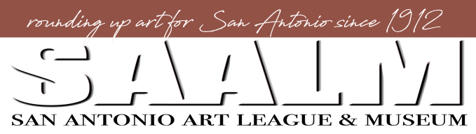
Our Art League is 112 years old and has gone through many changes during that time. You can read more about that on our website, saalm.org. When I first became President back in 2017, this was our logo:
![]()
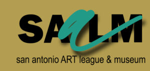
It was hard to read and reproduce. I played around with some new ideas in 2018 (below), but ultimately we decided to use the one that you see at the top of the post, a simple SAALM. Kinda blah, but readable
![]()
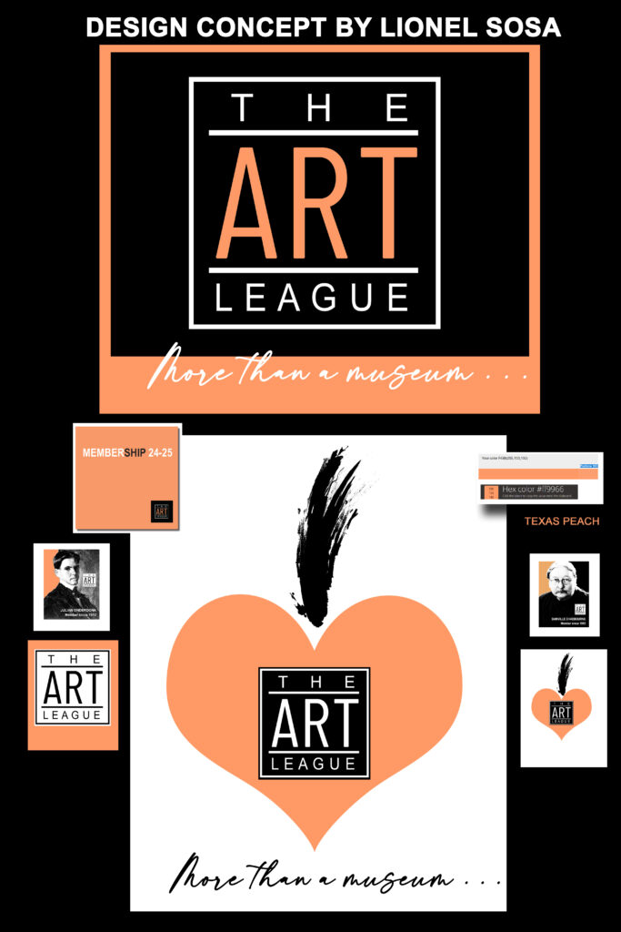
However, in a recent stroke of very good luck, our current Art Patrons for 2024 are Lionel and Kathy Sosa, and Lionel just happens to be a world-renowned graphic designer, former owner of the largest Hispanic agency in the country.
Lionel, who is generous with his time and talent, did some pro bono work for us and suggested we brand ourselves as simply “The Art League . . .more than a museum.” It’s true – we are more than a museum because we give workshops, showcase student art, off public lectures, and collaborate with other arts organizations in our community.
Here are some samples of the new ideas:
![]()
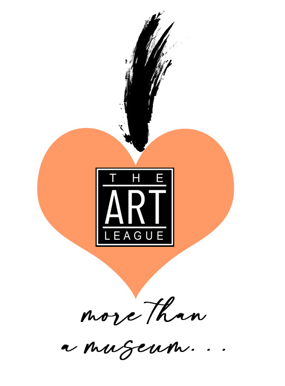
What are your thoughts?
- Do we need “San Antonio” on our logo?
- Can we just be known as The Art League for short?
- Do you like the Texas Peach as the accent color?
Help us with our new marketing ideas! You can send your comments to me on the Art League website.
Thanks!!!
Lyn
I like the big, bold lettering “The Art League” and the script “more than a museum.” Most people call SAAL&M “The Art League” anyway, so I don’t think we need San Antonio. I’m not 100% crazy about the heart. The peach color is okay and works with the black to make the lettering stand out. Really good changes to the brand!
Do we need “San Antonio” on our logo? I am from Montana and subscribe to or visit a lot of art newsletters, museums and online communities. It would be very helpful for your out-of-area customers to know where on earth you are, unless your work is entirely online. That said, maybe you don’t need the location in your logo, so much as somewhere on your newsletters, pamphlets or ads.
Can we just be known as The Art League for short? I sort of addressed this in my previous answer, but if you want people to physically come find you, having a city helps. I personally appreciate a physical location reference when I am searching things online. It helps me narrow down my focus and exclude those choices that don’t work for me.
Do you like the Texas Peach as the accent color? Respectfully, no.
I like the peach heart, but the one I like the most is the teal with the arch.
Hello Hello
I personally like one from 2018 thoughts pile-
The first one with the large lower case green a.
✨✨
In my opinion, you need a sense of place, so adding San Antonio somewhere is needed. The new logo is so ‘clean’ that it could be anyone’s/anywhere.
I like the peach heart. You probably do want Texas in there somewhere, but I think that heart with the feather-like thing on top is very simple, artsy, inviting.
Love the new designs! Naming your home base may be a good idea to differentiate you from all other art leagues, groups, etc. the ONLY thing that I keep seeing is the S in the word Museum. I keep reading it as a G. I may be the only one, but there you go.
Love the new designs! Naming your home base may be a good idea to differentiate you from all other art leagues, groups, etc. the ONLY thing that I keep seeing is the S in the word Museum. I keep reading it as a G. I may be the only one, but there you go.
I like the peach and black. Very strong. I like the tag line “more than a museum” but maybe we need to honor the past, celebrate the present and foster the future rather than only implying that we are more than a museum..something with three tiers that signifies these three concepts? I think we need the SA in there too.