About lynbelisle

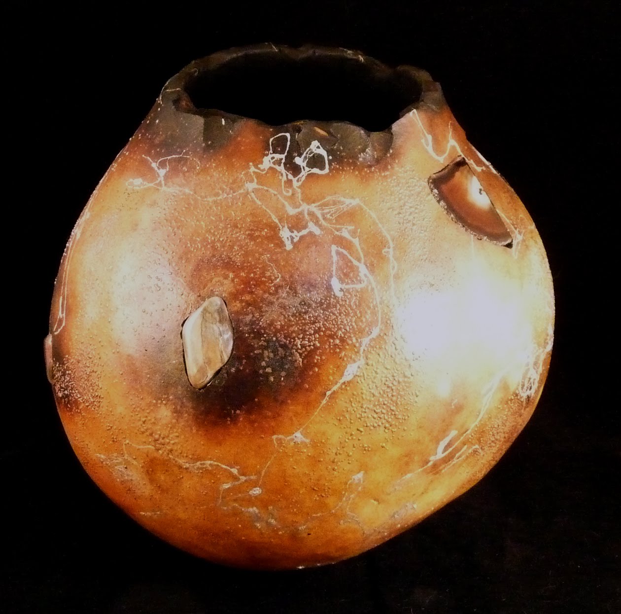
Lyn Belisle Artist’s Statement: Shards and Veils As an artist, my personal obligations and passions are pulling individual connections from the circular nature of time, fashioning shards of recognition from the well of collective unconscious, exploring the idea of the “secret handshake” in symbol and archetype, celebrating the frozen moment between what was and what is to come. I work in four main media to explore these ideas: • In collage, often using beeswax and altered papers to celebrate anonymous faces and otherworldly places • In unglazed earthenware clay and found objects, often to create spiritual and symbolic “neo-santo” assemblage • In fiber and paper, often to create wall pieces with natural colors, wax, felt, cheesecloth and digital photo images • In acrylic paint, often as pure, non-referenced exploration of form and veiling I take inspiration and comfort from the knowledge that we are all connected on a deep cross-cultural level with shared collective memories that each of us can glimpse through art without the need for words.

Studio organizing

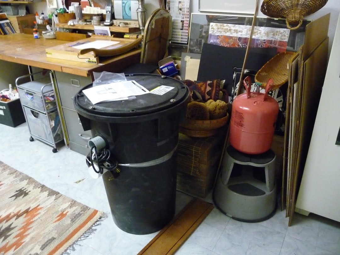
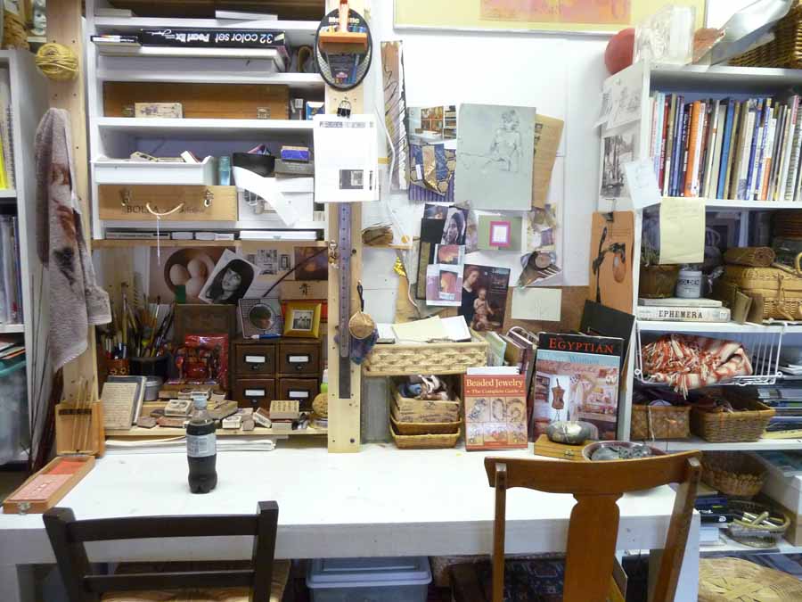
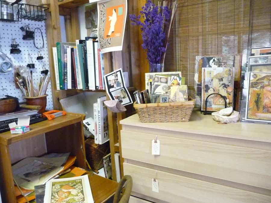
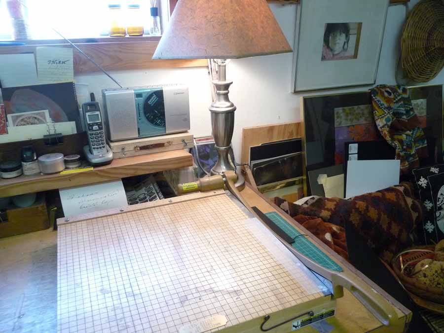
I don’t think a studio, at least not my space, is ever really organized like an office, but it’s good to know where to find things – last night it rained (hooray) and so I spent the evening in, re-ordering stuff and getting ideas for future projects. Here are the results of the re-ordering, mostly for me to see what the place looks like when it’s not covered in paper and glue. I should put up photos of those times, too, because that’s what it loooks like normally.

Nique o’ the Day – Surface and texture redux

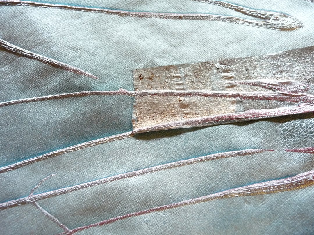
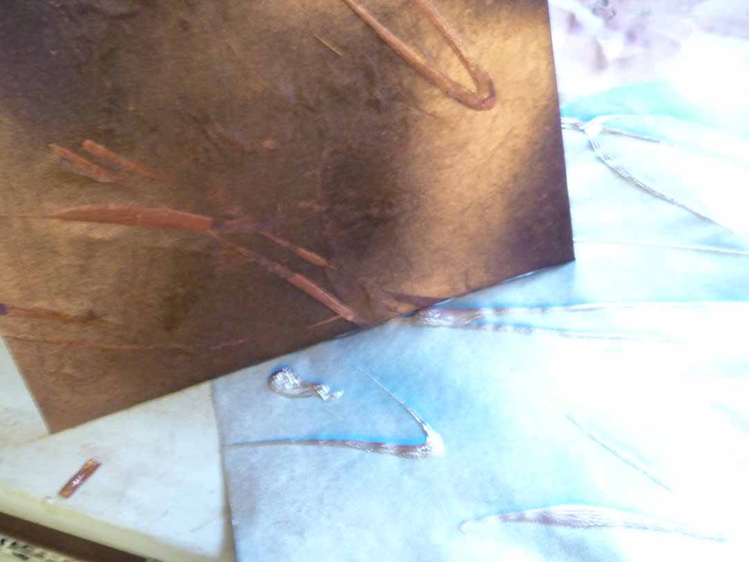
I went back to some old techiques for surface decoration on paper yesterday – one technique is to apply metallic liquid acrylic onto paper through a squirt bottle, then spray it with gold paint while it is still wet and let it dry.

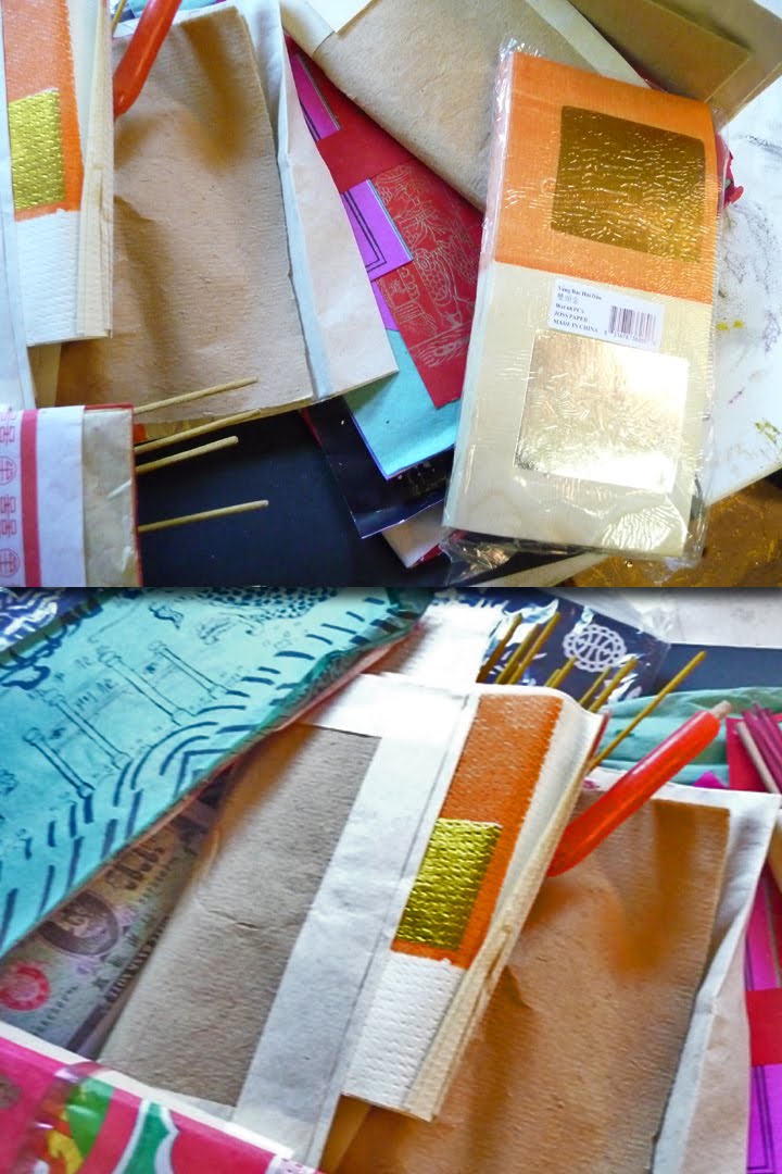
I also ran a sheet of joss paper through a crimper – we used to use real paint tube crimpers, but since this technique was discovered, manufacturers are making “corrugators” on purpose. The effect is nice, though. I’ll use these both on the new covers I’m starting tonight.

Help! My creativity is stuck in neutral . . .

I’ve thought that too often, and this morning happened to run across a COPYBLOGGER post that helps unstick – Do You Recognize These 10 Mental Blocks to Creative Thinking?
The first one is something I am always nagging my students about when we talk about design:
“One of the worst aspects of formal education is the focus on the correct answer to a particular question or problem. While this approach helps us function in society, it hurts creative thinking because real-life issues are ambiguous. There’s often more than one “correct” answer, and the second one you come up with might be better than the first.”
I think I’m going to make the whole article required reading – for me, especially.

New clay beads – following the directions

I am learning more than I wanted to (almost) about polymer clay. I thought you just rolled it out and baked it, which may be why, after my first attempt, my beads were pretty but not very strong. The clay needs to be “conditioned” first, which means rolling it through a flattening machine a bunch of times. I got one of those, and that part was pretty easy. It’s a lot easier than wedging “real” clay for the potter’s wheel. In the photo, it looks strangely like bacon, and it IS pretty thin. You can stick it back together, though, to make it thicker.

Then you need a dedicated oven to bake the stuff in. I got one of those, too. Actually, neither was expensive, especially with a Jo-Ann’s coupon! This was Sculpy day in the studio, and the beads came out well, if a little bizarre looking with the squashed faces on some. They seem a lot stronger. More work than I thought, but the results are promising.

Nique o’ the Day – Binder clips

This tip is probably known by most everyone, but I had need of it today for holding just the corners and one edge of a cover while the glue was drying. These binder clips come in different sizes and really hold tight, tighter than a clamp for small jobs. I like the way the look, too – simple and efficient. Too bad other little day-to-day things in life aren’t that way!

Also, I discovered a new material (see pic) that improved even on the diagonal stretch cord (in my last post) for holding iPads – am still trying it out but it looks good so far. More soon.

Engineering Eureka

It came to me in a dream – actually, I did think of it just as I was waking up Sunday morning. I had worried about the iPad slipping out of the covers from the bottom. I was attaching the bands horizontally on both those covers and the Kindle covers. It worked fine on ereaders, but I “saw” that I should be putting them diagonally on the corners for iPads to keep them from slipping. It worked great. I retrofitted one of the covers that had sold but not shipped,and I think that the buyer will be a lot more pleased with the secure fit of his iPad! See the old version and the new, below:

Jessie Voigts, Photographer and Friend

I’m lucky enough to know Dr. Jessie Voigts, one of my Girlfriends in Art, who recently sent me some of her spectacular photos, a few of which you can enjoy below. When she’s not exploring and visually celebrating Lake Michigan, she heads the organization Wandering Educators. You don’t have to be an educator to appreciate the treasure trove of resources on this site. Check out her blog, and read about her personal take on travel, learning, and the citizens of the world at large.
Many thanks, Jessie!

Nique o’ the day: domino closure/clasp

It’s one of those mornings with unexpected time to play around in the studio, and this is a small but useful discovery. I have some little wooden dominoes that I planned to use for closures on the journals and covers. I turned one over, sanded off some of the black finish, drilled some holes with an awl, and applied a paste of copper powder mixed with neutral shoe polish. It really came out well, much better than the photo (which was taken in a hurry on my iPhone). I think this has possibilities.

Superfad.com – amazing

My friend Carol introduced me the this site – her stepdaughter works with this creative group. You can explore it for yourself, but be sure and read their statement of purpose. Their work is a fusion of all of the best media art and technology I’ve ever seen – don’t miss the Sony “Eye Candy” ad (screen shots above). I am going to show this to my students and hoPe that it inspires them – it did me!

Gotta know when to hold ’em . .and fold ’em

Kenny Rogers sang it – you gotta know when to walk away. I tried a new and unfamiliar theme last night, wanted to visit the 30s and Art Deco. It didn’t work from the start – I didn’t have a feel for the images or the era and tried to bluff my way through using color and line. Along the frustrating way, I learned a lot, particularly to stick with what calls you and don’t try to force your art in a direction that you want to control when you don’t feel the story. See the photos and the resulting cover-up. The first three show that it wasn’t bad — it just wasn’t RIGHT. As I’m always saying, there’s more than one right answer in art and design, but this wan’t one of them.
The more I read in the book Art and Fear, the more I realize this, taken from page 56, “One of the best-kept secrets of artmaking is that new ideas come into play far less frequently than practical ideas – ideas that can be re-used for a thousand variations, supplying the framework for a whole body of work rather than a single piece.”
I still have thousands of variations to explore in themes that I love – Asian, Renaissance, surrealism. . for example, the rooster (last photo) in the now-recovered false start of a cover has a lot of potential and a story to tell. Can’t wait to see how he turns out.