It’s time to update the media/branding look of the San Antonio Art League & Museum. Coincidentally, I’m the new President and I love playing with logo design. So – aha! I get to create some new design ideas, and you get to help!!
Here’s the original design – it’s been around for years, but it doesn’t seem to reflect what we are – it’s fairly generic and undistinguished. It also has a drop shadow effect that’s hard to reproduce in print.

I like the way the old logo kept the word “ART” as the focus, so I used that in the new designs. But it doesn’t say much about the organization.
When you create a logo, you are creating a visual symbol that says “who we are.” At the San Antonio Art League & Museum, we are
- guardians of a precious permanent collection of notable paintings that are exhibited several time a year
- an active support organization for San Antonio artists. Our Members Gallery, opening in September, will feature work by area artists throughout the year
- part of one of America’s most beautiful historical areas, the King William District
Getting all of that into one design is a challenge.
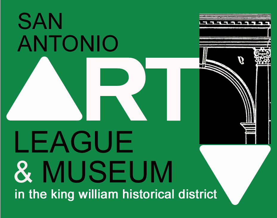
Here’s the first idea – The green color suggests the leafy environment in the area and the triangles add a contemporary touch. There is an architectural fragment used as a graphic element on the top right.

The next one is a clean contemporary design with a rendering of the Art League building in the circle.

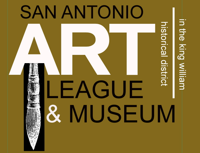
This logo features my favorite vintage bronze color with an antique brush etching and a very contemporary font.

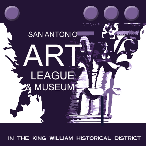
The last idea has a classic column on the right side and a paint spatter on the left side. Designers have a saying that says “purple pulls” so this one is purple, but I’m not sure about that.

You can take this link to tell me what you think about each logo, or just tell me which one you like the best. You don’t need to be an artist to choose what you like – in fact, that sometimes complicates the choice!
If you are an artist, I’m open to suggestions – if you have a design that you think works better, send it along to me via email and I will give you TWICE what I earn as the SAAL&M graphic designer. Lucky you!!
And if you are a SAAL&M member, these logos will go out in tomorrow’s newsletter for you to vote on. It definitely takes a village to support a beloved non-profit art organization like the San Antonio Art League & Museum!

I like choice two or three–teal or gold. First of those was the round, teal, with KW house.
Thanks, Nancy!!
The second one is my favorite one
Thanks, Michelle-
I emailed my response to you Lyn. You amaze…is there anything that you CANT do?
Uh, nope! xo Laura
Maybe make the survey page work – LOL
Survey page worked fine. I just didn’t understand that in the link sentence…my bad…Laura
I think i left comments on the survey – for each one, but then it said the page didn’t load. let me know if you need them again!
Ah — I hope the survey is saving responses – I’ll check – always so good to hear from you, jess!
OK, I checked the survey page ind the info is there – boy, are there differences of opinion!!! And some very very good ideas!!
The green one positions the pencil so it resembles a downward pointing arrow. The Gold one does something similar with the brush. The viewers’ eyes will follow the direction of the line (Gestalt principle of Continuation). This has negative connotations.
In any design- upward lines are positive, diagonals suggest action. I suggest arranging elements to direct the viewers’ eyes inward or upward.
In the Gold- the strict vertical placement of elements (line and brush) in the gold are too static. You want something that suggests growth and forward movement.
In the Green the curve on the right adds a nice sense of movement but pointing in or up would be better than pointing down. The triangles are a nice contrasting shape.
Purple- imagery is too low fidelity to make it out and purple not a popular color. Beveled buttons at top seem incongruous.
#2 Teal is okay- could use a more interesting typeface on “ART” for visual interest. The plain san serif is pretty bland. Also a better quality image- the extreme pixilation looks like a jpg that has been saved over and over. The simplicity can be maintained without sacrificing quality.
More than you wanted to know- but you did ask!
Ooops- sorry I didn’t realize you had done these Lynn- I should be more diplomatic. I actually like the current logo- think it could be easily updated. Of these the Teal is the best and most versatile IMO. I understand about your GD salary 🙂
I like A.#4 and B #2 Don’t like the color backgrounds of #1 or #3 very much.
Great job Lyn! I like #2!
The second one captures the KW connection best.
I think I like 2 the best, too.
I’m intrigued with the triangle idea. What if the overall shape was a triangle as well? The three sides represent the art, the artists, and the community. San Antonio could be centered at the top of the triangle.I would add a black or dark green outline as a frame for the logo.
Hi Lyn: Wow there’s a lot to choose from. I like the logo with the mustard colored background and the paint brush because it captures the range of functions the organization covers. The graphics are clear that it is both a league and a museum that happens to be located in a historical district. It balances everything.
My other favorite choice is the 1st logo on the bright green background, though I would change the background color to purple or deep teal or red. We tend to dismiss green signs because there are so many of them. Or, they relate to traffic, parks and other non artistic signs. The balance between League, art and historical is good.
I like the black and white architectural insert but find the two triangles a bit distracting. I find myself wishing you had a black and white “fine art” sketch inside a triangle to emphasize the “art” part of the organization. Maybe a subtle sketch of a face as if it is looking around the corner in left side of the ART triangle. Or, a paint brush or brush and palate, or ????? Alternatively you could try a black line around the triangles and the “r” and “t” letters. I think that would tone down the triangles and integrate well with the black lettering. The architectural rendering appears to have a small upside-down and backwards “a” in the black part. I think it might be better to just have a solid black area. The logo with the circle and an etching of a building focuses mostly on the historical district.
The last purple logo is visually confusing. I found myself wondering what the white area on the left was looking at. The logo with the deep teal background seems to me to be about the historical district and not about art. I hope this is helpful. You are a busy lady!
Have you ever considered writing an e-book or guest authoring on other blogs?
I have a blog based on the same subjects you discuss and would really like to have you share some stories/information.
I know my visitors would appreciate your work. If you are even remotely interested, feel
free to shoot me an email.
On second viewing I like #3 the best. The background color and detail in the brush add a richness that communicates the quality of the work that is shown at SAALM. So- longevity vs first impressions is also a consideration. After viewing all of them 7 or 8 time and experimenting with color and text on #2- I like #3 the best and am humbled by your accomplishments on this!
Best,
Nancy
Definitely # 3.
I agree with comments about upward and inward lines being more positive. I would like a more stylized image of the museum building – black and white with a bold color – a more yellowish bronze or the bright green or teal with yellow or bronze.
Hi Lyn,
I like the one with the king w. district in the circle.
xo, L
The bronze, but I would turn the brush right side up and use the brush in lieu of the line on the right separating KW l AD
Love the image of the last one but the architectural reference is prominent, not the art league.
Hopefully I’m not overly late with my comments. I really appreciate the design choices and the creative work that went into them. From my past experience, I would check to see how these designs look when reduced to postage stamp size and how they look blown up. Sometimes we don’t have control over how these images are copied for distribution and it may be worthwhile to see how they appear in black & white. ( i.e. Xerox copies). Just some thoughts.
Very nice post. I just stumbled upon your blog and wished
to say that I have truly enjoyed surfing around your blog posts.
In any case I’ll be subscribing to your rss feed and I hope you write
again soon!
We’re a bunch of volunteers and starting a brand new scheme in our community.
Your web site offered us with valuable info to work on. You
have performed a formidable job and our entire neighborhood
will be thankful to you.