The favorite so far, but not yet a winner
So let’s talk logos – the results are in. And, boy, are they mixed. Overall, designs 2 & 3 were the favorites but we still have lots of work to do to perfect a new logo for the San Antonio Art League & Museum.
I wanted to share some of your comments so you can see what a funny, complex job it is to design a logo for an organization. Among my favorites were, “The tree looks like an alien claw,” and, simply, “Phallic.”
These particular comments came from the online survey, although I received lots more via email and messaging.Here we go:
LOGO #1
![]()
SELECTED COMMENTS:
- This is my first choice! I don’t care if the background color is green, but I like the overall feel of this logo the best❤️
- nope the “A” look like arrows that go nowhere
- This one feels a little chaotic to me and my eyes keep getting drawn to the “arrows and away from the pertinent info
- I like this one best because it says today, modern, forward thinking, and it shows respect for yesterday. I would like to see it with small green triangles added to both large triangles.
- the swoop after the T is distracting, although i love that graphic. the two triangles, of which one is an A, are confusing.
- My favorite because of the triangle shapes. Eye catching.
- I don’t like this one. The downward-facing arrow that’s connected to the arch has a negative vibe to me….as if it’s suggesting “down with art”.
- Phallic
- Not too crazy about this one. Not sure why.
- Don’t like the triangles
- First choice
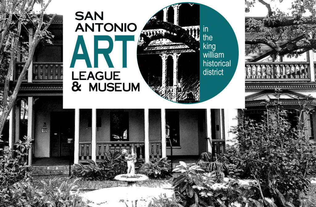
LOGO #2
![]()
SELECTED COMMENTS:
- Does not really reflect art but only the building
- This is my favorite.
- Nice but not my first choice.
- I like this logo the best! The Turquoise and black stand out and the image of the house gives it a lot of flavor. What about the paintbrush from #3 placed under “& Museum” on its side? #3 is my second choice. Not crazy about the background color.
- nope like the building but not the branch in front of it looks like an alien claw
- This one is my favorite. I love the whole package. #3 is my second choice. They all look great.
- My fav! I emailed you with comments about each one…Your survey page worked!
- I like this one!
- My favorite, hands down! Easy on the eyes, the relevant information is right up front, and then I’m drawn to the lovely rendering which captures visually the historic nature of the place.
- This one would certainly encourage me to go there… love the design in the circle.
- I like this one the best
- Probably my favorite.
- hard to see the photo. why is there a tree branch?
- don’t like at all
- This is my favorite. The circle suggests timelessness, and the type names who you are – in plain, simple letters. You might play with the color, however. The teal blue feels dated.
- classy. favorite
- I think this is my favorite. And since you like that bronze color, in my mind’s eye this would look fabulous in bronze!
- LOVE LOVE LOVE this one.
LOGO #3
![]()
SELECTED COMMENTS:
- This is my choice. Simple, elegant and to the point
- This is the one I like best–crisp and clean, “ART” stands out, love the contrast of the vintage-looking brush against the contemporary lettering (because I did like the architectural elements in the 1st two logos).
- I like the bold letters. It is contemporary!
- This is super easy to read. ART being the main focus. Simplify, simplify……..great logo. Anne Brennan
- Like the design although paint brush might lead people to only think of painting.
- yes yes yes classic classy tells it like it is
- I don’t care for this one. It’s not clear (maybe I’m dense) whether I’m seeing a brush or a table leg. 🙁 Of course it’s a brush because it’s art but then there’s the change in text direction. Despite the clean lines, it feels like too much to figure out at a glance.
- The color and graphics say it all – and, in spite of no visible purple, draws me in.
- My second choice
- looks scatological, under the A. colors are not interesting.
- clean, simple. love the colors: I personally like black and brown together.
- This one is too busy, and nothing is gained from the paintbrush coming down from the ‘A’.
- paint brush is overused
- Not crazy about this one either.
- OK, not very exciting
- Third choice
LOGO #4
![]()
SELECTED RESPONSES:
- I was too busy trying to look at the background drawings before I got around to reading the Museum part… last choice
- I don’t like the purple and the logo is very hard to read and distinguish what it is advertising.
- nope too busy
- My favorite!
- Here, I feel frustrated trying to figure out what the image is and what the dots mean. It also feels too top-heavy to me, despite the grounding line at the bottom. Please pick #2 – it’s perfect! (Let us know what you decide.)
- What about this one in the bronze?
- hard to see, and the purple dots don’t jibe with the (column?).
- I like this too. The & symbol is a little lost. King William District could be a little larger.
- This would be my second choice, but I don’t understand the meaning/reason behind the circles up top. A few suggestions: 1. Eliminate the dots/circles at the top, 2. make the top and bottom horizontal blocks less deep, and move the “In the King William Historical District” line up so that it is closer to the top of the bottom block.
- might run into problems with the purple
- This is probably my second choice. But, like you, I’m not too fond of the purple color here. … Also I think I don’t care for the placement of the King William banner; maybe it could be thinner: just tall enough to hold the letters. ???
- Too confusing
- Last choice
Thanks for all of the comments!! The are hugely helpful – I’m going (literally) back to the drawing board and refining your favorite designs – stay tuned.
Designer Milton Glasser said, “There are three responses to a piece of design – yes, no, and WOW! Wow is the one to aim for.” That’s what we wanna do for the San Antonio Art League and Museum!