
What do you think? Do you like the lighter look? Everything else is the same except the color scheme. I think it’s easier to read. Maybe it was because I was working with so much white during Wednesday’s workshop, but this seems to be a nice change. Let me know.
OK, back to work — have a wonderful weekend, and stay dry in those predicted thunderstorms!
Yes….yes….yes!
Thanks, Clare – you taught me about the power of white!
“Lighter” doesn’t change the impression of age or time. (the essence?)..to me it is easier to see…
Thanks, dear H – easier to see is good 🙂
Love the lighter color scheme – I find it hard to read white print on a dark background.
Excellent! Thank you, Francesca –
LOVE the lighter look. It’s also easier to read if one is outside — and now that spring seems to have mostly arrived, outside is where I’ll be.
Great rationale – thanks, Susan – I’m gonna keep it this way, at least for a while 🙂
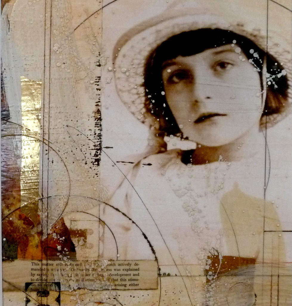
I love this one, Lyn! I can’t wait to take another class from you!
Yes, love the lighter look. Happy, Spring oriented.
Linda, thanks- would love to see you !
I agree – reading white on dark is so difficult that i rarely do it. but this? LOVELY and clean and enticing!
Jessie, you are the master of online design – thanks! It’s always so good to hear from you – hugs to Lillie
I love the lighter, clean look. I’ve never tired working with one color (especially white) before.
It’s kind of addictive – like seeing snow fall all over everything – you should try it!
Lynn, it is gorgeous. I have you DVD from Artful Gathering so I am going to try going lighter. I’ll sho w you when I finish. I love your blog. Wish I lived closer and could take a class. Thanks, Ann
Ann, I think this is a new direction for a lot of us – in Jane Davies’ workshop we used a lot of white, and it started me thinking in that way – it’s fun. Do send pics!! xoxo
Lyn, your blog is beautiful either way! Honestly, though, my own preference is the dark. 🙂
I like it!
A definite YES! Colors pop!