I returned from Greece this past weekend filled with awe and wonder and new perspectives. Here’s the first one.
One of the many revelations that came to me while I was there was the strange and beautiful properties of the color white. Of course, if you remember your science lessons, white is not really a single color but a mixture of every color on the light spectrum.
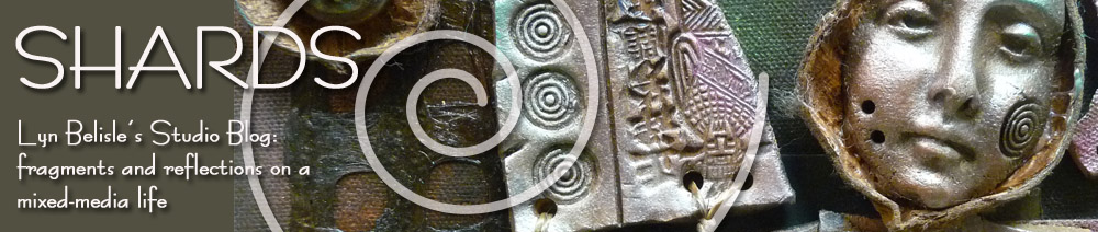
In Greece, white dazzles everywhere – in the architecture, on the clothing of the men, women, and children. The bright white color reflects the intense sunlight, helping to keep buildings (and people) cooler during the hot summer months. The uniform white aesthetic has become a cultural and architectural tradition.
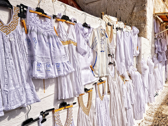
Intuition would suggest that if everything is white, then nothing stands out. But actually, white provides a clarity of detail that would be lost in a mass of various colors through the emphasis on form and value. Look at this rock wall in Mykonos – each white-washed stone is clearly outlined by form and shadow.
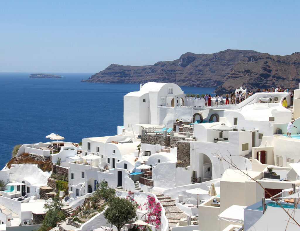
In this photo of Santorini, each building is clearly defined by its shape and its non-white accents such as the windows. If every building were a different color, this clarity would not be so evident.
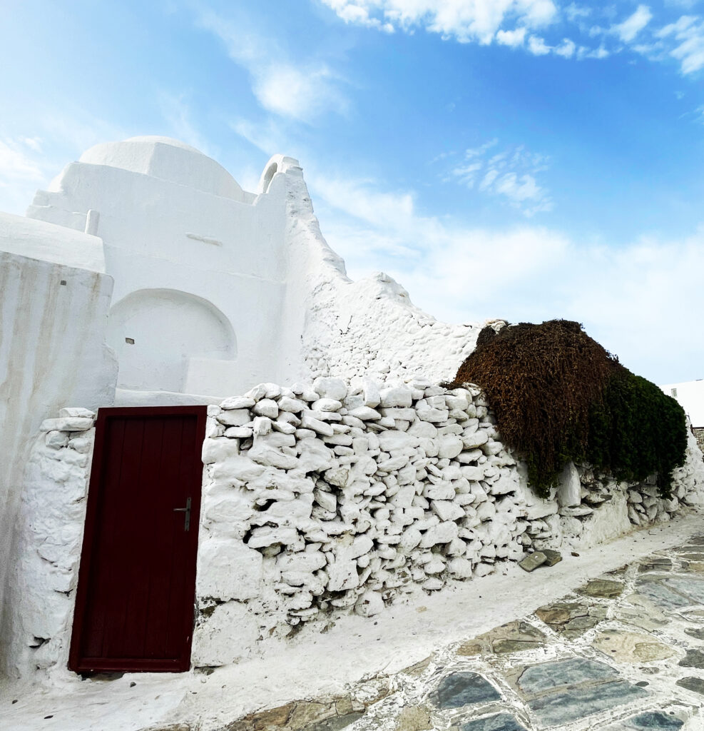
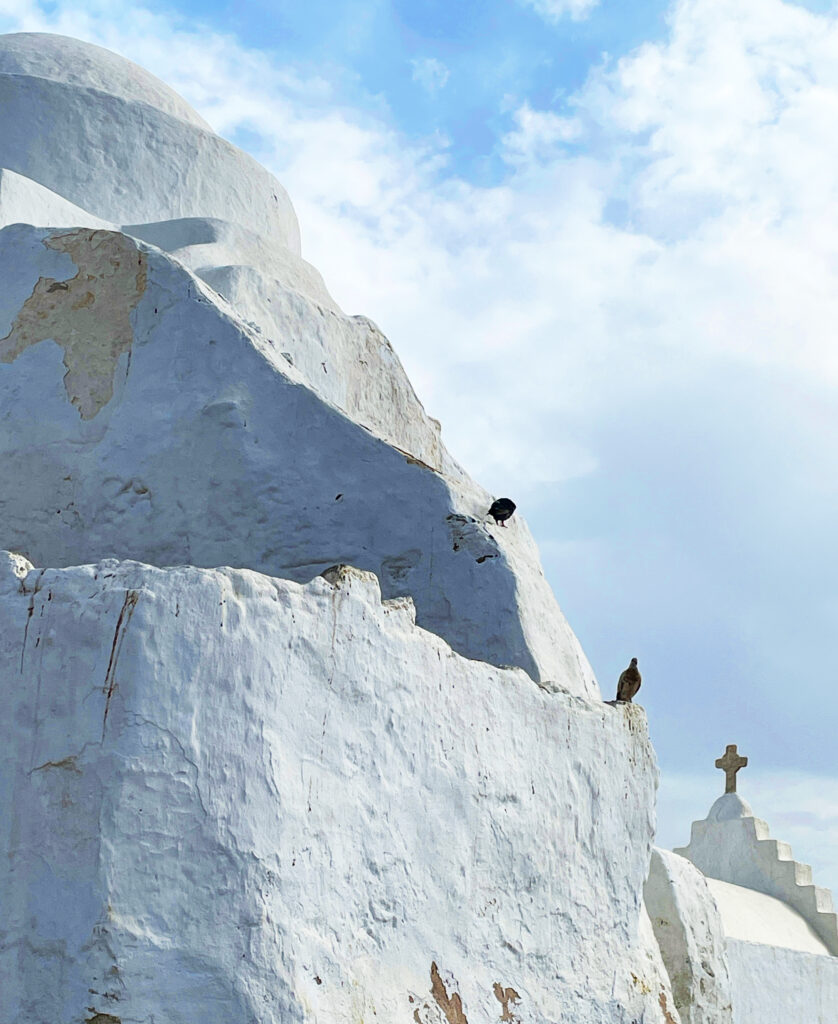
And here is a Greek chapel. Does this white abstract form remind you of Georgia O’Keeffe? It does me 🙂
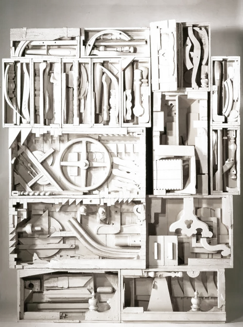
Sculptor Louise Nevelson used this principal to clarify her signature work because she wanted to emphasize and give power to the forms.
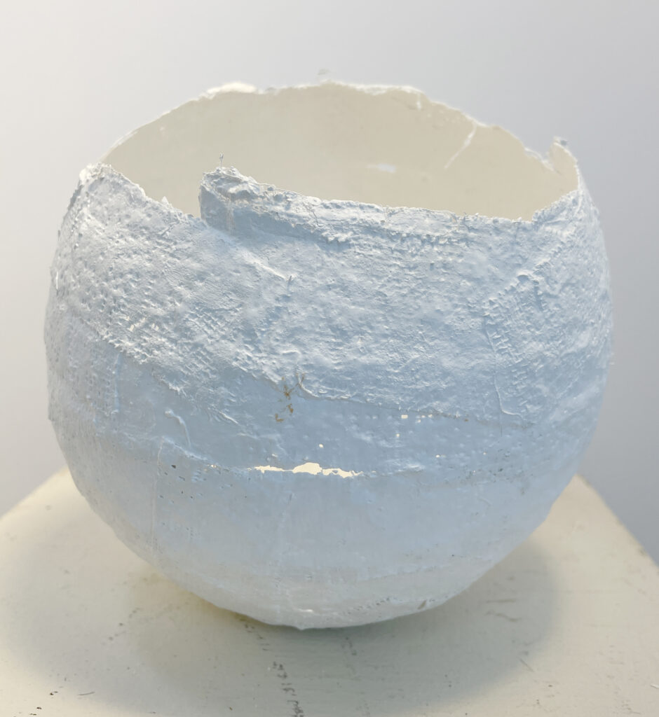
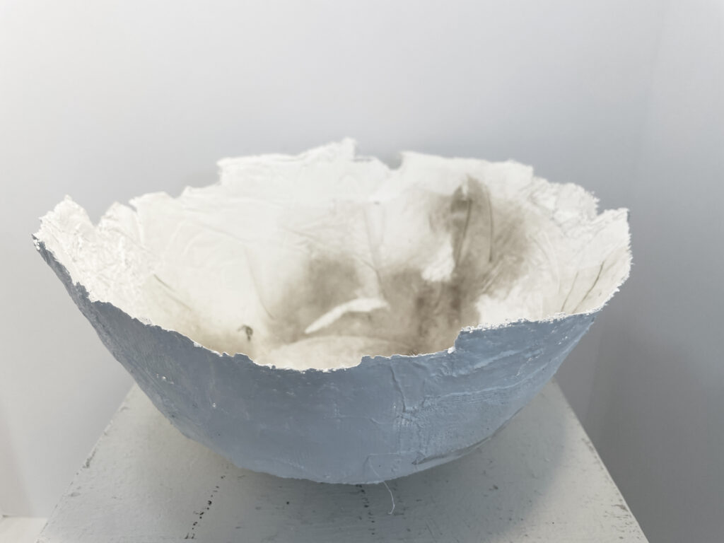
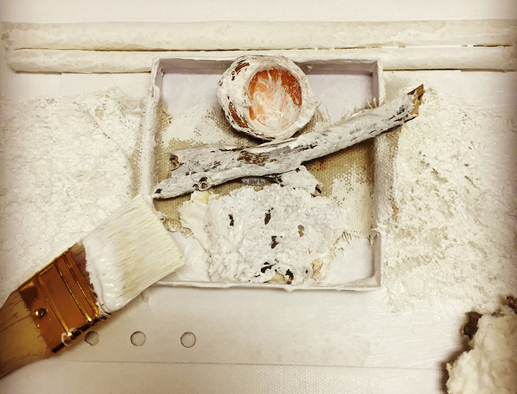
This morning, I was thinking about all of this while working in my studio on some base forms for the Vessel workshop I’ll be teaching at UTSA/SW School in July. The forms start out as pure white and are intended to be expanded and embellished. Here are a few that I made today, stacked up together:
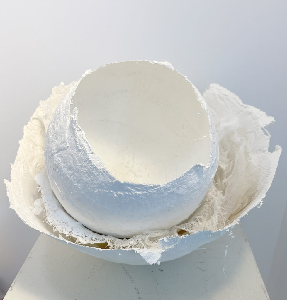
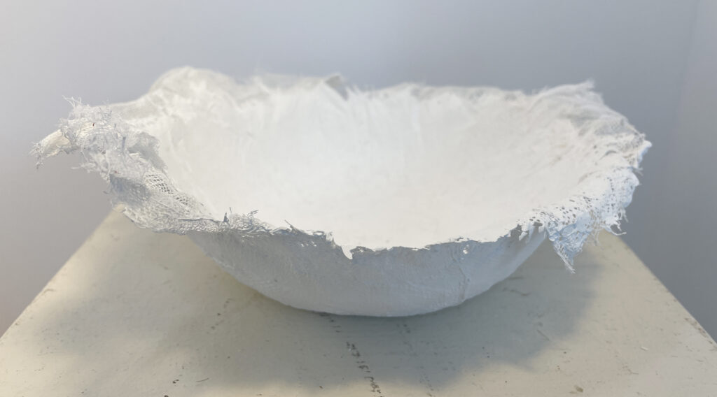
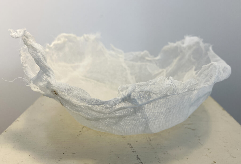
Here they are individually – I experimented with various base materials:
Plaster gauze over balloon armature
Cotton rag and plaster
Mulberry paper and cheesecloth
Layered cheesecloth with acrylic medium
There is a huge temptation to leave them just as they are – variations in white that show the texture. But of course they are just bases that are intended to be added to.
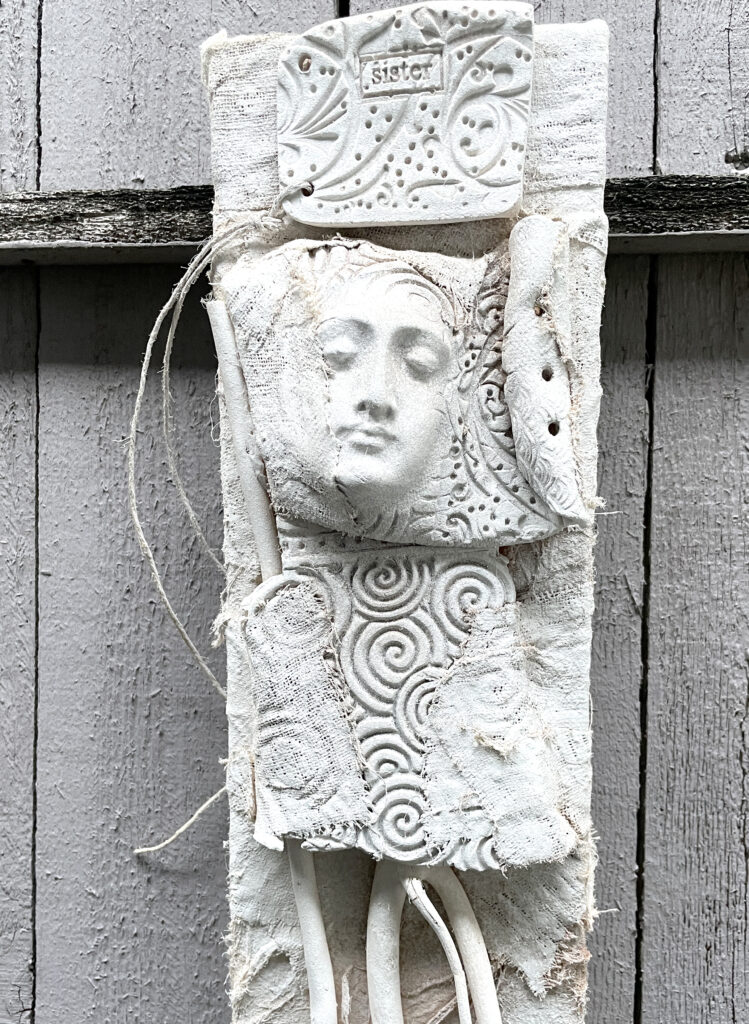
On a whim, I took a couple of scrap assemblage pieces that hadn’t been working and painted them white, like the rocks in the Greek stone wall – I liked the result. The white clarifies the design and gives me some new directions.
I’m obviously not going to take a can of white spray paint and cover everything dimensional that I’m working on because of what I saw in Greece, but this new appreciation for white as a clarifier and unifier rather than just a blank element or space-holding color is inspiring. White. Simple. Limitless.
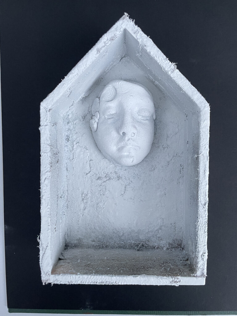
End of Greek Lesson One – next lesson, shards and faces!!
Thanks for reading!
~~Lyn, Intrepid Greek Island Explorer

 Offering a new workshop is a risk, both for the teacher and the students who are the first “test drivers.” That was the case with the Wednesday
 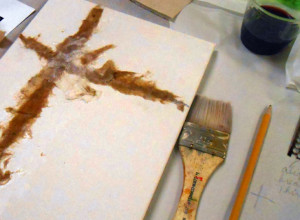 I started the session by demonstrating how to draw a visual classic cruciform framework with pencil lines on a 9×12″ canvas. Then we built thin layers of torn paper across that flat framework. I showed several techniques using both created and found textures, and combined these with mark-making through wet paint.