Yesterday I did something that I haven’t done in 25 years- participate in a “live” outdoor art show. There’s always been a gallery or a web site or something else between me and the person looking at my art. It was a fun, instructive and humbling experience. Mostly fun!
The show was the annual Trinity Alumni invitational exhibit held in conjunction with alumni weekend. I am an alum, but not a very active one (probably because I teach there and feel more like faculty).
My fellow alumni artists exhibited all kinds of wonderful things, photography, fabulous jewelry, paintings, and screen prints. No other Kindle cover artists, thought – hmmmmm….. The show and sale (and alumni barbecue picnic) were held on the grounds of Trinity’s Holt Conference Center and it was a blessedly beautiful day except for a few annoying wind gusts. I got to experience set-up and take-down and talked to lots of people in between. A lot of people had no idea what a Kindle was!
I learned a lot from fellow artists, some of whom have little credit card machines that they carry to all of their sales events. One of the best tips was from visiting artist/alum Liz Walker from Portland, OR whose business cards were fabulous – she got them at moo.com. Check them out!
Post-game score: I sold four Kindle covers, traded one for a friend Tina Barajas’ recycled paper earrings, and bought exactly enough jewelry to equal what I made. What a perfect show!
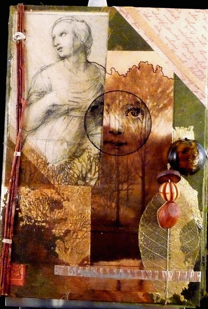
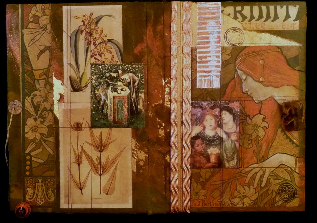
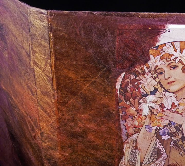
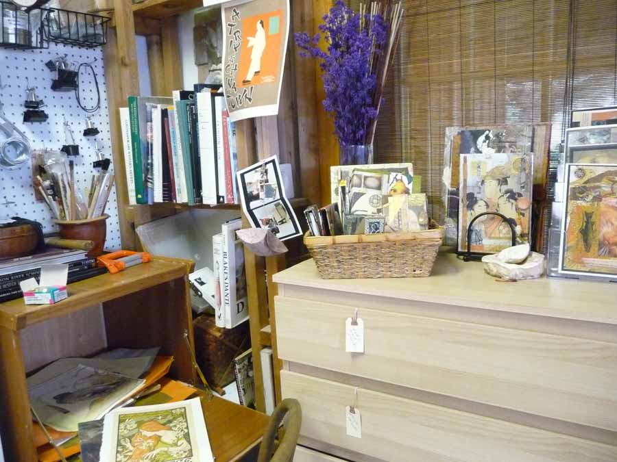
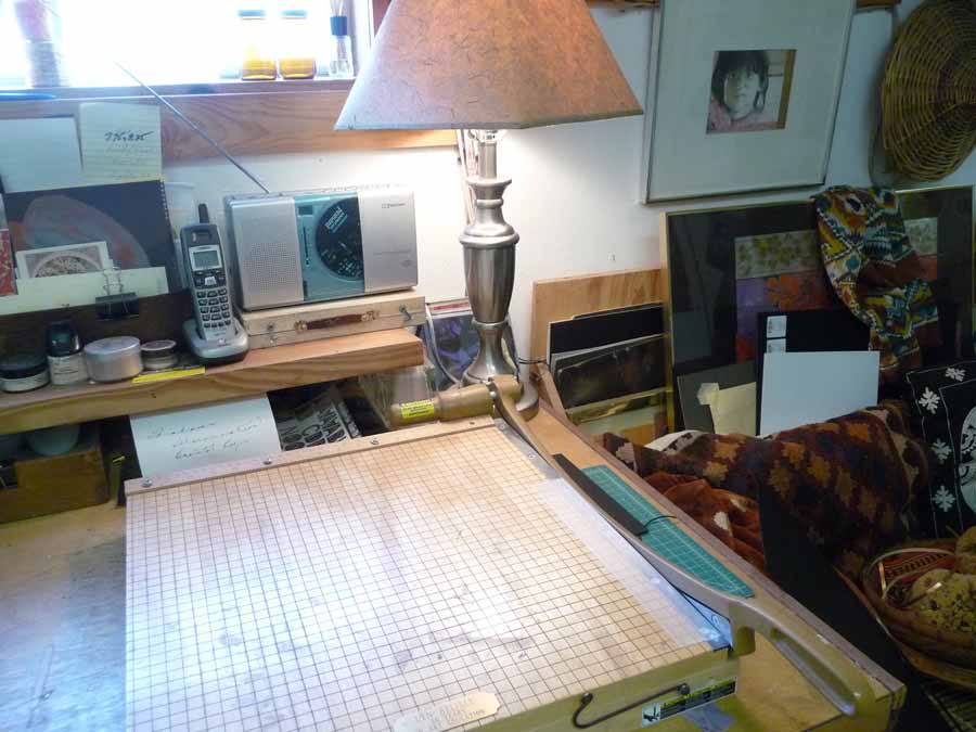
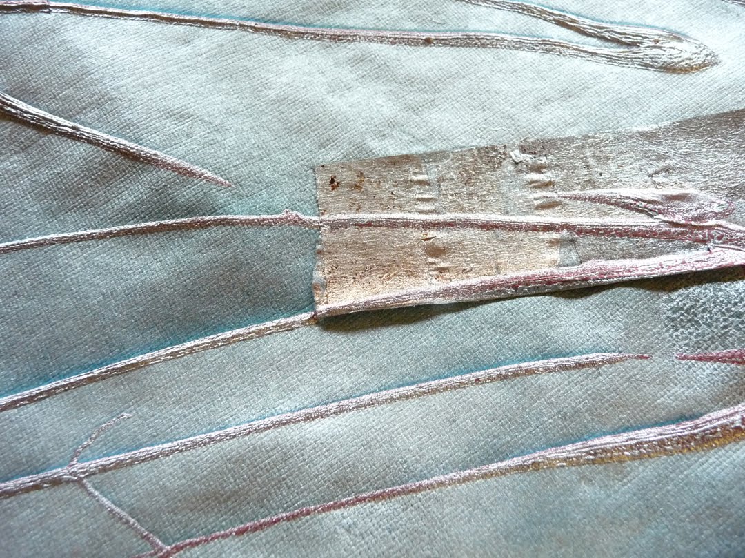
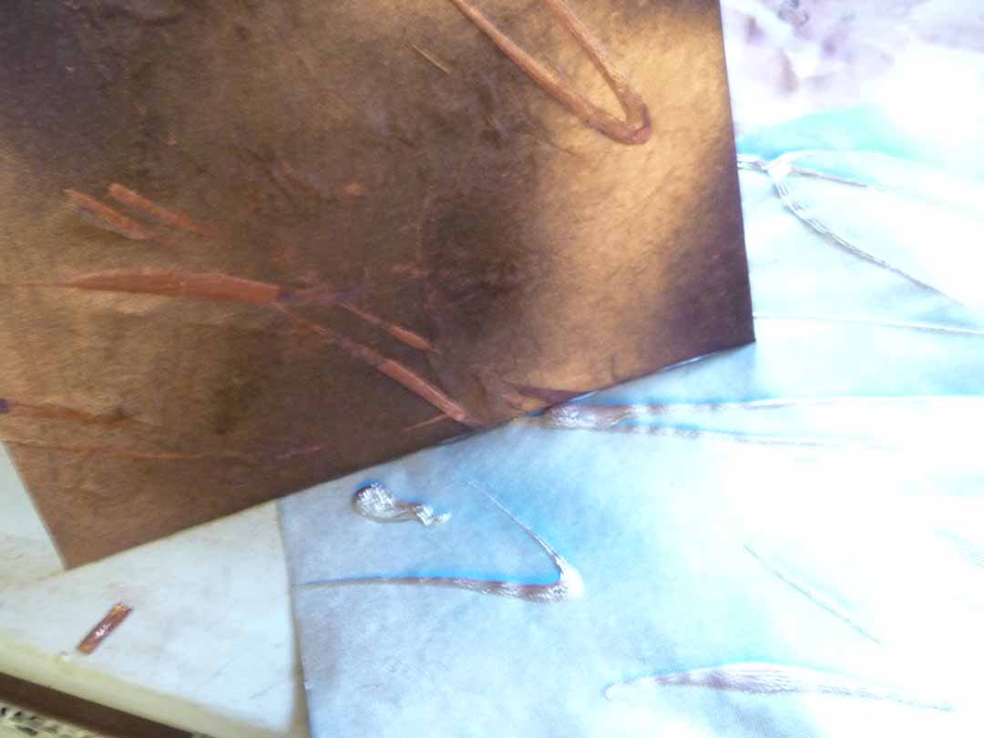
Here’s a look: