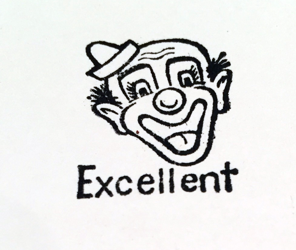
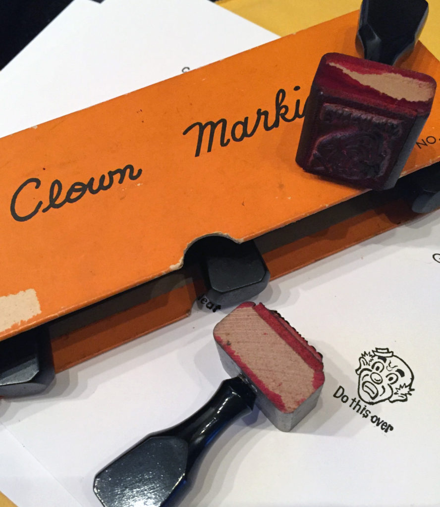
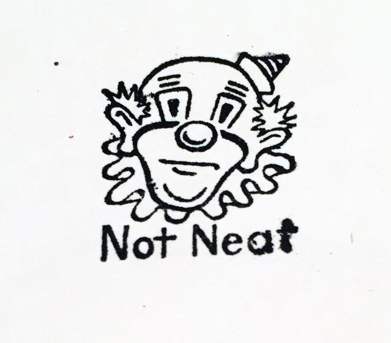
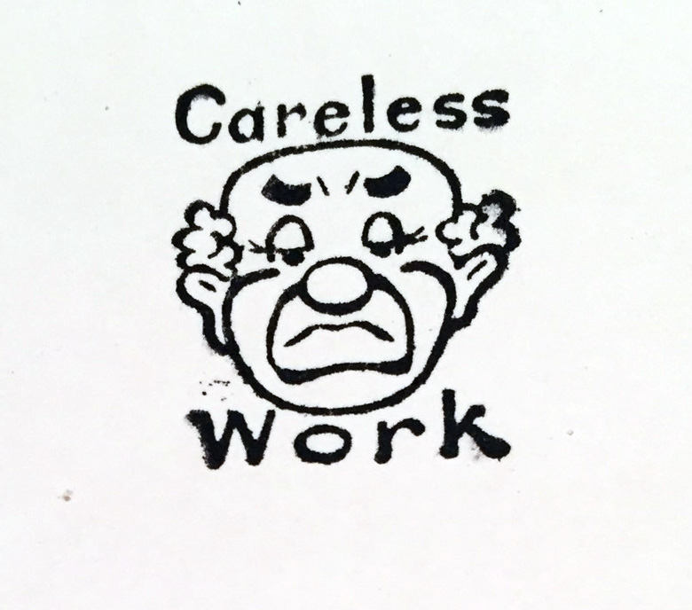
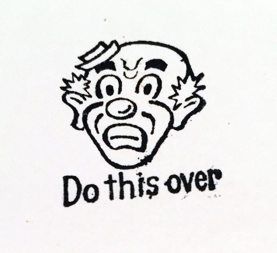
One of the things that I’ve had time to do this month is poke around in thrift shops. I found this totally creepy set of stamps from the 50’s called “Grading Aids.” The idea is that you evaluate some poor kid’s work by stamping a scary clown face on their paper or drawing. No words, no comments, just a clown face. Ewww. That is wrong in so many ways.
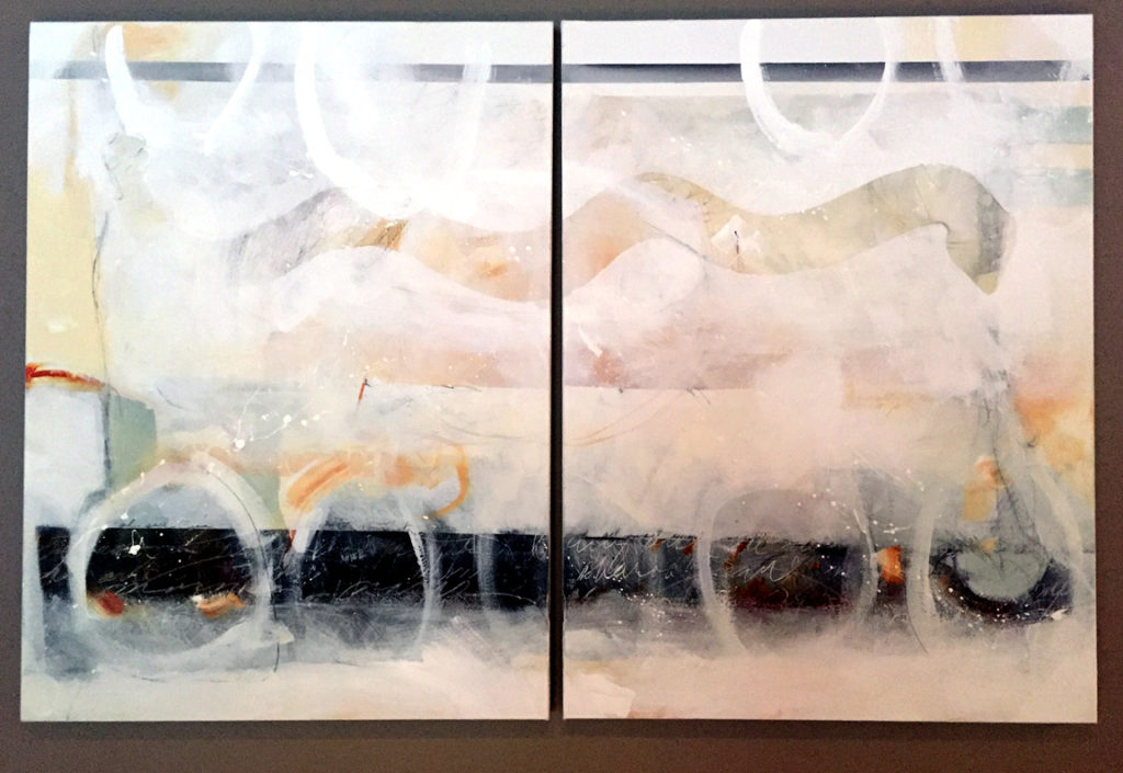
Let’s apply these standards to the new abstract diptych that I just finished. It’s layered with symbol and calligraphy and paint and prayer and a mystical snake and all kinds of radical, goofy non-representational stuff.
Well, first of all, it’s not neat. Damn, I hate it when that happens. The Clown is not pleased either. Look at those random spatters.
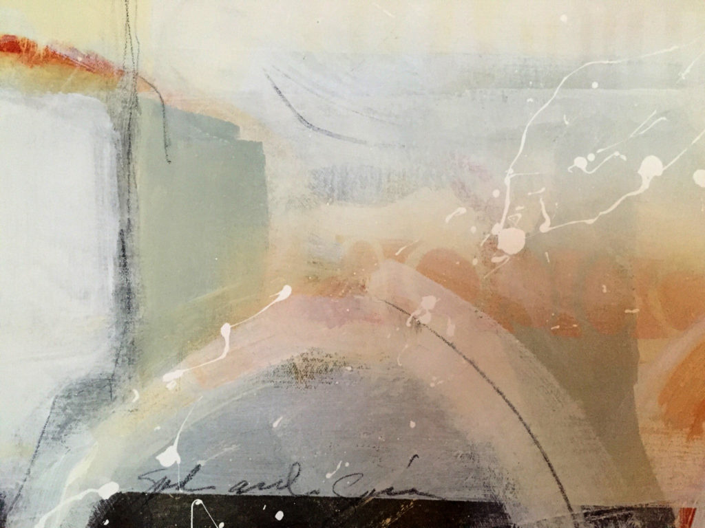
It’s also obviously careless work – you can’t even read what it says – very poor penmanship (no matter that penmanship isn’t even taught anymore). The Clown disapproves.

In fact, this painting is so unacceptable I might have to do it over – right, Clowny?
Actually, I think I’ll do it over a bunch of times – I’ll do a whole SERIES of careless, messy joyful abstract paintings – take THAT, you stupid clown and all the rest of the inside-the-box thinkers that try to rubber stamp individual creativity. Hooray, back to the Studio – what an EXCELLENT idea!!
Happy creating, Everybody!