Patched up . . .

I started this blog in its current form back in 2010 and it has become my invaluable journal of where the creative path has taken me. Recently, however, my SHARDS blog site completely crashed and I thought 15 years of entries and over 1000 posts were lost forever. Thanks to George Howard, a smart techie and highly-recommended good guy, we are patched up and running again. Sending you a shout-out, George!

I’m back just in time to share something lovely that Jude Hill wrote this morning

“So what if I concentrate on story building with loose patches for a while? Language Patches is what I have come to call them.  They are simple and small and maybe you can play along?”

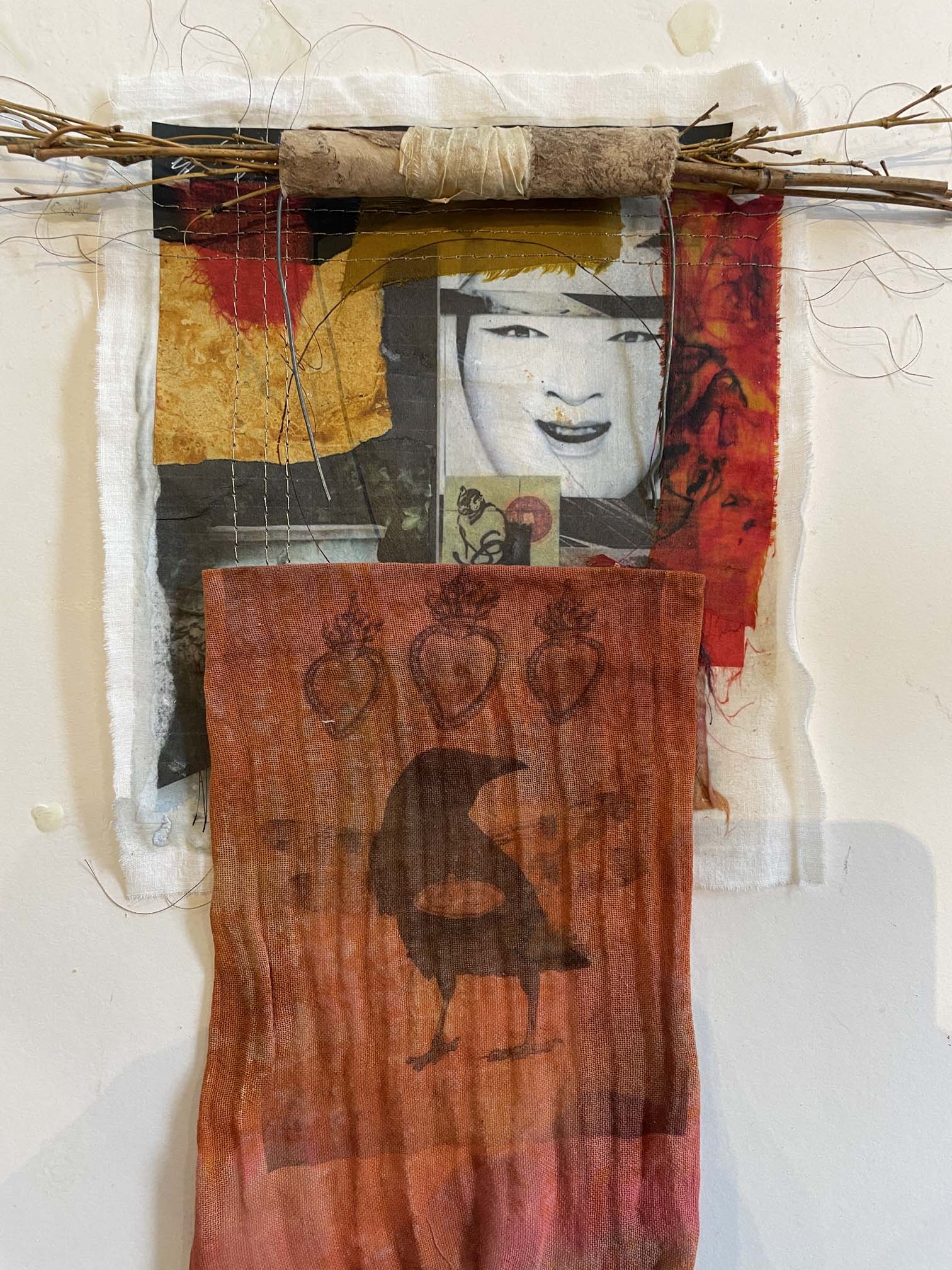
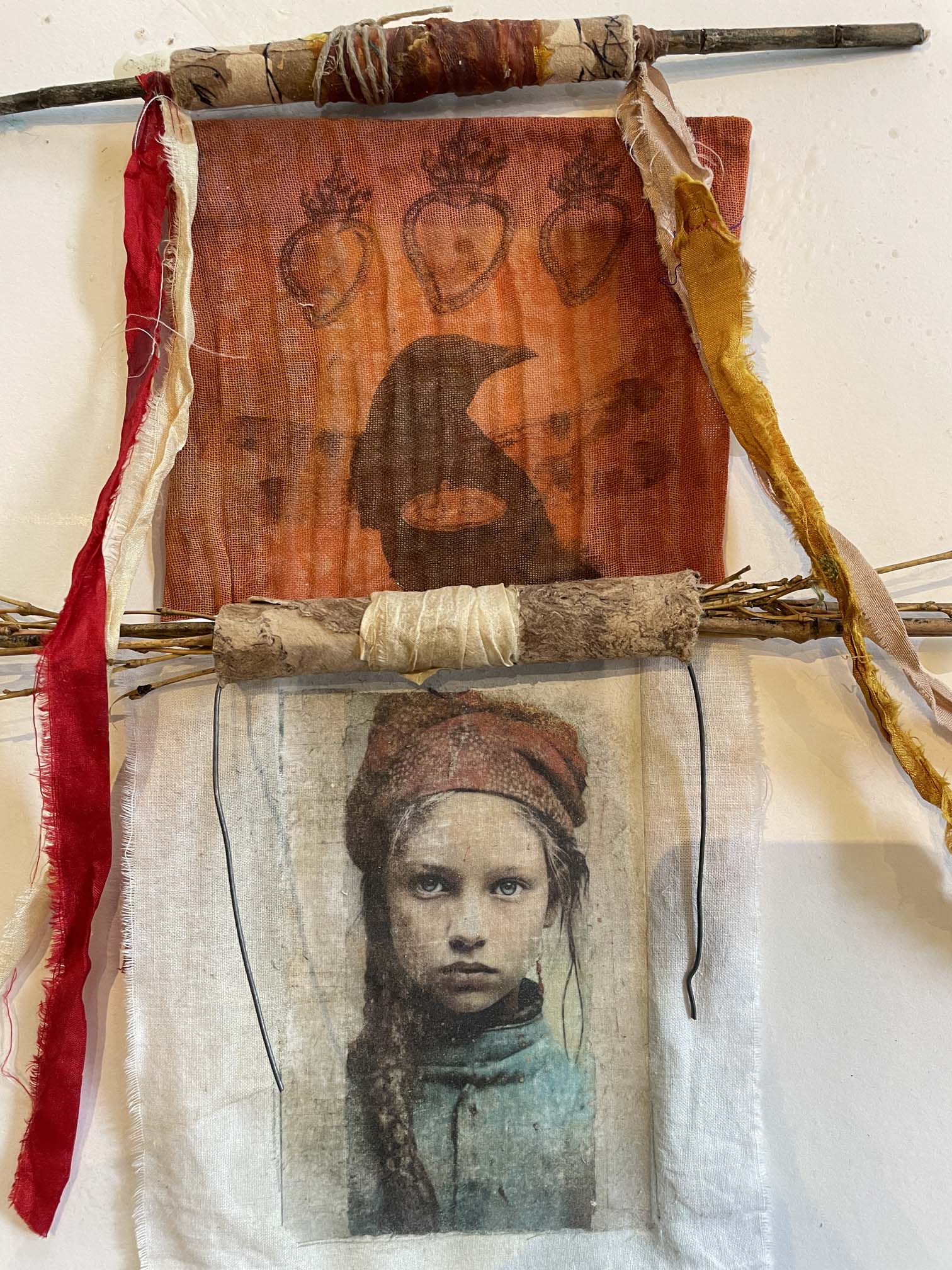
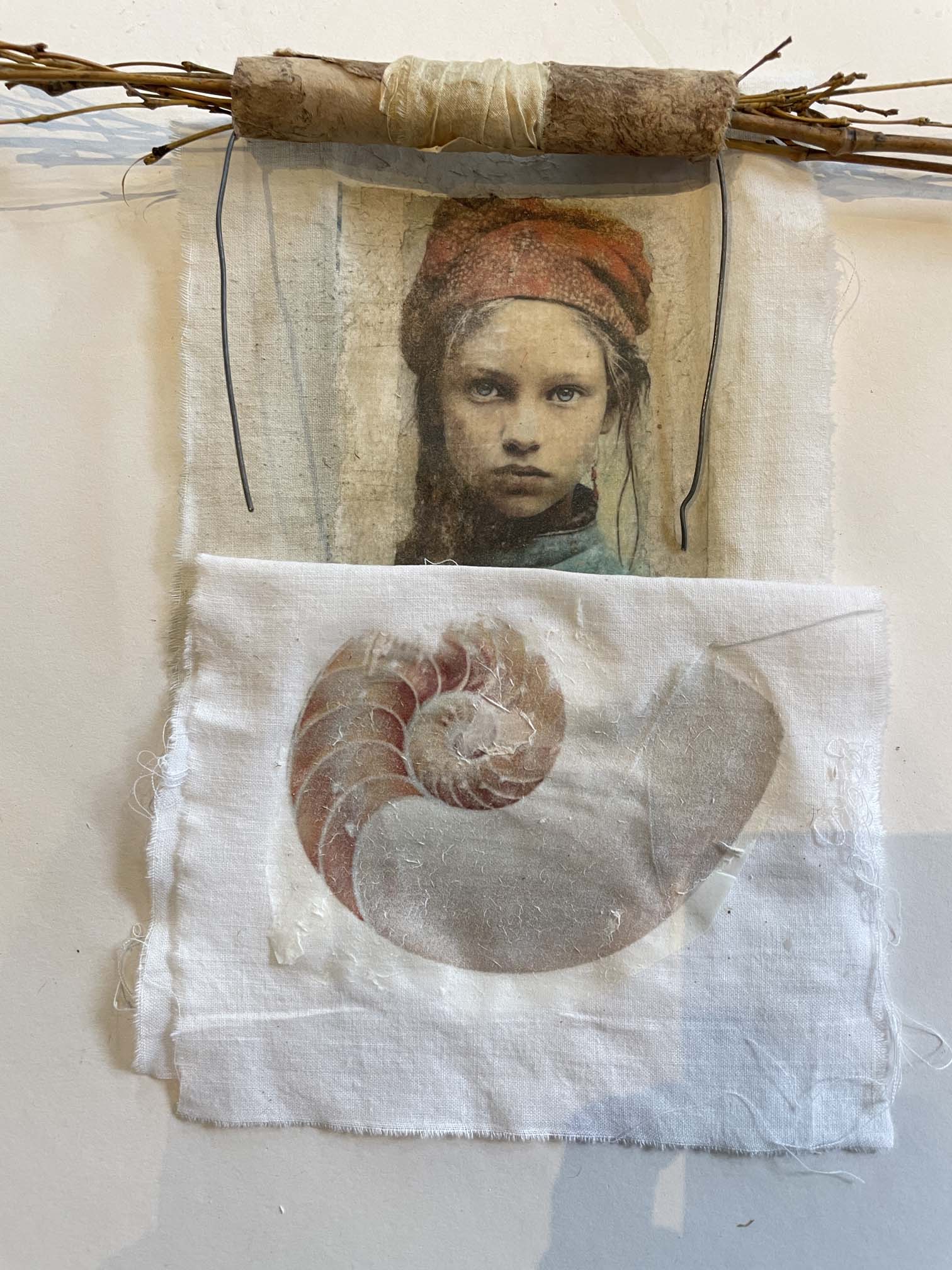
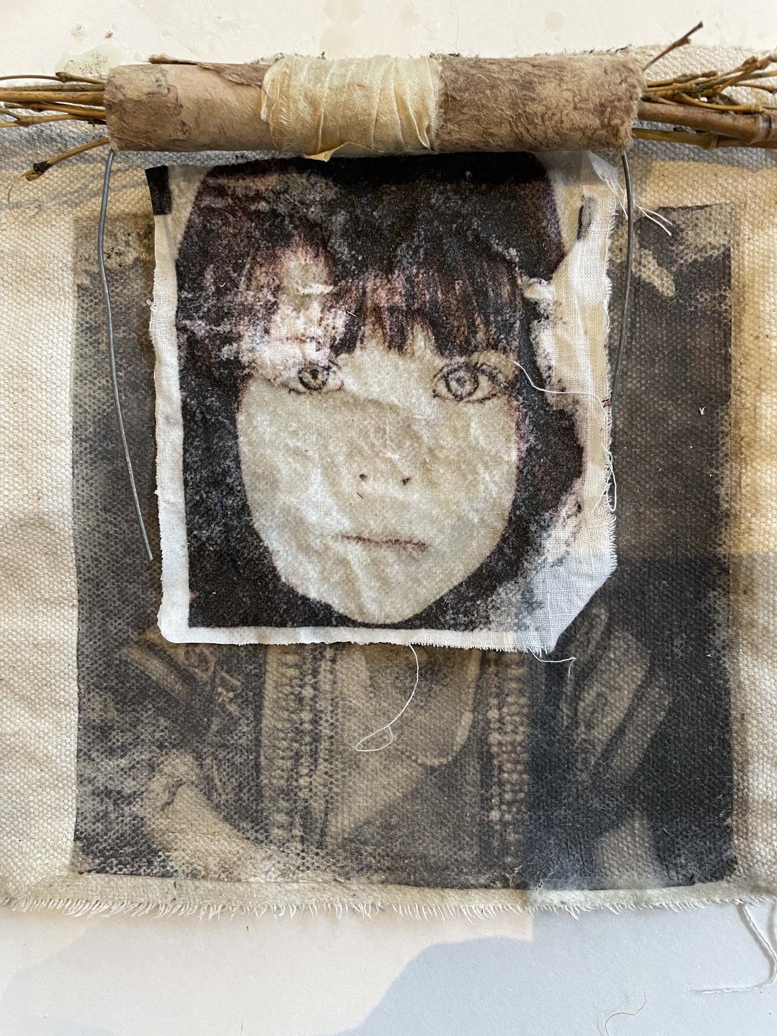
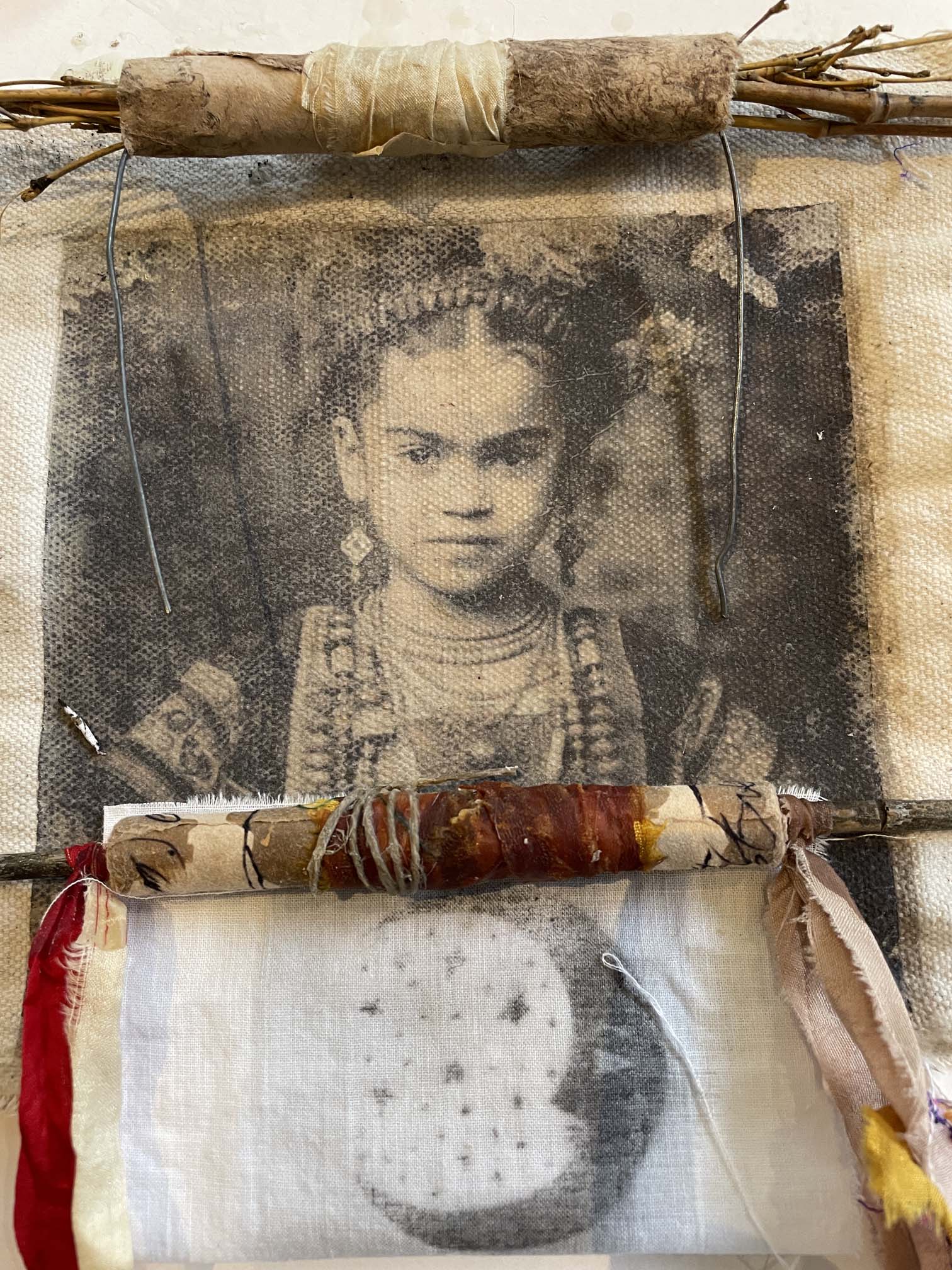
This is so much like what I’m doing with my new workshop, Scrolls and Surface, that I wanted to expand on the idea. The scrolls that I’m assembling as prototypes for the class are nothing more than a collection small “patches” of narrative. They go together in various ways, much like chapters in a book, and because they are small, they can be rearranged.

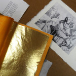
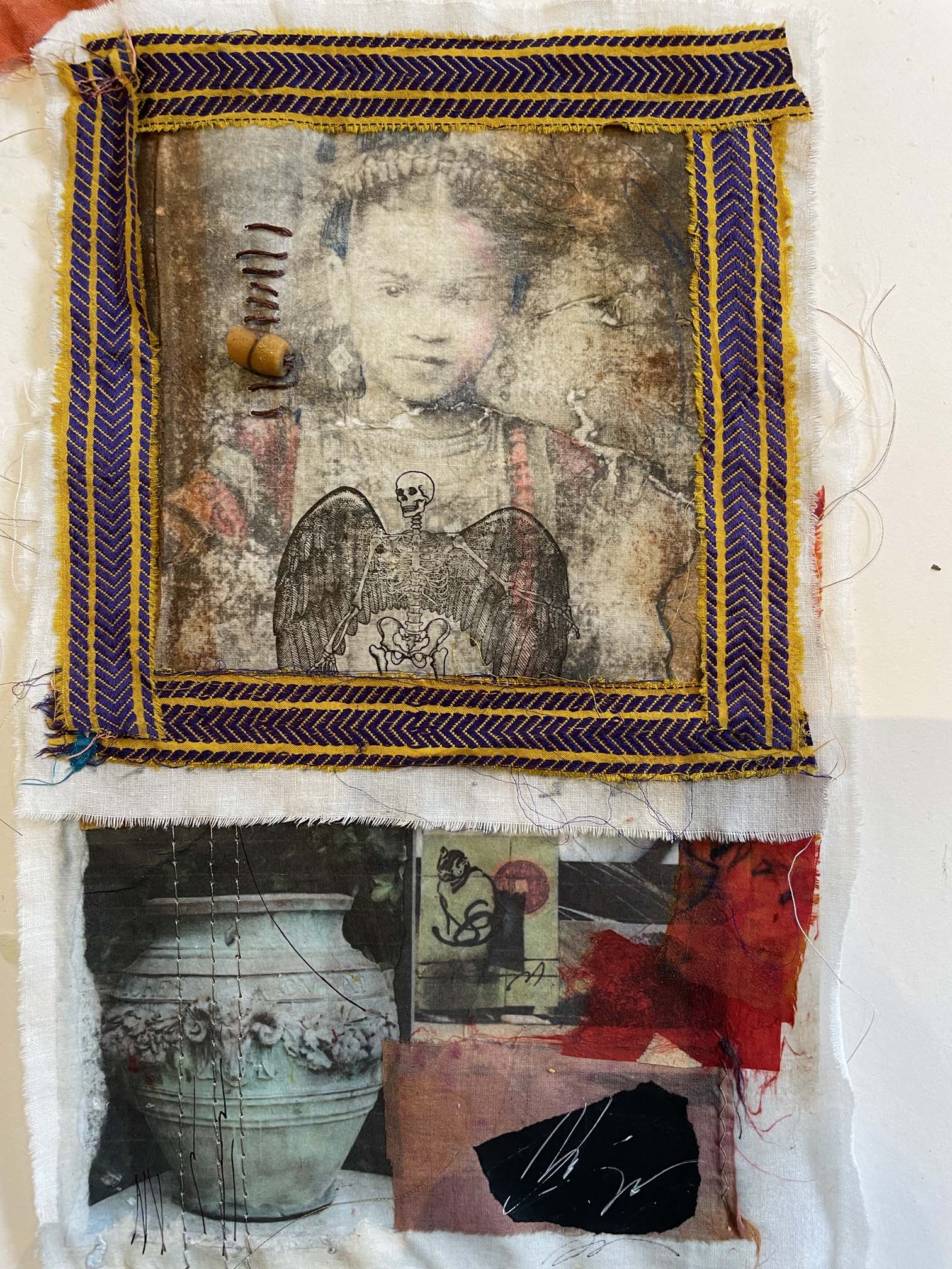
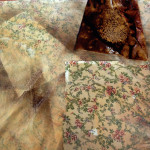
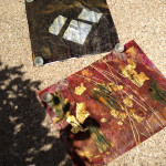
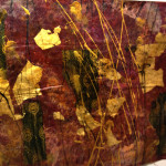
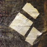
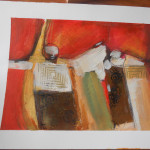
Here are a few examples – some of these are image transfers on fabric, some are what I call “fusion patches,” and some are handmade or found objects.

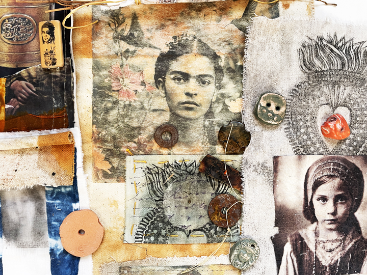
The images that I choose incorporate on these “patches” reflect my personal themes: neo-santos, shards, paradoxical connections, lost children, myth and mystery. Your images will be different just as your story is different.

Once you start working this way, creating small components that will ultimately go together as a larger picture, you’ll discover all kids of possibilities and combinations. It’s great composition practice, but more than that, it’s a lesson in how one element affects another.

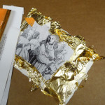
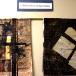
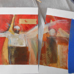
Assorted combinations of fusion patches and transfers to fabric – are there stories here? Can they be rearranged to tell a different narrative?

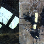
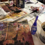
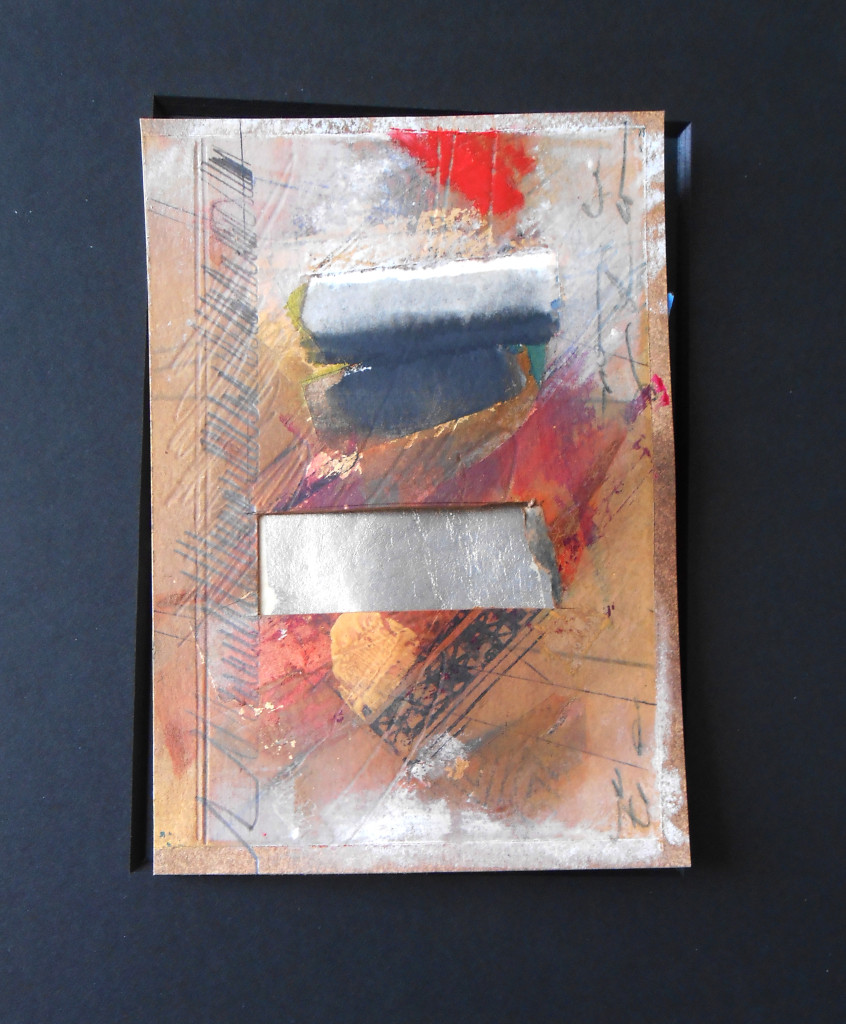
It really is so much fun to lose yourself in this task. And it’s equally as much fun to actually create the patches using all kinds of experimental methods. Even when something doesn’t work, it’s a good lesson. Jane Dunnewold makes Citrasolv transfer look so easy – when I first tried it, I got blobs. But at least they were mysterious blobs.
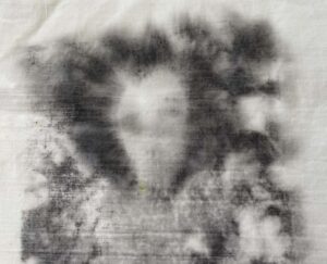
A Mysterious Blob

I’m filming a lot of these experiences for a new online workshop called The Pilgrim’s Scroll: Stories in Paper and Cloth which should be ready in a couple of weeks.  In the meantime, it sure is great to have my blob – er, I mean, BLOG, back!

Thanks, Jude and George and all the people that help us stay connected and inspired!


I would SO fail . . . . . .

c2

One of the things that I’ve had time to do this month is poke around in thrift shops. I found this totally creepy set of stamps from the 50’s called “Grading Aids.” The idea is that you evaluate some poor kid’s work by stamping a scary clown face on their paper or drawing. No words, no comments, just a clown face. Ewww. That is wrong in so many ways.

Let’s apply these standards to the new abstract diptych that I just finished. It’s layered with symbol and calligraphy and paint and prayer and a mystical snake and all kinds of radical, goofy non-representational stuff.

c8

Well, first of all, it’s not neat. Damn, I hate it when that happens. The Clown is not pleased either. Look at those random spatters.

c9

c5

It’s also obviously careless work – you can’t even read what it says – very poor penmanship (no matter that penmanship isn’t even taught anymore). The Clown disapproves.

c10

c4

In fact, this painting is so unacceptable I might have to do it over – right, Clowny?

c7

Actually, I think I’ll do it over a bunch of times – I’ll do a whole SERIES of careless, messy joyful abstract paintings – take THAT, you stupid clown and all the rest of the inside-the-box thinkers that try to rubber stamp individual creativity. Hooray, back to the Studio – what an EXCELLENT idea!!

Happy creating, Everybody!

c6


Save

Home as Collage

Casa Belisle

Casa Belisle

Knock knock. Who’s there. Oh, it’s YOU!

C’mon in! I was just rearranging stuff in the chaotic collage that’s the house I live in. Calling all of this a “collection” dignifies it with more organization than it deserves. But I do like to find little objects that enhance the art from friends which graces my home. As artists (and really, we all are) we notice and respond to our surroundings. I love the concept of home as collage – ever-changing and shifting, always a new composition to inspire us..

Recently I brought home a beautiful armoire that had been at the Studio. It belonged to my stepmother, and I cherish it, but the construction on the wall next door (right behind it) made me nervous. I found a perfect place for it here at home, and that inspired me to mix up other things, old stuff new configuration.

Since you’re here, look around at some of my motley assortment. I love folk art, friends art, funky art. It’s definitely not about price tags, but it is about curated choices. (If you can’t see the photos, click on the title of this post).

Some of my tips on arranging small collages throughout your environment are based on the AB3s of Composition that I developed and teach;

  • A=Alignment – have objects face each other within a group. For example if you have a wall-hanging with a crescent moon on it that you’re hanging next to a portrait, have the crescent and the face looking at each other. Makes sense? Then add a smaller object underneath that faces out.
  • B=Breathing Room – yeah, I know. When you look at my stuff, there’s not much of that. But there are spaces between groupings so that you concentrate on one group at a time. And there are lots of clear, uncluttered surfaces. You can put up as much stuff as you want, but keep some breathing room, however small, between groups of stuff. Mirrors help, because they provide an illusion of depth and space.
  • #3s = Three and Thirds – Groups of threes are so wonderful – if you add a fourth object, it ceases to be a group and looks like four separate things next to each other. But three object create a dialog. Try it. Here’s a link to a post that expands that idea.

I just got a fantastic book called STYLED by Emily Henderson that has a ton of examples on how to build groupings in your “home collage.”  It’s a treat to look at the photos. Not everything is going to be your style, but I did enjoy the book. It’s a guide to another kind of collage – the kind we live in. Happy weekend rearranging stuff!

Three-minute “big question” video

I was upgrading my Vimeo account this morning and came across this Staff Pick called “What Comes After Religion” by Jonathan Hodgson. It’s thought-provoking and beautifully made and addresses (in just three minutes) questions about the human need for spirituality in the absence of formal religion – and the way art plays an integral part. I thought it was worth sharing. Comments?

WHAT COMES AFTER RELIGION from Jonathan Hodgson on Vimeo.

OK, back to work – is it Friday yet?

Surface treatment

So I joined the Fiber Artists of San Antonio in March under false pretenses – the only fiber I knew anything about came in my granola. But I am learning so much from this talented group – it started when I met Sherrill Kahn at the first meeting I attended.

Today I took the plunge and worked a bit with surface design on fabric. It was amazing! And fun! After about four hours steady work in the Studio, I completed three pieces (well, the surface part, anyway). I even had time to do some sewing on one piece. The materials I used were Gesso, acrylic paint, India ink (that may have been a mistake – it’s very intense and unforgiving – live and learn), pattern stamps, and gold leaf sealed with acrylic medium. I also tried a digital heat transfer on one of the pieces. Here are the results. i don’t know where I’m going from here, but I do know that I’m hooked on working with fabric and fiber. Look out, FASA 🙂.

Friday Freebie – Threads of Blessing

When the Sathreads1cred Ground exhibit opened at Cathedral House Gallery in late May, I met a woman named Helen Schnelzer who sponsors a wonderful program called Threads of Blessing, an annual needlework workshop for the women of Uganda. These workshops are designed to encourage women to gather as a community, learn organizational skills, and help develop personal esteem. I purchased five of the embroidered tapestries and wanted to share one with a SHARDS subscriber as a Friday Freebie. This one was embroidered by Abby Thorciba, who writes in her statement, “I have orphans I care for . . .the Lord has given me this to feed, clothe and care for them and myself.” Look at the great expression on this face!

threads2

Here is the full tapestry – it’s about 18×18″ on unbleached muslin and could be stretched to frame or sewn into a hanging or a pillow. It’s signed by Abby Thorciba. I’ll wait until Sunday to do the Friday Freebie drawing but will let you know who the winner is Sunday night. All subscribers will have a chance to win, and I thank you so much for reading my blog.

And here’s the brochure – click on it to read it, and if you’d like to donate, you can write to The Episcopal Diocese of West Texas, Attn: Threads of Blessing, PO Box 6885, San Antonio, TX 78209 (or just email me and I can give you more information – I’m not affiliated with the program, but I definitely support its philosophy and will continue to threads3purchase these unique works).


Beacon Hill Art Walk – ups and downs


aw3
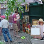
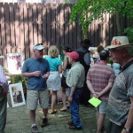
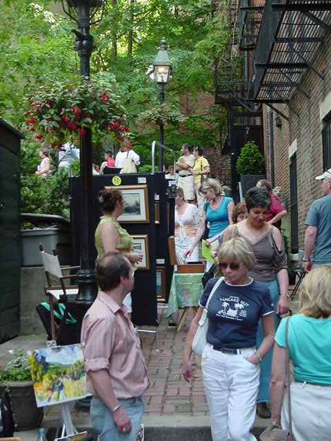
Hooray! There were many more Ups that Downs yesterday. The only little downs were the really strong winds that spontaneously rearranged the artwork every fifteen minutes, and the high temperatures. But hundreds of people turned out for the eighty or ninety artists who showed on the streets and in the courtyards of Beacon Hill.


Among the highlights – I saw an old friend from Chicago, Sharon Bostick. She lived on Beacon Hill for many years and happened to be in town for the show, looked me up, and voila! Sharon and her husband purchased several pieces. Thanks, Sharon! An unexpected highlight came from the Art Walk committee who visited my spot and awarded me with yellow ribbon for third place in show – wow! Not bad for this first-time non-Boston newbie. Thanks, Committee!

aw

I could not have done the show without friends Pat Semmes and Danny Sanchez who helped haul the stuff (including tables) up and down the brick sidewalks. I think after all was said and done I sold ten pieces, got a very nice award,  met some super artists (who said that it was more of a looking day than buying day, but still . . .) and will definitely apply for next year. I’ll be back, jurors willing and the creek don’t rise.  Here are some more photos:

Hamburger Transformed

Sorry,  I’m probably “over-blogging” from Boston, but rarely do I have such a stretch of time to experiment with art and write about the weirdness of the process. For example, my Taos teacher Gwen Fox always says, “Start with a thumbnail from an existing picture.” So I found this hamburger in a magazine (fig. 1) – it looked interesting through the paper window (or maybe I was hungry). I turned it sideways and sketched in the shapes which started morphing into abstract figures. (fig.2). I tried to make the two figures balance and relate, but it became obvious that the figure on the left was dominant, so . . .whack! Off went the second figure to be used elsewhere. (fig. 3) I put a very few finishing tweaks on the left figure and, when matted, it is intriguing and colorful. (fig. 4). I think I will name it “McDonald.” Or maybe “Hunger and Evolution.” Isn’t art fun??

Note to self – quit while you’re ahead

Having all of these fantastic new art materials to try is great, but I keep making the same old mistake  – trying to fix a painting or collage by adding more stuff. Arg. It’s really tempting when there are a zillion colors to choose from, especially when you’re working small like I am on a dining table in my temporary Boston “studio.” . Here’s an example of a really awful painting that I tried to save by piling on more layers of color, scratching into the layers, adding gold leaf, spraying with walnut ink – all the usual tricks. I even cut a hole in it! Ewww. What a mess.

abstract4
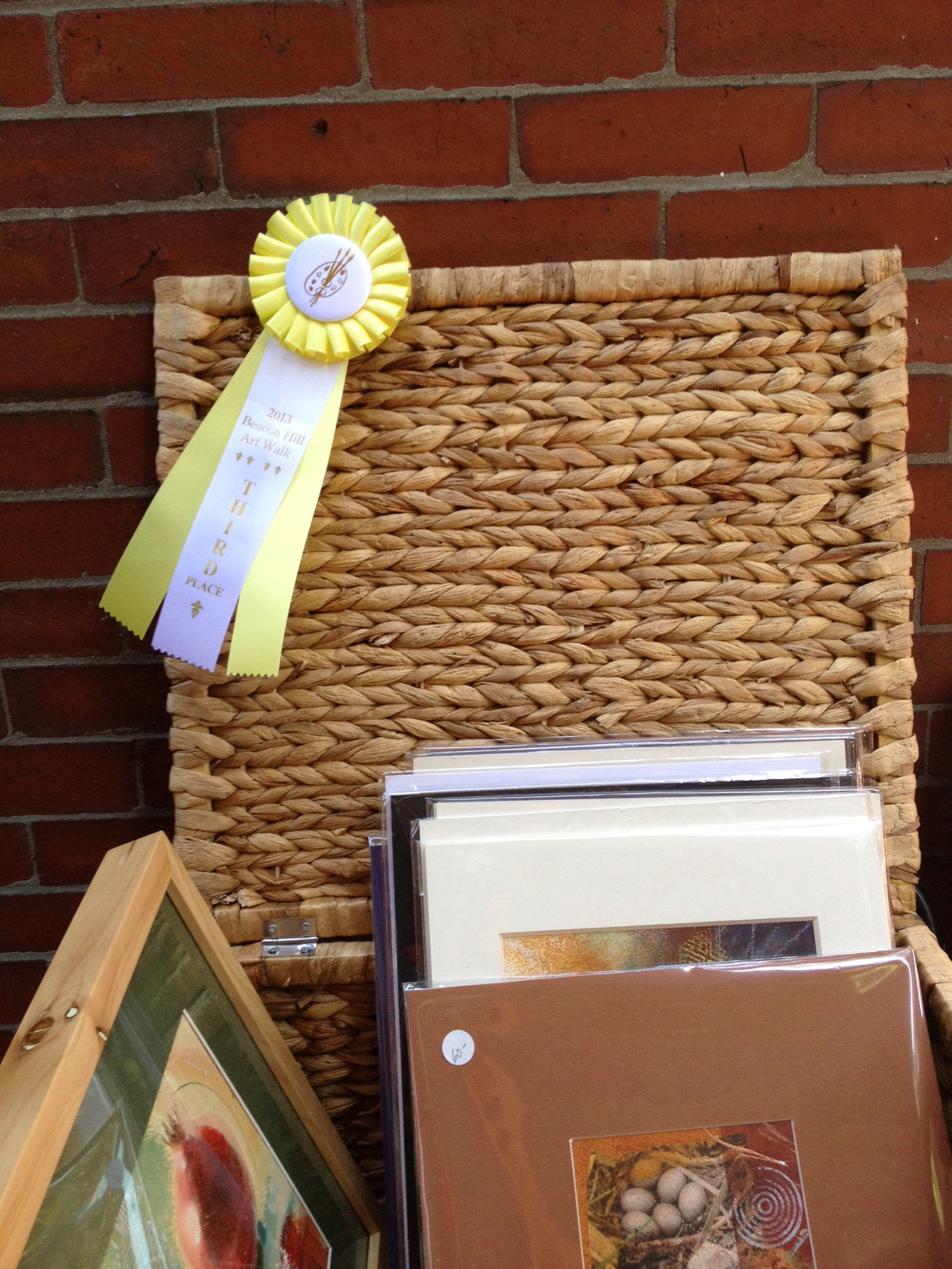
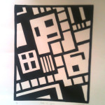
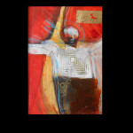
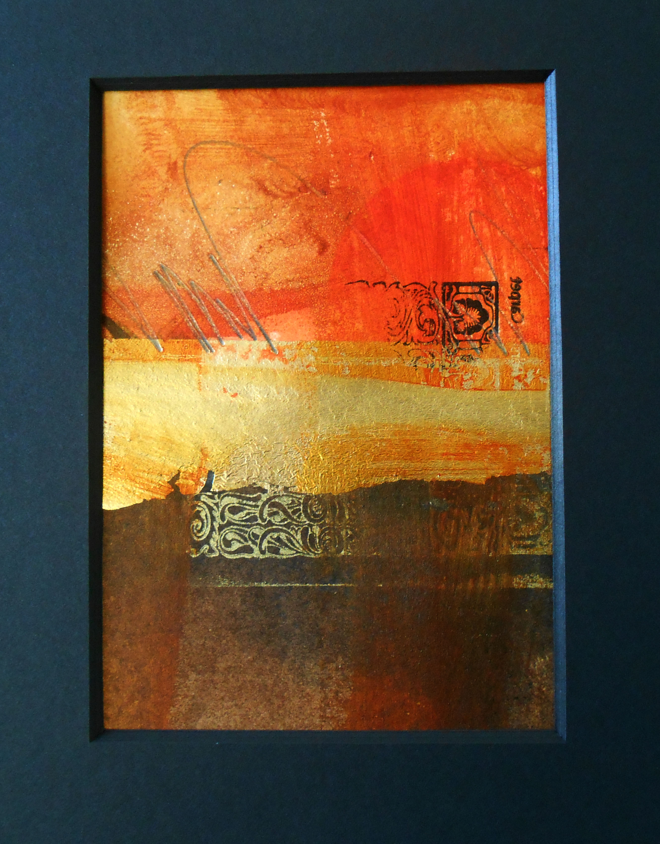
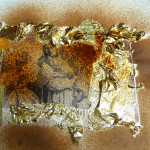
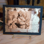
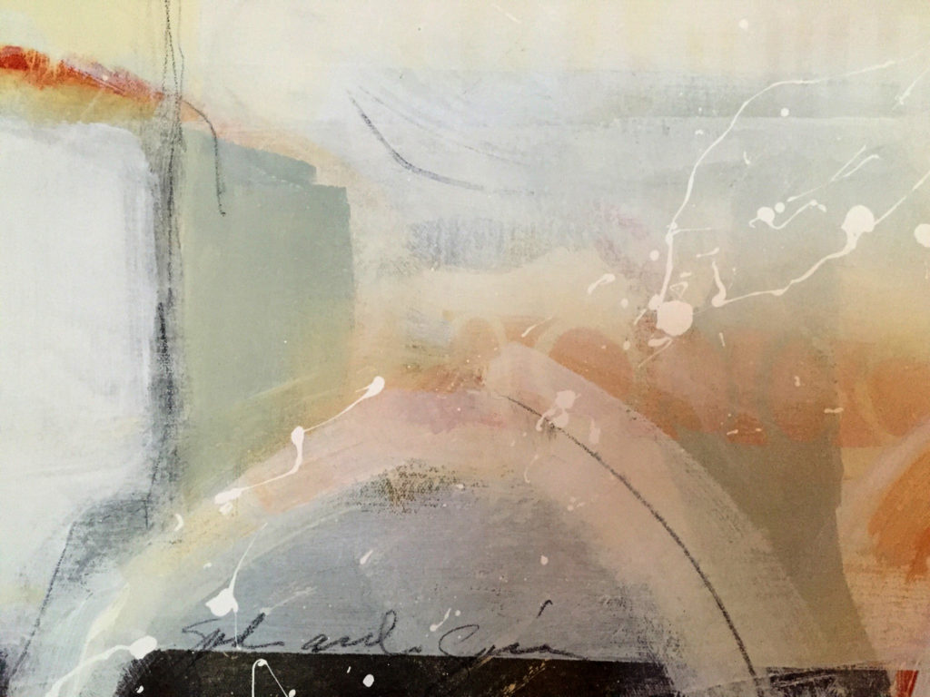
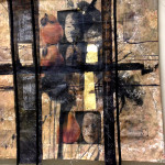
Here’s the next one – it might not be finished, but it isn’t overworked.  I simplified the composition and the palette, and then stopped. Sometimes less is more. (Except maybe for gold leaf, walnut ink, chocolate sorbet and Diet Dr. Pepper. :))

abstract2

3-PART ART #1

So I was thinking about new workshops and such, and I thought it would be fun to share some quick and easy techniques that you can do with just three “ingredients” (there are a bunch of cookbooks like that*). The first of these is a Reanissance-esque little collage on watercolor paper that can you can use as a card or a cover on a box or – whatever you can think of. Here are the three ingredients (yep, they include my favorites):

  • Walnut Ink (made by Tsukineko, available at Michael’s and Jo-Ann’s or online)
  • Fake gold leaf (ditto)
  • A black and white page from an old art catalog or art book from Half-Price Books or wherever you can find pages to recycle

Here are the steps:

Idea – if you have an art “ingredient” that you bought and don’t know what to do with, tell me what it is and I’ll see if I can figure a three-ingredient project to use it with. Hey, and don’t forget about the Sacred Ground show today!

*PS If you want my favorite three-ingredient food-type recipe, click here 🙂