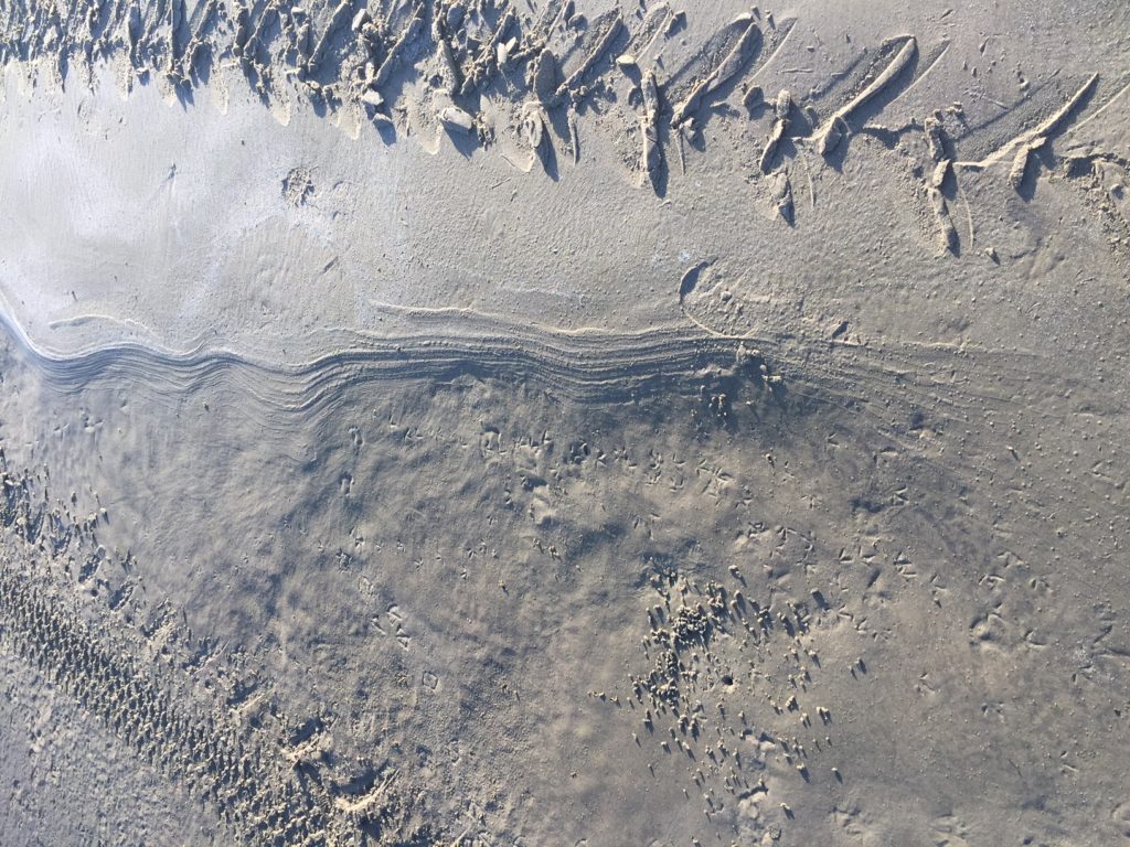
Tracks of all kinds, including a high tide salt line and bird tracks in the lower right near a tiny hole where some critter lived
“In every outthrust headland, in every curving beach, in every grain of sand there is the story of the earth.” ― Rachel Carson
It’s been over a week since I posted on SHARDS because we’ve just returned from a family beach getaway. Boliver Peninsula is a relatively undiscovered stretch of waves and sand along the Gulf of Mexico near Galveston. You can walk for miles without seeing more than a few people, especially during the week.
As artists, we are always looking for patterns and symbols, teasing stories and meaning out of what we observe. I started noticing the relationship between tire tracks and wave tracks along the edge of the beach. The tire tracks were deeper, but the wave tracks were more persistent and eventually obliterated the tire marks.
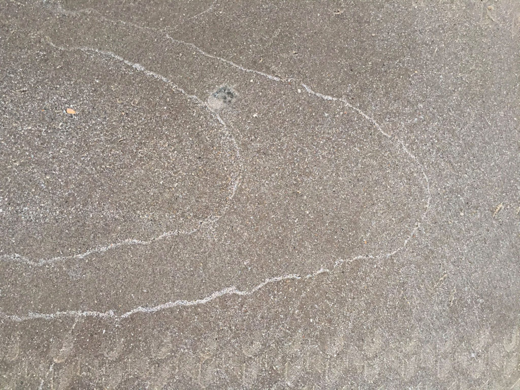
OK, so maybe I did have too much time on my hands, but it was fun to simplify for a few days! I noticed also that the different tire track reminded me of those knitted Aran sweaters.
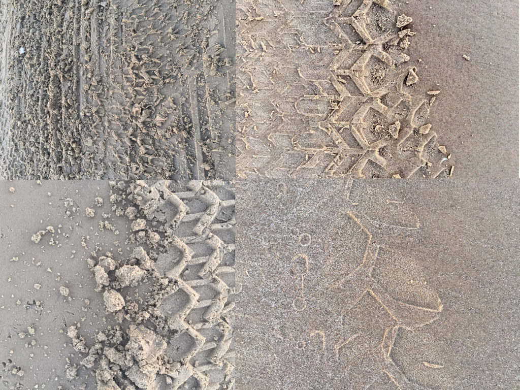
See?
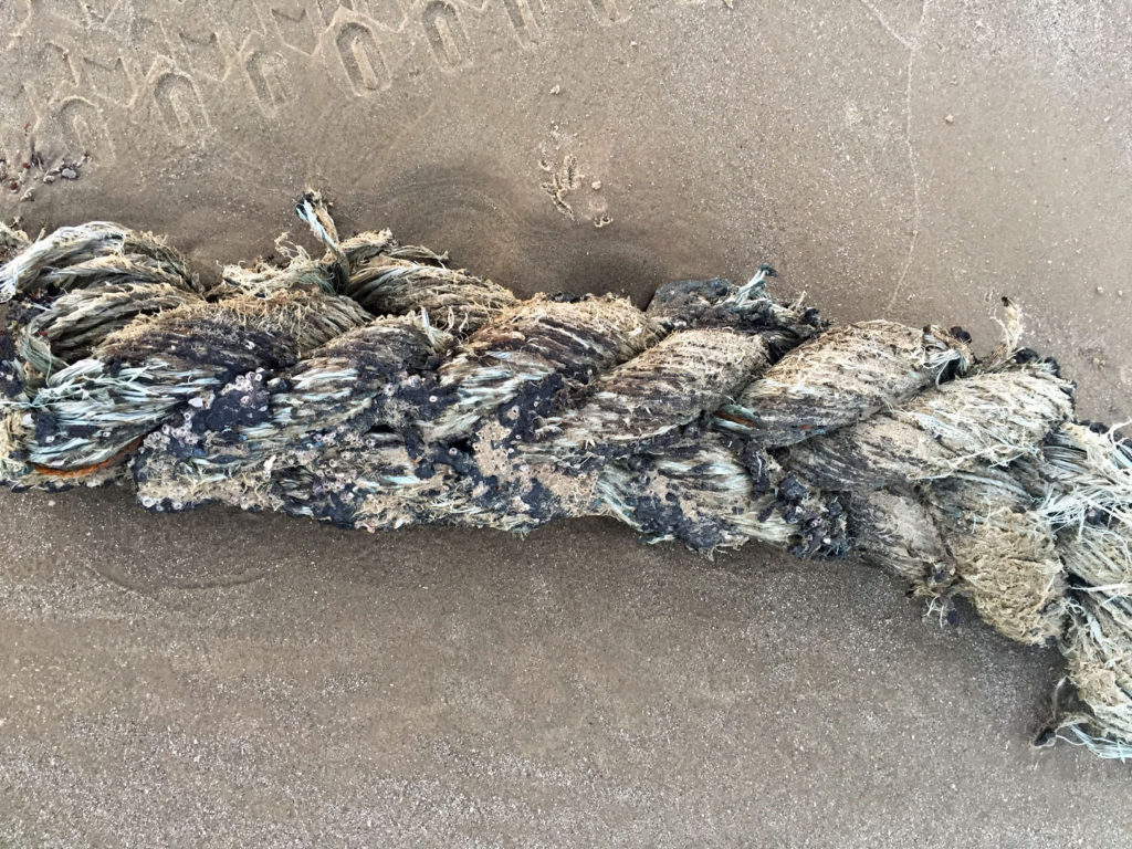
Honestly, there’s inspiration everywhere. Here’s a big piece of rope that had washed ashore from a ship – it was as big around as a small tree trunk, heavy and all fiber-y and sandy.
I loved these patterns, too – they changed according to the sun’s angle. Wouldn’t they make a great abstract painting? Maybe encaustic?
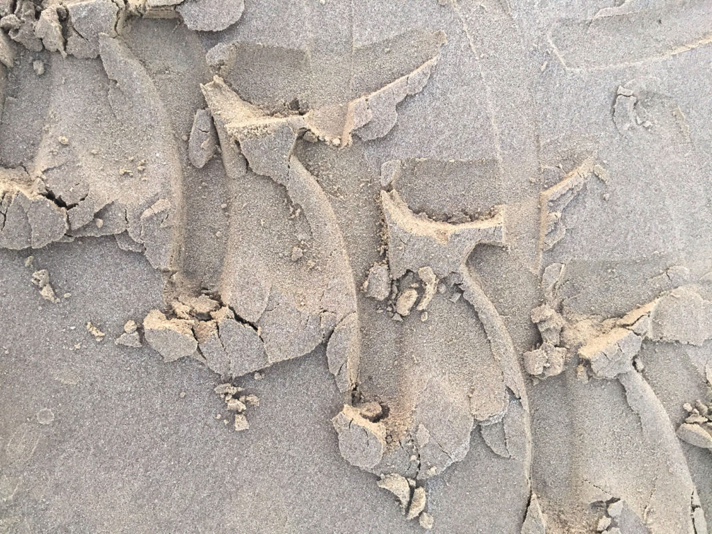
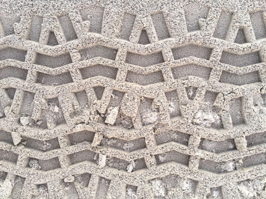
So all of this thinking about patterns and sand and simplicity brought me back to the logo design for the Art League. Those of you who warned me about being to cluttered, design-wise, were right.Look what I ended up with!
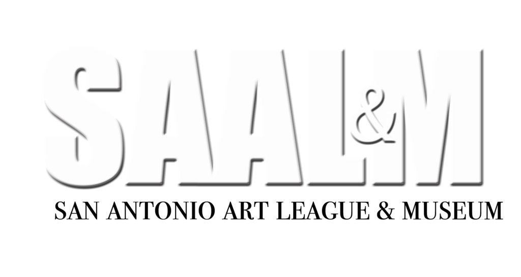
It’s completely simple, bare bones, but it will work on a web page or a business card or on a billboard.
It will even work in sand!
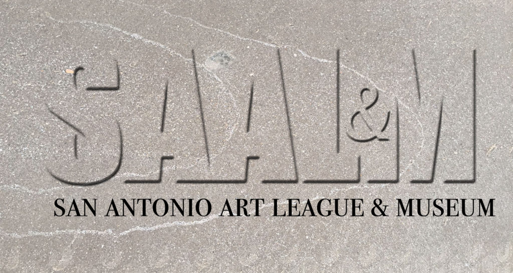
‘Tis a gift to be simple – and a week away from everything, walking along the shore every day, brought all of that back to me. Yay!

I felt the lightness and inspiration of your soul in your post. No, you did not have too much time on your hands…you had the perfect amount! Thank you for sharing your wonderfully relaxing week!
Love the new SAAL&M Logo. As Da Vinci said, “Simplicity is the utlimate elegance”.
Lovely quote, Gaye – thanks –
I felt really antsy the first couple of days, but finally got into the flow, as it were – lightness is a great word 🙂
I like the logo. It also looks like marble!
Hey, it does!
Lyn, you are such a joy! Thank you for sharing.
Oh, Diana – thanks!
Loved this post. It was beautifully done, showing so many textures with subtle color gradations. Narratives by Lyn are always great.
Big smile – thank you, Nancy 🙂
Love the new logo, Lyn. Elegant. Especially appreciate the juxtaposition of sanserif and serif fonts. Lovely.
Thanks, Lynn – a great compliment coming from you with your good eye for design 🙂
Lyn, the new logo design is truly beautiful. And for the few days I was there, it was a joy just to watch you collecting the sights, sounds and treasures all around you and holding on to them for what will become true works of art.
Wasn’t it fun, Lilla? And you won the prize with that shell! You should post a picture of it on FB!