Walking The Labyrinth, Lyn Belisle 2026
One of the questions I’m asked most often is, “How do you know what to make next?”
Most of my new work doesn’t begin with something completely new. It begins with something I already know.
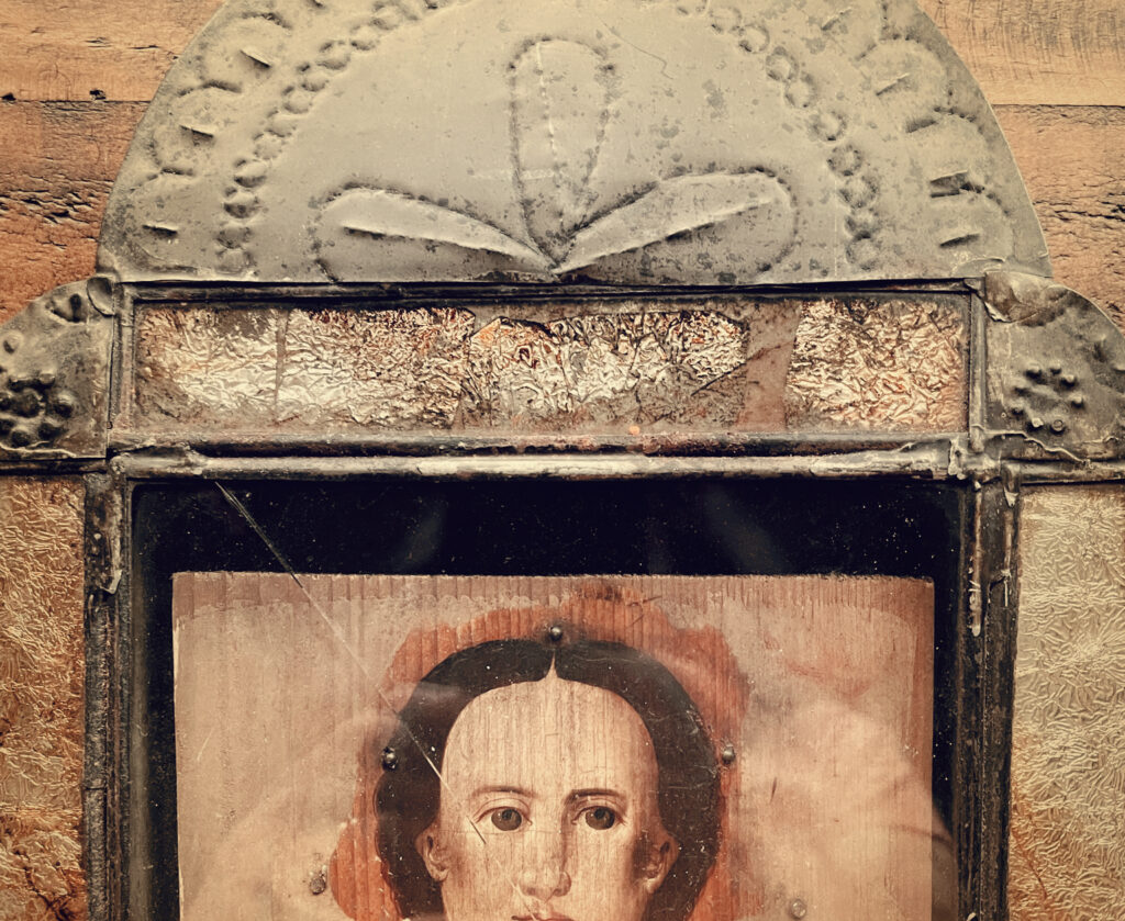
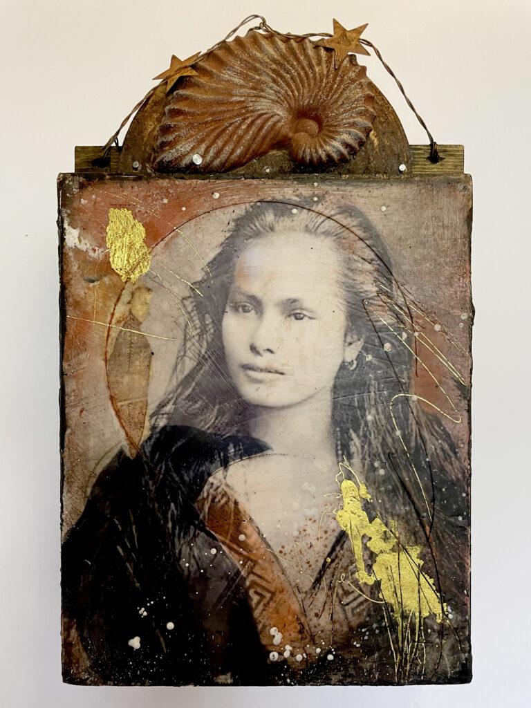
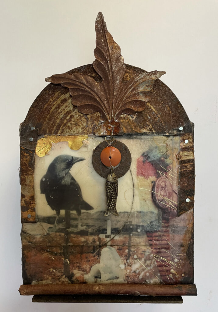
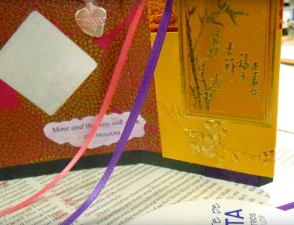
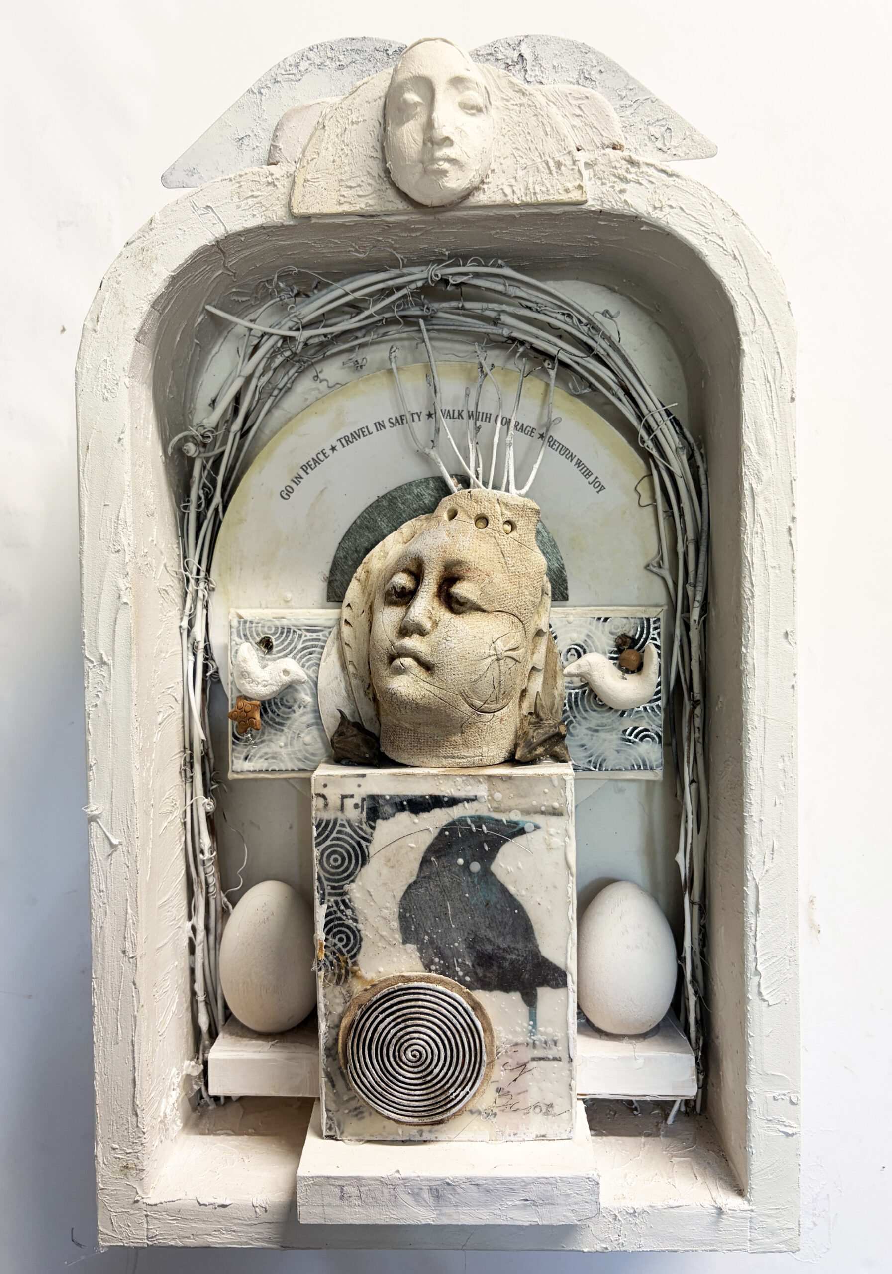
This altar, Walking the Labyrinth, was created for the annual Celebration Circle Altar Exhibition at the San Antonio Art League + Museum. While the piece reflects the winding paths we all travel in life, it also reminded me that our artistic journeys are labyrinths of another kind. We circle back to familiar places, seeing them differently each time.
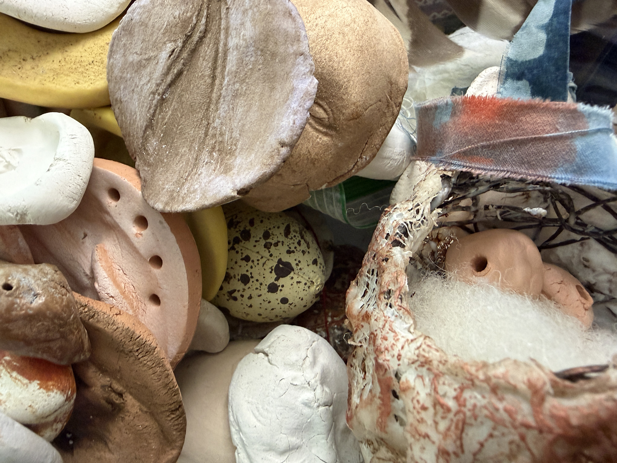
The wooden eggs in Walking the Labyrinth first appeared years ago in my early Encanto altars. At the time, I simply loved their quiet presence. Later I realized they had become symbols of possibility, mystery, and the things we carry before they’re ready to emerge.
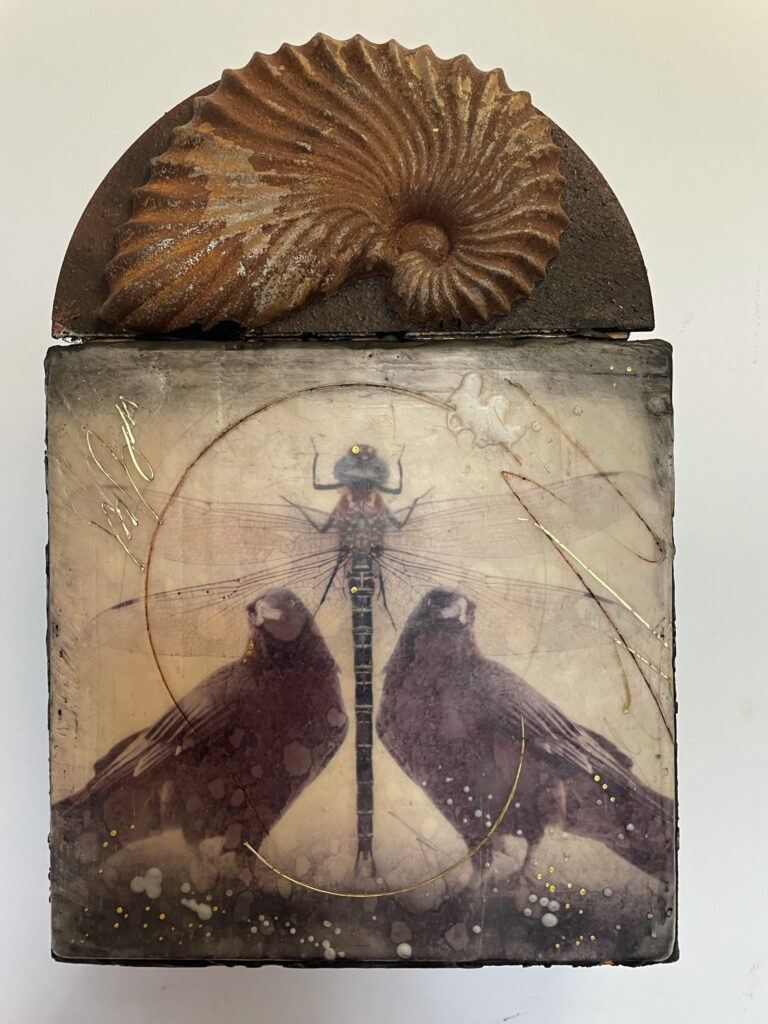
The crows arrived later, but have persisted in my recent Crow Reliquaries.
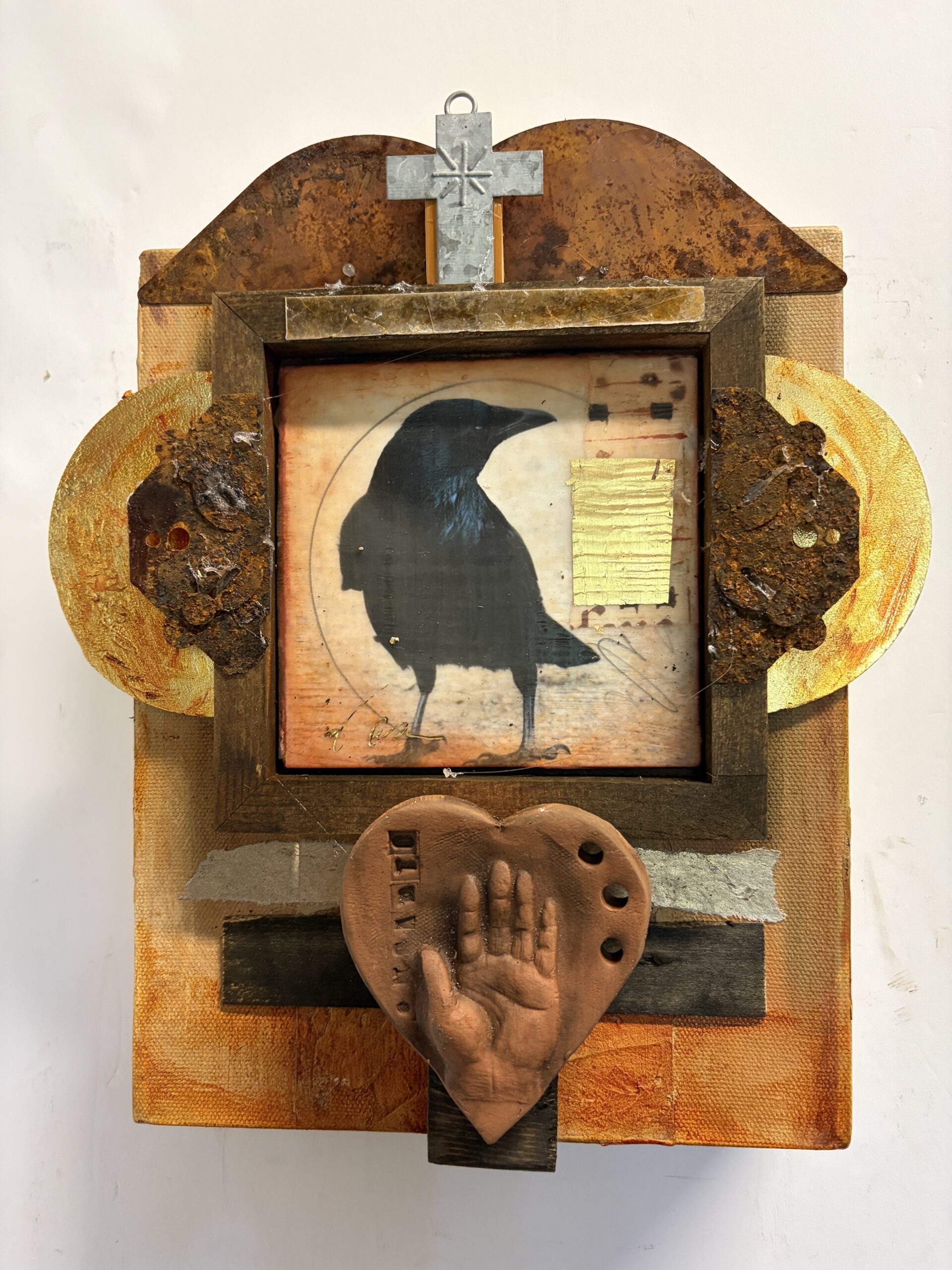
The Crows brought with them ideas of witness, memory, and the threshold between worlds. Now it has found its way into the altar about the Labyrinth, quietly keeping watch over the traveler.
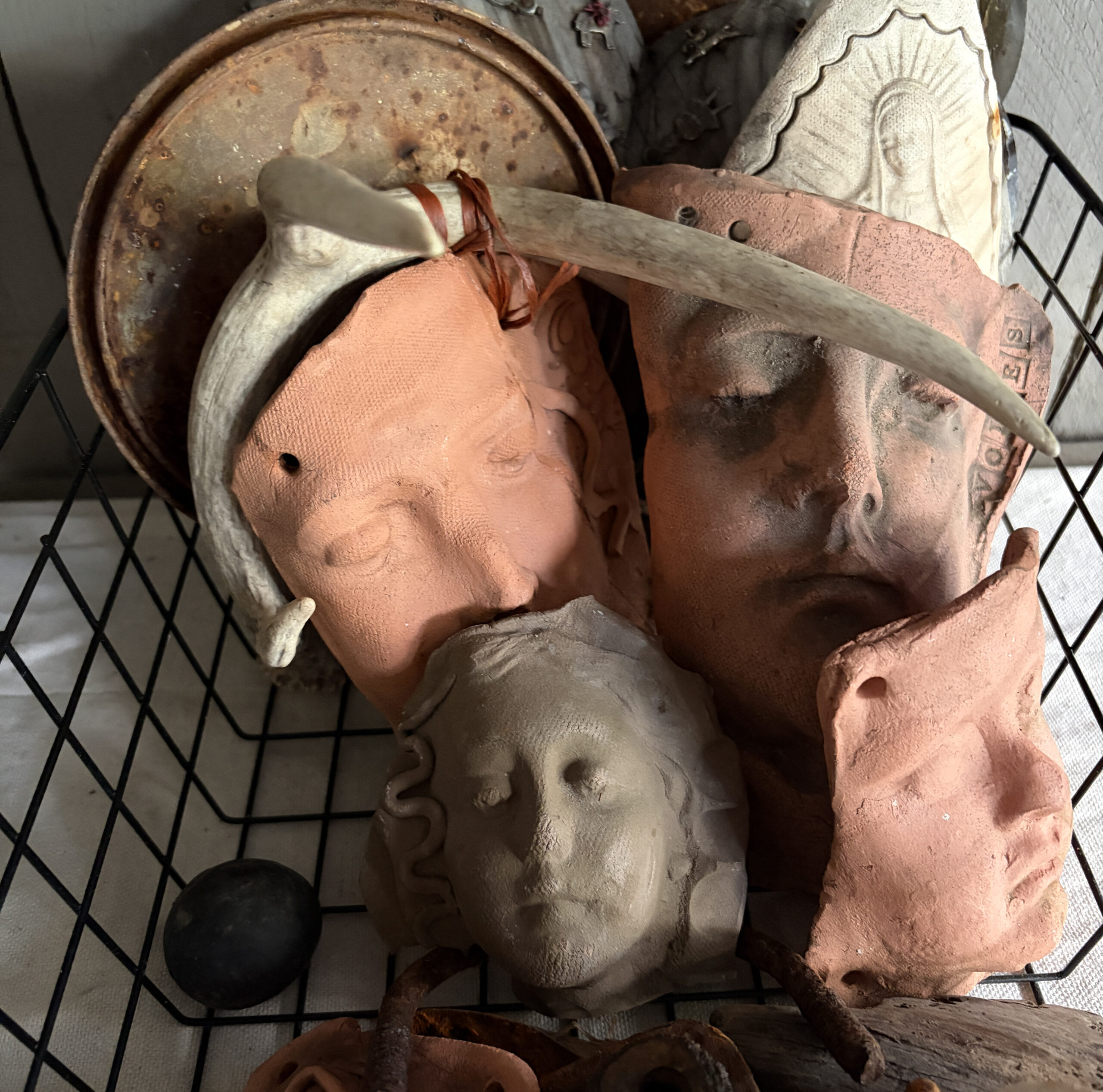
The serene faces…the arches…the vessels…the circles and spirals…each has surfaced again and again over the years. I don’t consciously decide to include them. They simply belong.
I think every artist develops this kind of visual vocabulary.
Writers have favorite words. Musicians return to familiar chords. Artists collect forms, symbols, colors, and materials that continue speaking to them long after a single project is finished.
Those recurring elements become more than design choices. They become archetypes—objects that carry meaning beyond themselves. They tell us what we’re trying to understand, what we’re returning to, and perhaps even what we’re devoted to.
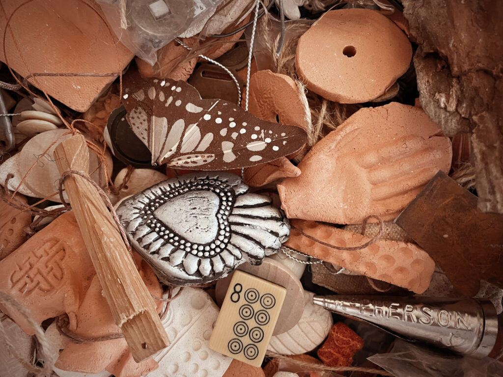
One of the most revealing exercises is to look back through several years of your own work. What keeps reappearing? Birds? Circles? Windows? Maps? Hands? Fragments? Certain colors? Certain materials?
Those repetitions aren’t failures of imagination. They’re clues. They’re the visual language you’ve been quietly teaching yourself to speak.
I love the connection this has to my ongoing Objects of Devotion series because it suggests something I’ve come to believe: our symbols choose us as much as we choose them. We don’t manufacture an authentic artistic voice overnight. We discover it by noticing what insists on returning.
That’s a comforting (and important) thought for artists who sometimes worry they’re “doing the same thing again.” Perhaps the work isn’t repeating itself at all. Perhaps it’s deepening the conversation.
And perhaps those recurring forms—the crow, the egg, the vessel, the spiral, the face—are our own Objects of Devotion, patiently waiting for us to recognize what they’ve been trying to teach us all along.
~~Lyn
PS: Here’s the statement for the Celebration Circle Exhibition about Walking The Labyrinth – I want to think more about this winding path and find words in my personal creative vocabulary to see where these thoughts take me:
Walking the Labyrinth
Lyn Belisle, 2026
Earthenware, encaustic on wood, found objects
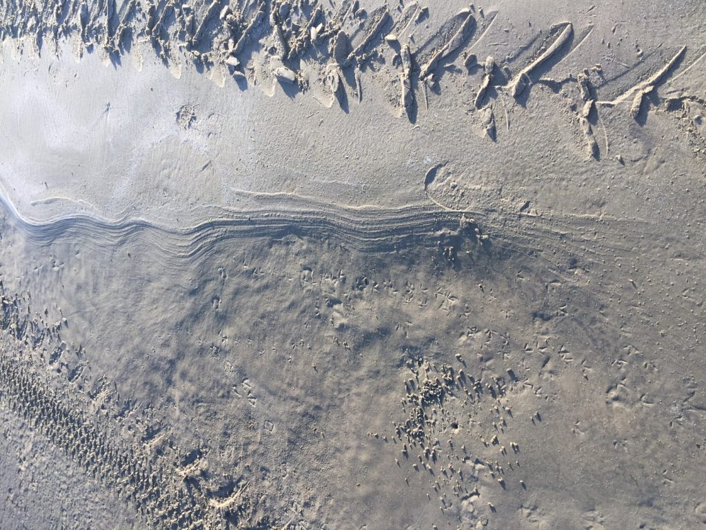
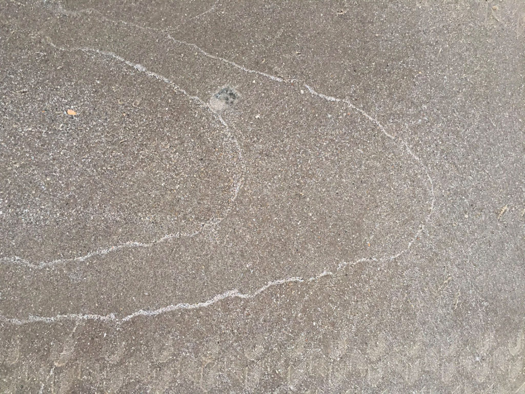
The labyrinth is one of humanity’s oldest symbols of pilgrimage. Unlike a maze, it offers a single path—one that winds inward before leading outward again. It reminds us that life’s journey is rarely direct. We circle through uncertainty, joy, grief, wonder, and renewal, gradually finding our way to the quiet center of ourselves. And then, transformed by what we have discovered, we begin the journey home.
This altar honors that timeless rhythm: birth, exploration, wisdom, and return. The crow, eggs, spiral, and watchful face are companions along the way, each representing mystery, transformation, memory, and new beginnings. Together they suggest that every stage of the journey holds its own sacred gifts.
Inscribed across the altar is a simple blessing that accompanies every traveler:
Go in peace.
Travel in safety.
Walk with courage.
Return with joy.
Whether we are setting out on a new adventure, navigating the labyrinth of daily life, or completing the final journey that returns us to the mystery from which we came, may these words remind us that every path—however winding—is worthy of trust.