I returned from Greece this past weekend filled with awe and wonder and new perspectives. Here’s the first one.
One of the many revelations that came to me while I was there was the strange and beautiful properties of the color white. Of course, if you remember your science lessons, white is not really a single color but a mixture of every color on the light spectrum.
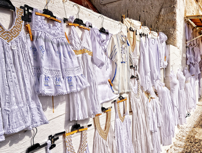
In Greece, white dazzles everywhere – in the architecture, on the clothing of the men, women, and children. The bright white color reflects the intense sunlight, helping to keep buildings (and people) cooler during the hot summer months. The uniform white aesthetic has become a cultural and architectural tradition.
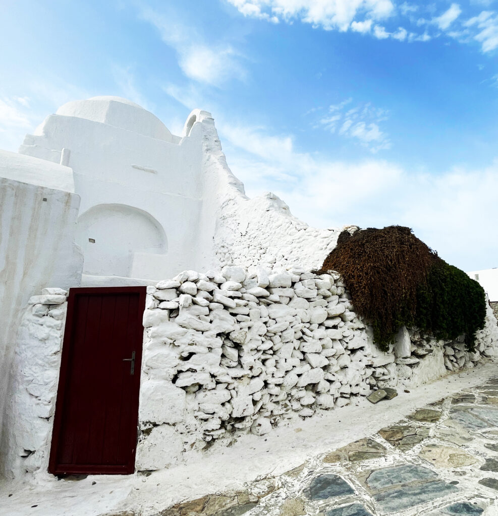
Intuition would suggest that if everything is white, then nothing stands out. But actually, white provides a clarity of detail that would be lost in a mass of various colors through the emphasis on form and value. Look at this rock wall in Mykonos – each white-washed stone is clearly outlined by form and shadow.
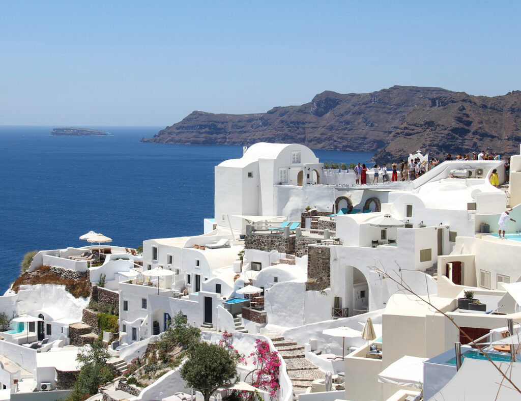
In this photo of Santorini, each building is clearly defined by its shape and its non-white accents such as the windows. If every building were a different color, this clarity would not be so evident.
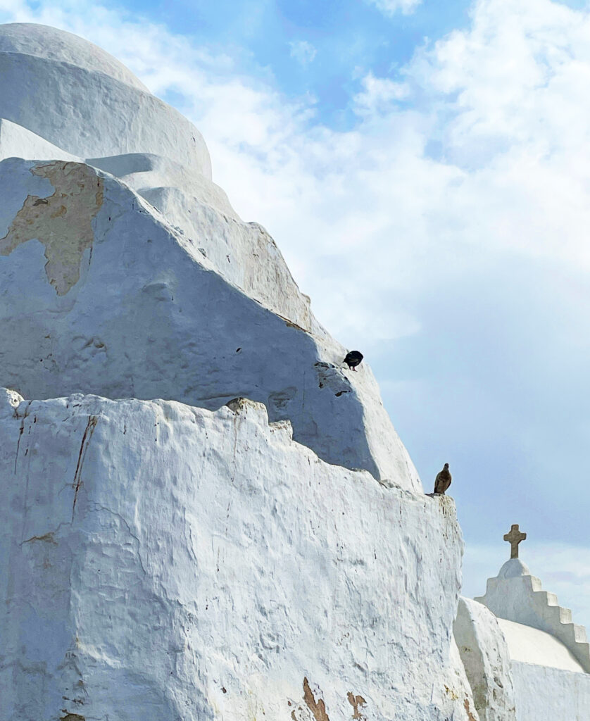
And here is a Greek chapel. Does this white abstract form remind you of Georgia O’Keeffe? It does me 🙂
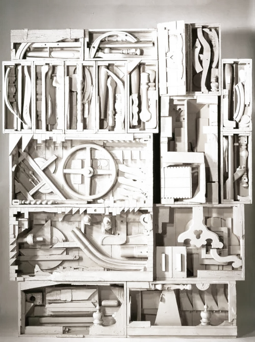
Sculptor Louise Nevelson used this principal to clarify her signature work because she wanted to emphasize and give power to the forms.
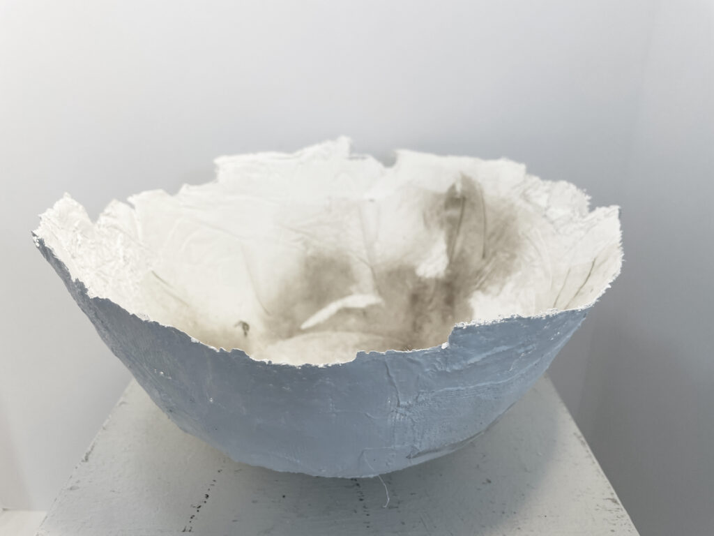
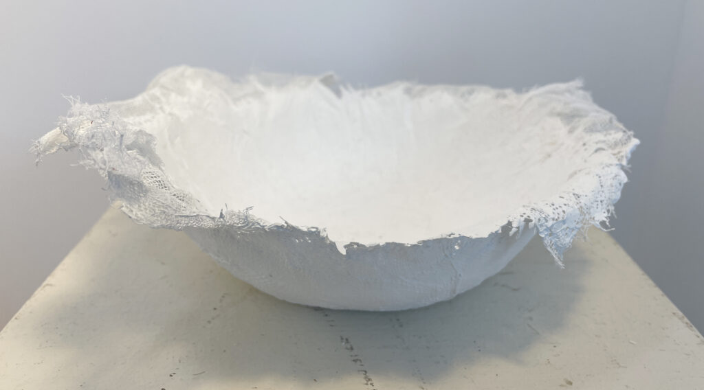
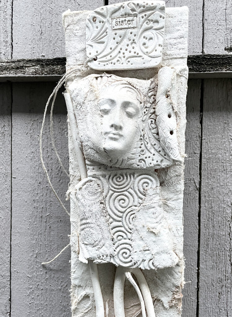
This morning, I was thinking about all of this while working in my studio on some base forms for the Vessel workshop I’ll be teaching at UTSA/SW School in July. The forms start out as pure white and are intended to be expanded and embellished. Here are a few that I made today, stacked up together:
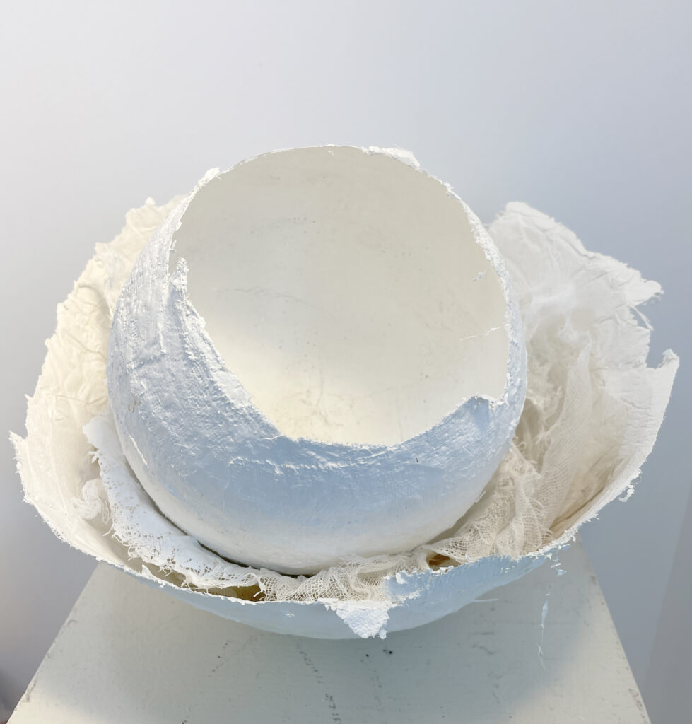
Here they are individually – I experimented with various base materials:
Plaster gauze over balloon armature
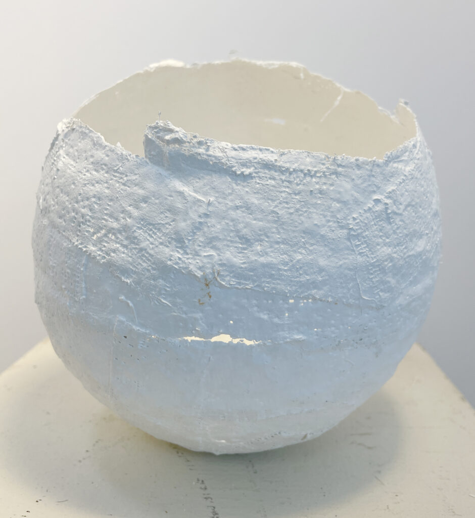
Cotton rag and plaster
Mulberry paper and cheesecloth
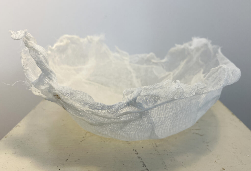
Layered cheesecloth with acrylic medium
There is a huge temptation to leave them just as they are – variations in white that show the texture. But of course they are just bases that are intended to be added to.
On a whim, I took a couple of scrap assemblage pieces that hadn’t been working and painted them white, like the rocks in the Greek stone wall – I liked the result. The white clarifies the design and gives me some new directions.
I’m obviously not going to take a can of white spray paint and cover everything dimensional that I’m working on because of what I saw in Greece, but this new appreciation for white as a clarifier and unifier rather than just a blank element or space-holding color is inspiring. White. Simple. Limitless.
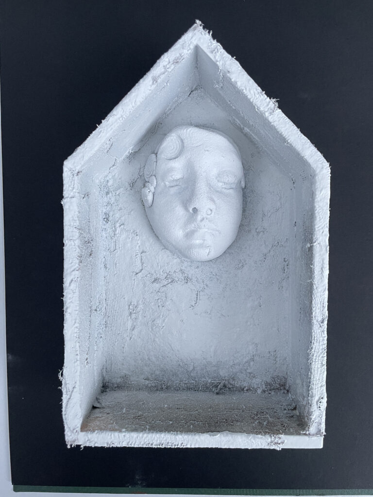
End of Greek Lesson One – next lesson, shards and faces!!
Thanks for reading!
~~Lyn, Intrepid Greek Island Explorer
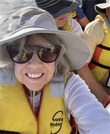
I love the photo of the Intrepid Greek Island Explorer!
Thanks! Even the dorky hat??
Love the photos and so glad you had a marvelous trip! You’ve inspired me to get my plaster cloth back out…can’t wait for your vessels class to hit the online world soon?
Plaster cloth is just amazing – it combines with so many other materials. I really liked the way it worked over the balloon 🙂
I love this! The over-painting of your 3D pieces, as well as your approaches to creating vessels. Years ago, I had a piece of rough-weave muslin (about 12×12) that was stained and not really “usable” for anything. It seemed to be moving around my studio so I would keep running into it now and then. One day, n the spirit of play, I coated it with white gesso and when it dried I fell utterly in love with it. It had a smooth plastery feel to it but some of the texture from the muslin kept peeking through. It still seems to show up every now and then and I love it just as much every time I see it!
I totally relate to this – there is something so sculptural about a textured white surface. I may do something like this on purpose and see what kind of vessel I can turn it into!! xoxo
what an exciting, yet simple approach! your vessels are just fabulous! thank you reconnecting us to the beauty of white!
Thanks, Janet – I guess I just needed to see so much white in Greece to remind myself of how evocative it can be!
You and your work are always amazing.
As you may know, I paint flowers, and am known for my extreme use of color…but my favorite flowers of all are white roses. Go figure!
I always think of you when I think of color – that is so interesting!!
Thanks for “white” commentary. Ironically, I have been toying with an off-white encaustic sculptural concept recently. It’s still in the mental aspect. Your post is moving it closer to the virtual stage.
Betsey, me too on the white encaustic sculpture – I love white wax on wood and on white unglazed clay!!
All fabulous
Thanks, Linda 🙂
Love your perspective!
I loved Greece for the very same reason. And although I don’t use a lot of pure white in my work, I do gravitate to neutrals- maybe for some of the same reasons – pure and simple.
Sue, you and I use the same palette so often – I was really surprised how different pure white is from the usual ivories and rusts and creams –
Did you ever read “the way of whiteness”
A beautiful poem by Wendy Barker.
Hope to talk to you soon.
Dorothy
I just ordered the book – I am such a fan or hers and we all miss her so much. Thank you for the recommendation – there was a wonderful interview with her husband Steve Kellman recently in a local online arts journal. I’ll send you the link. ♥
This is so inspiring, I love the shapes you made!!!!!
Thanks, Vanessa – I love what you’ve been doing lately!! ♥
Lovely to see your happy face. Sounds like your adventure was a big success!
I love the white on the walls and your pieces, which I think are lovely!!! I think Dry Brushing one or two vessels would show shadows and look great. Not my play house so I will get my ideas out of your play house. lol But I do love them, I can’t wait to see what you do with them.
Hugs, Ann Marlar
BRAVO!! What a marvelous revelation from the simplest of beginnings. I have been stuck recently and seeing the vision through your eyes has helped to reopen my own. THANK YOU for this share.
P.S.The pictures are wonderful!
Thanks for sharing Lyn. The white is so beautiful. The white buildings in Greece made the sky and surroundings so much more vibrant and beautiful. I also loved the white clothing. I’m anxious to hear if you met any artists during your travels to Greece. So glad to hear that you had a wonderful trip. Cyndi
Love your commentary on white, your photos and vessels, and assemblages! Thanks for sharing and inspiring!
Great commentary on great places and I agree on the sharpness white gives to define the places and objects, I think that clarity along with the contrast of the blue blue sea is what I remember standing out for me. Your perspective on it brings it alive thanks for sharing.
Luv your comments and always good to get a refresher course on the importance of form and pureness of white
Unless we are only talking about pure white, which is hardly ever the case, I love the variation of white values. I agree with you.
I do enjoy your emails.
Vonnie Diehl
Vonnie’s Bittersweet Art
So awe-inspiring and so true, Lyn! I appreciate your creative eyes in Greece. Your words say it all. I love that country for its beauty and simplicity. You brought back wonderful memories! Thank you!
I love these. I’ve done several pieces using only white. It forces focus on texture and shadow. Looking forward to seeing how this develops for you
I visited Mykonos and Santorini last year, plus several other beautiful Greek islands as well as Istanbul, Türkiye. Yes…those gorgeous white buildings were just spectacular!
Much food for “new” thought. Thank you.
this is fantastic! What an awesome trip, vessels and assemblages!
This also made me aware why I love doing white tops with black paint in my work.
The fabrics have different textures. And each texture interacts differently with the paint. Giving very different results from texture to texture.
Kinda cool to actually put that in words – vs. “just” recognizing intuitively.
Thanks for that Inspiration!!!
P.S. – gotta put that plaster and gauze to work! If it’s not too old by now:):):):)
Beautiful “illumination”. Thank you Lyn.
Lyn, As always the words & work are beautiful. I must ask what you were doing in the photo of you in a life vest.