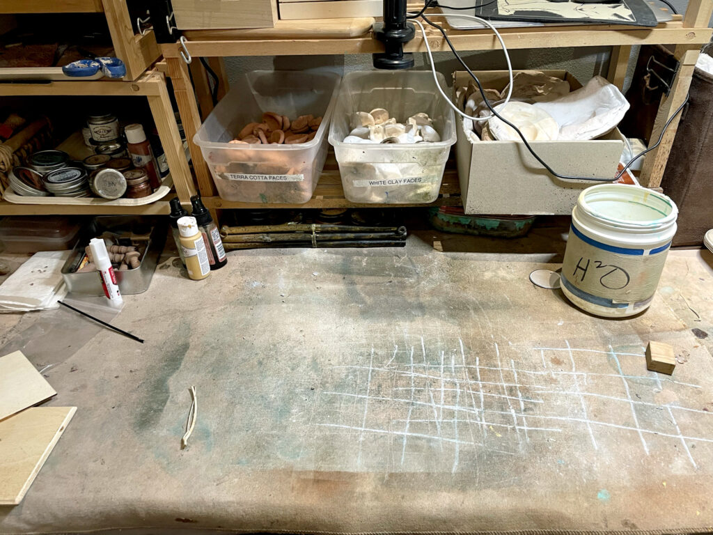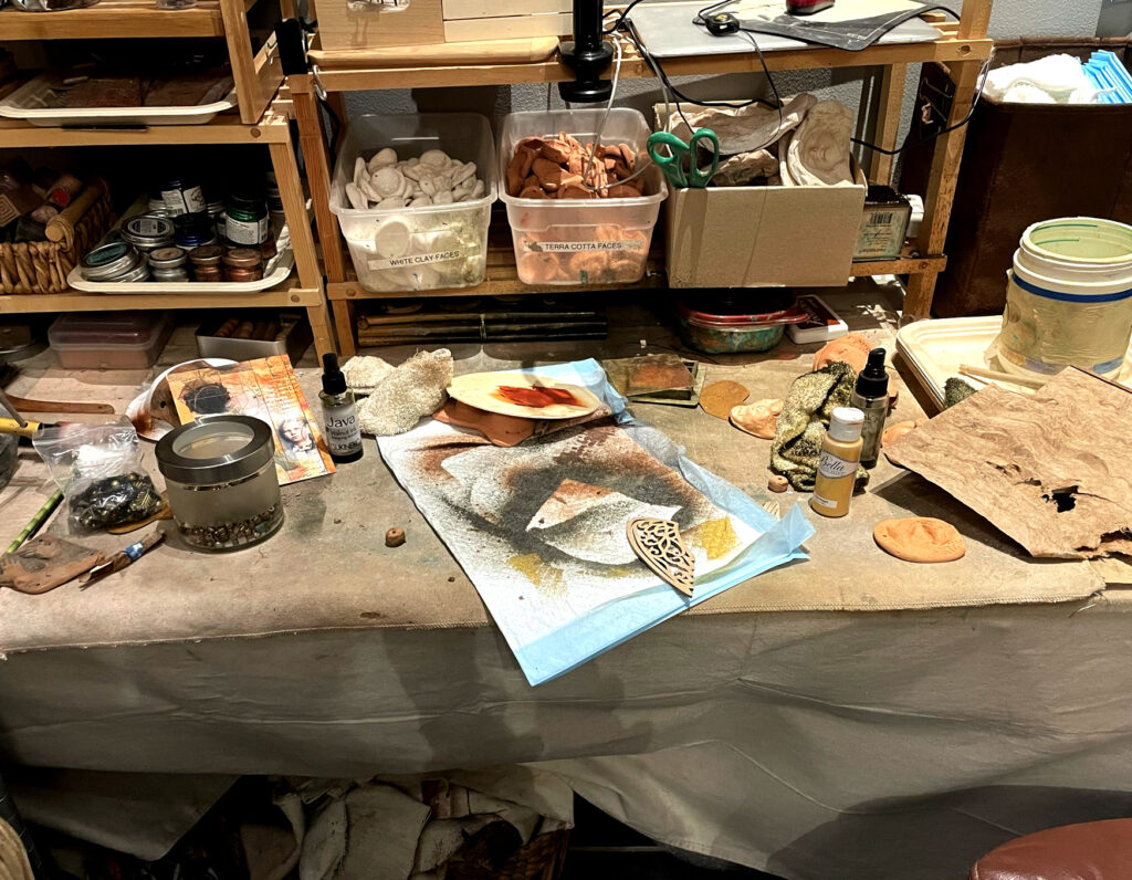

This is the next in a series of summer posts using the in-progress Enso Circle oracle cards that I’m working on to help myself keep consistently grounded in studio practice and creative community. Thanks for being part of that. Read on.
In the wake of the recent floods here in Texas, we find ourselves reeling not only with grief, but with a sense of helplessness. As artists, our instinct is often to respond: to create, to express, to offer solace through our work. We feel the call to stay on the path, to keep moving forward, to do something with our hands that might help mend the world.
But there are moments when even that noble impulse must yield to something deeper—stillness. Not from a lack of inspiration or purpose, but from a need to let the weight of the world settle gently into our hearts without resistance. To let silence be a kind of medicine.
This is not a surrender. It’s a sacred pause—a conscious act of rest and reflection that allows us to absorb what we need before we continue on with renewed meaning and strength. We do not stop because we are lost—we pause because we are listening.
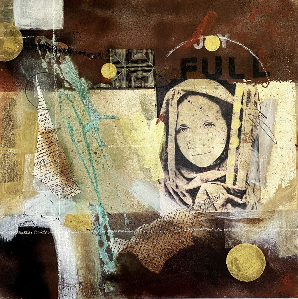
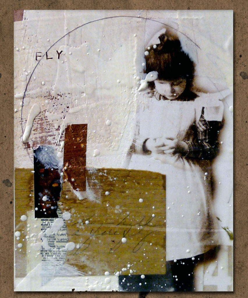
This another early Enso Oracle card that I created several months ago, but it seems really appropriate right now.
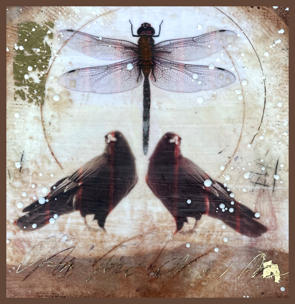
THE PAUSE

The Pause – When Stillness Is the Bravest Choice
Keywords: Stillness · Restoration · Listening · Grace
Interpretation (Upright):
The Pause arrives not as an absence, but as a presence—quiet, whole, and necessary. It invites you to step away from motion, not because you are uninspired, but because your spirit knows when to rest. Like a hush between notes in music, this moment of stillness holds space for something sacred: integration, healing, and gentle awareness. In the midst of life’s turbulence, this card reminds you that you are allowed to stop. To be. To listen. Rest is not retreat—it is preparation. In the pause, your deeper knowing rises. Let it.
Interpretation (Reversed):
When reversed, The Pause may reveal a deep discomfort with stillness—an inner urgency to do something, especially in times of sorrow or upheaval. You may feel desperate to help, to fix, to create meaning out of heartbreak. But this impulse, though noble, can become a way of avoiding your own need to rest and receive. Not every response must be immediate. This card asks you to allow space for presence before action. Choose grace over urgency. Trust that your quiet awareness now will shape deeper, more meaningful offerings later.
Reflection Questions:
- When was the last time you truly allowed yourself to be still?
- What emotions or insights have you been too busy to feel?
- What would it mean to pause—not out of weakness, but out of wisdom?
Affirmation:
I honor the stillness between moments. In rest, I restore my light.

What happens after the Pause?
You don’t simply go back to work. You go forward—with a steadier heart, clearer eyes, and a deeper sense of intention. The stillness doesn’t erase grief or uncertainty, but it softens the way you carry them. You may begin again slowly. Gently. You may write one word, make one mark, sweep your studio floor, or sit beside your worktable and simply breathe. That is enough.
The Pause is not a break from your path—it is a sacred moment within it.
Things to think about when you need to pause:
- I don’t need to solve everything right now
- This moment is enough—I am safe to just be.
- Stillness is not emptiness—it is where I gather strength.

Previous Enso Circle oracle card posts: