Naturally Inspired – a natural collaboration

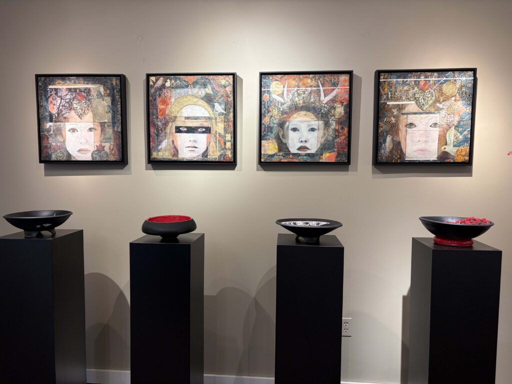
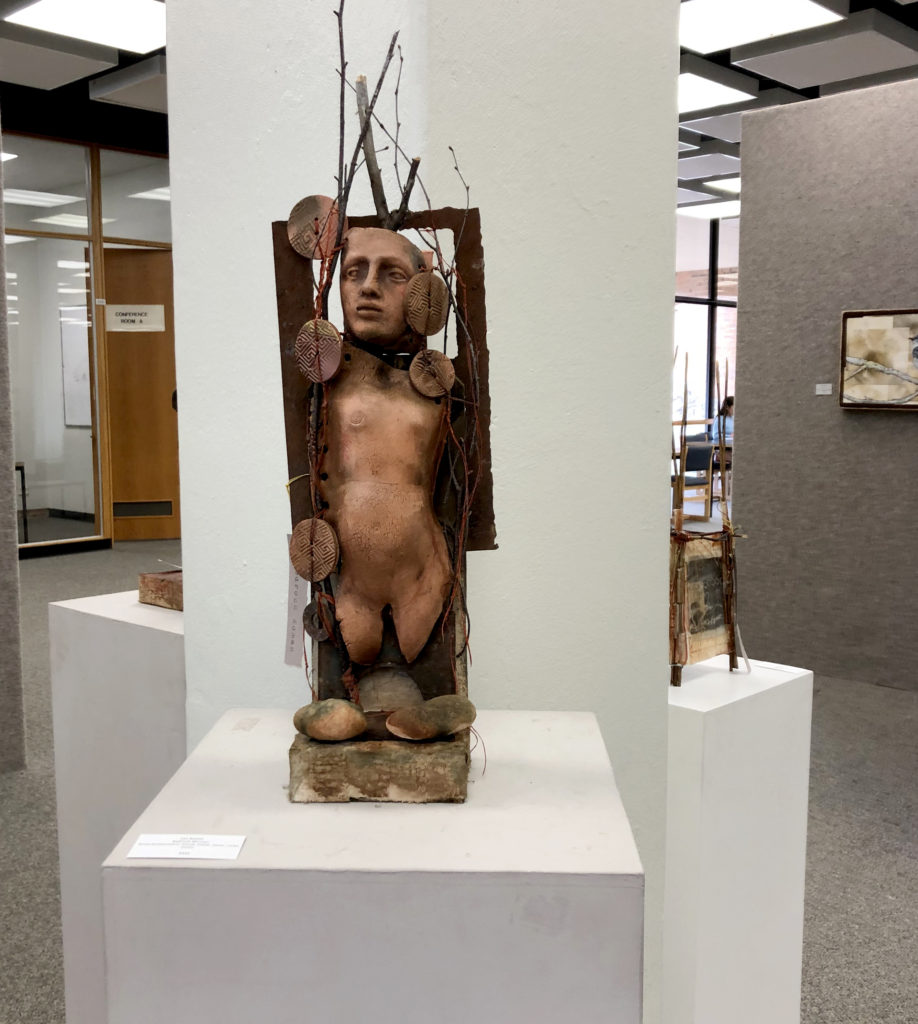
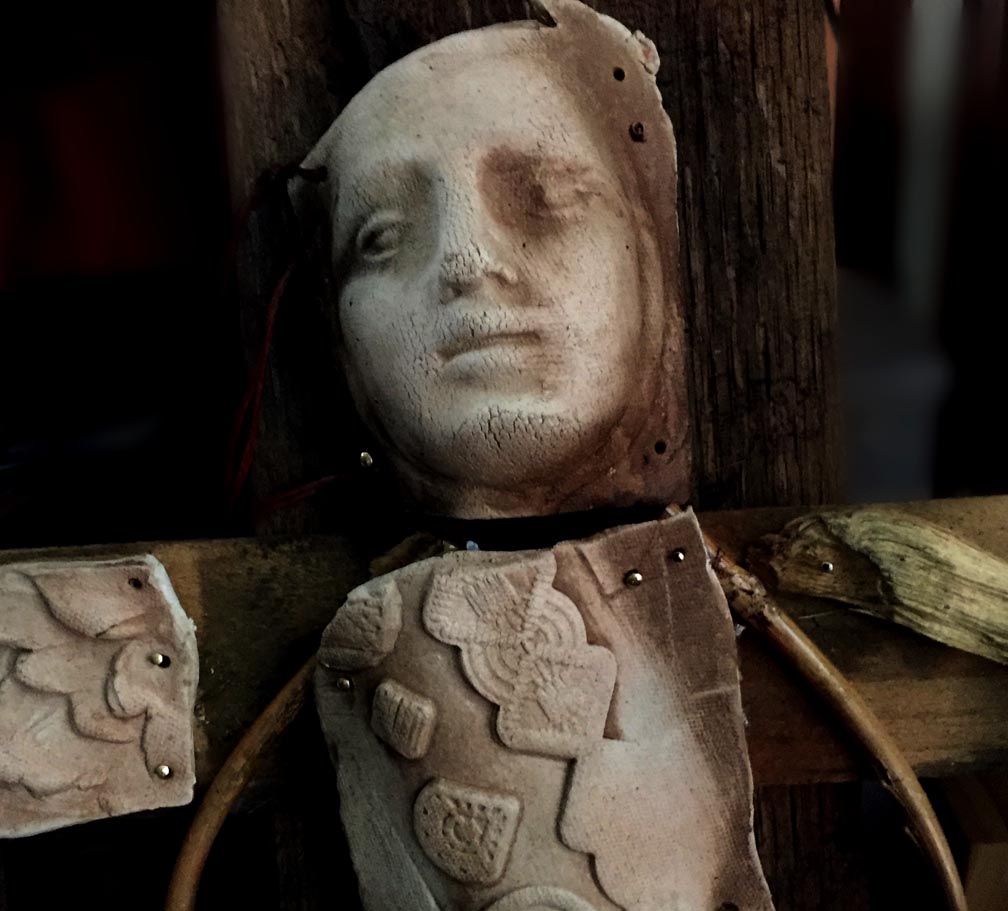
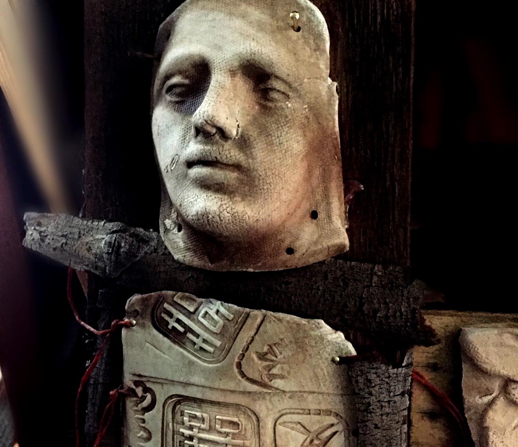
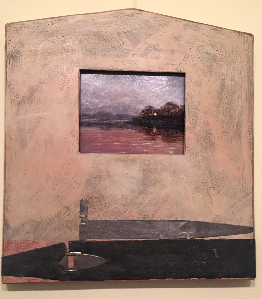
Lyn Belisle, “Bedrock” – Earthenware, found objects, 2019

NATURALLY INSPIRED: WORK BY LYN BELISLE, SABRA BOOTH, JESUS TORO MARTINEZ, AND TIM MCMEANS

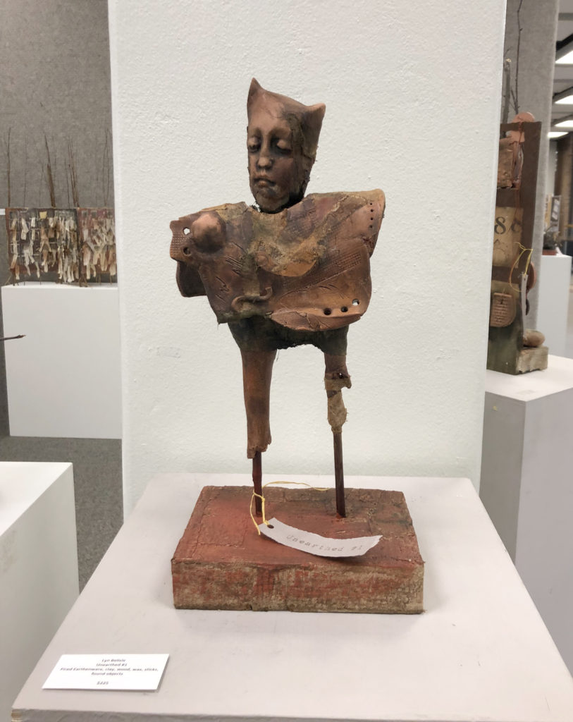
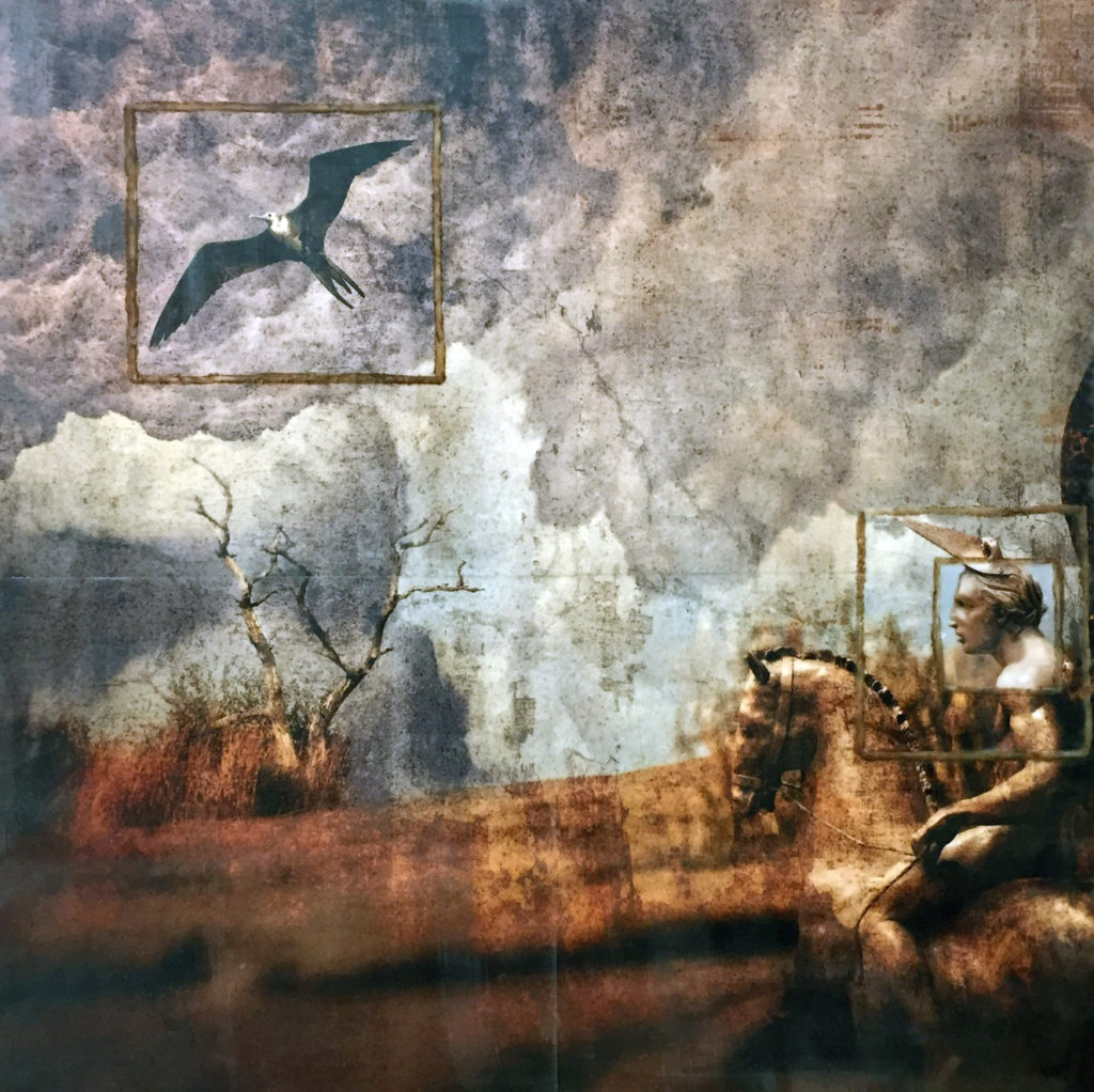
I finally got to the this fantastic exhibition at St. Mary’s University which opened while we were in Cuba. The last I saw of my “Unearthed” pieces was dropping them off in a big box to curator Brian St. John at St. Mary’s University – goodbye, stuff!

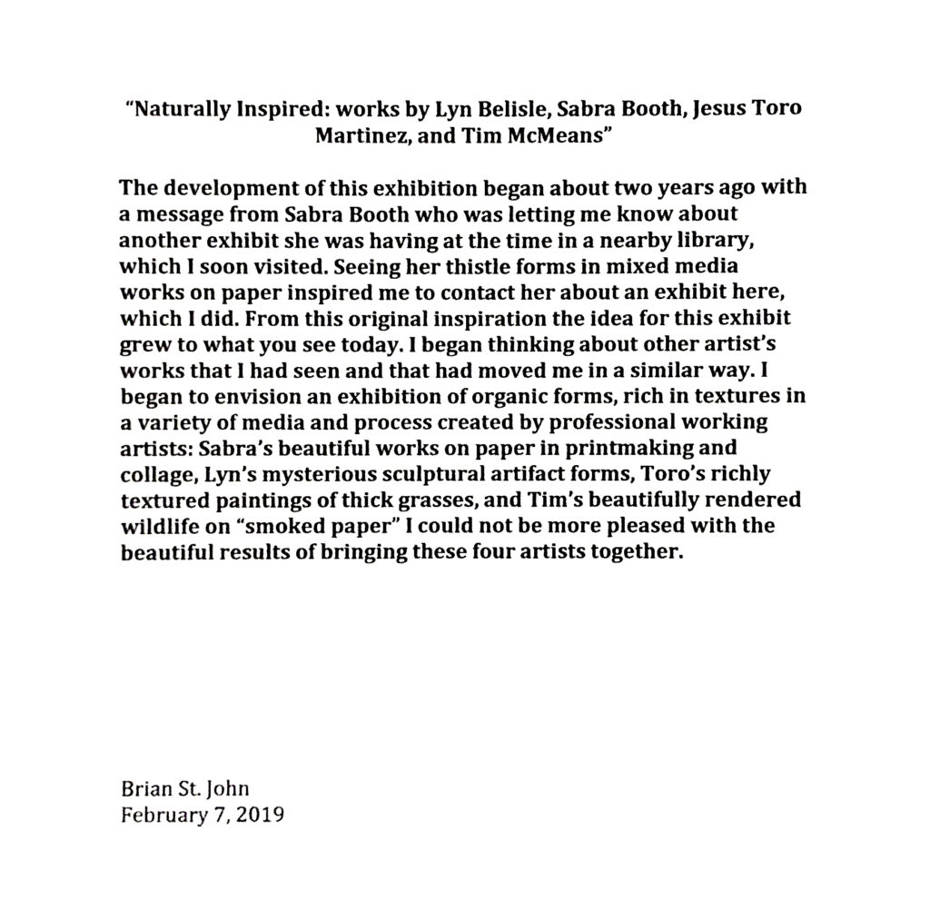
Brian, a huge talented painter and professor of art at St. Mary’s,  treated me to lunch yesterday and a tour of the exhibit – wow! The works by (lucky) me and the other three artists integrates beautifully. Read Brian’s statement to see how all of this came about:

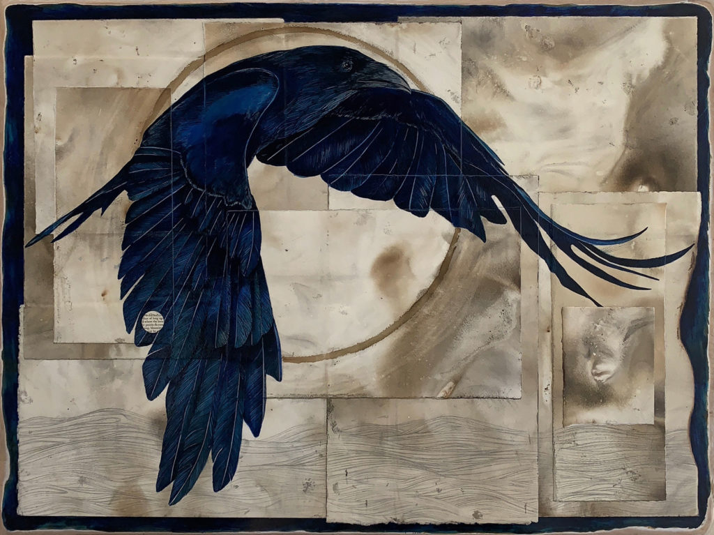
I knew Tim McMeans’ work well and had admired it for some time. His hybrid painted-drawings of two dimensional figures in broken geometric planes were recently featured in a great show at the Felder Gallery.

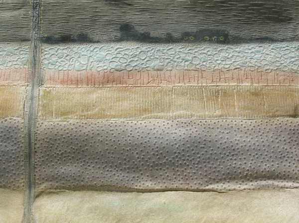
Jesus Toro Martinez is also a well-know San Antonio painter whose work I knew for its textures and power depicting earth themes. We had met a couple of times, and I loved his outgoing generous nature.

Jesus Toro Martinez, Sagebush by the Creek

Sabra Booth was new to me, but no longer – she is amazing. Her organize prints and collographs are stunning. In the exhibition, she has one huge collagraphic printing plate displayed next to the framed print it produced. I am a new fan of her work!

Sabra Booth, Frack House (detail)

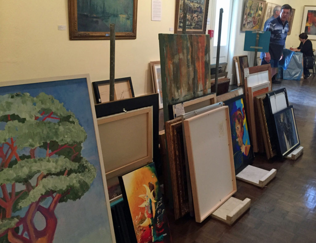
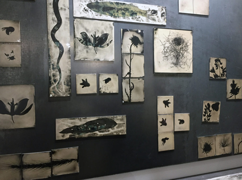
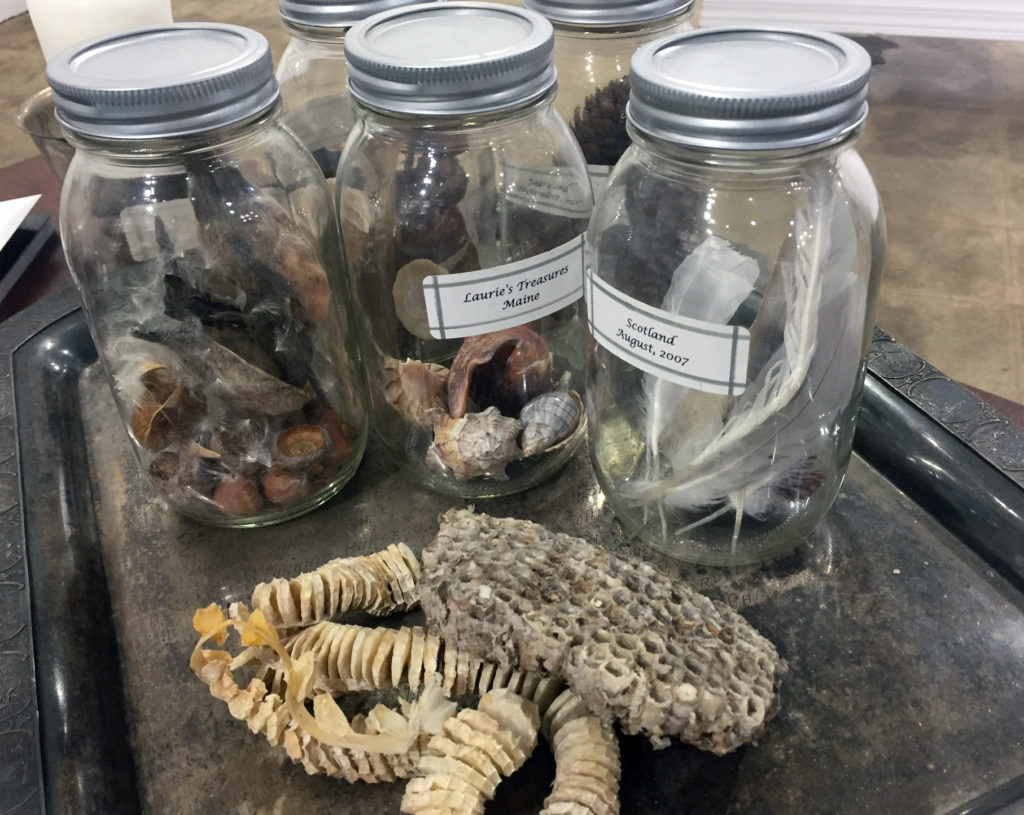
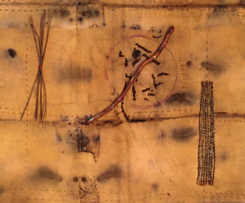
I took some photographs of the exhibit when I was there with Brian yesterday – want to see? Just click on the image below!

Lyn Belisle, “Unearthed” – earthenware and found objects, 2019


A few random things

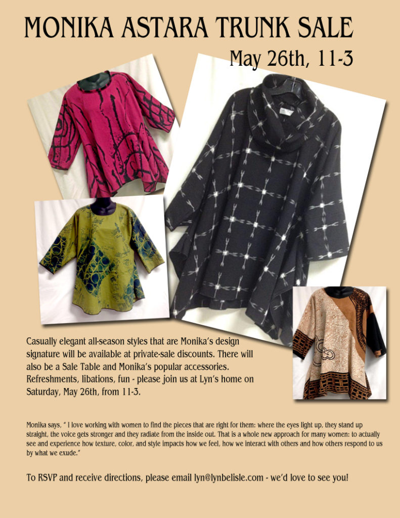
RANDOM THING ONE: Monika is coming to San Antonio. Yep, the internationally know and loved Austin designer, Monika Astara, will be at my house on Saturday from 11-3.  If you’d like details, send me an email – the flyer is below.

I love Monika’s clothes – me and about a jillion other people. The make everyone look good, plus they are comfortable and washable and iconic.


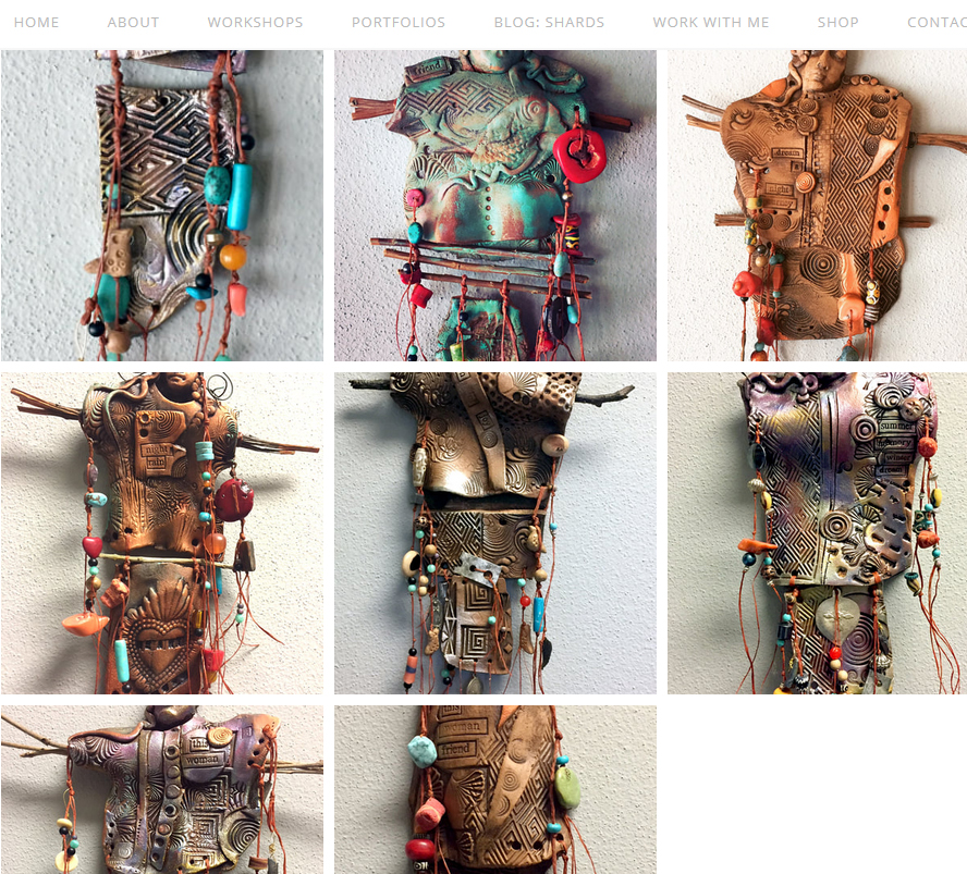
RANDOM THING TWO: Remember the piece I showed in my last post on knowing when something needs more work? I did several more pieces based on what I learned while I was putting that one together. You can see them here on my website (click below) – they look like sisters from the same tribe.

All these pieces are going to Marta Stafford Fine Art in Marble Falls, Texas today, but I have clay in reserve to continue the series. Doing the beading is a lot more fun than I thought it would be, kind of meditative. The artificial sinew I use makes its own “needle” because it’s heavily waxed.


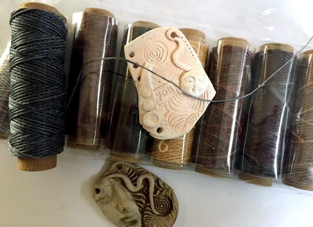
RANDOM THING THREE: This involves both earthenware and clothing – it’s a Waxed Linen Thread kit that came today – ordered on Amazon – (is there no odd craft supply that you can’t find there??). As I said, I used sinew to put those new clay pieces together, but wanted to try this waxed thread as a substitute. I’ve been playing around with it and am really happy with the way it feels. It’s very strong and would be useful for jewelers and fiber artists. And look at these cool colors!

There are 33 yards of each color on each spool, and the whole kit of eight spools cost just $9.99. That’s your Tip o’ the Day.


RANDOM THING FOUR:

If you go to Marble Falls, Texas, first visit Marta Stafford’s Gallery, then go up the hill to the Blue Bonnet Cafe, est. 1929. The menu will tell you it’s the real deal.Where else can you get a cup of gravy as a side order? But it’s the pies that bring people back. Just suspend thoughts of diet and order a slice. They even have a Pie Happy Hour from 3-5.

Those are all the Random Things on MY menu today – I hope you have a great week. Thanks for reading SHARDS!


A weekend with the art and the Juror

Friday and Saturday were super-busy days at the San Antonio Art League – there were a total of 351 entries submitted for the 88th Annual Artists Exhibition. From those, 65 will be accepted and 24 awards will be given.

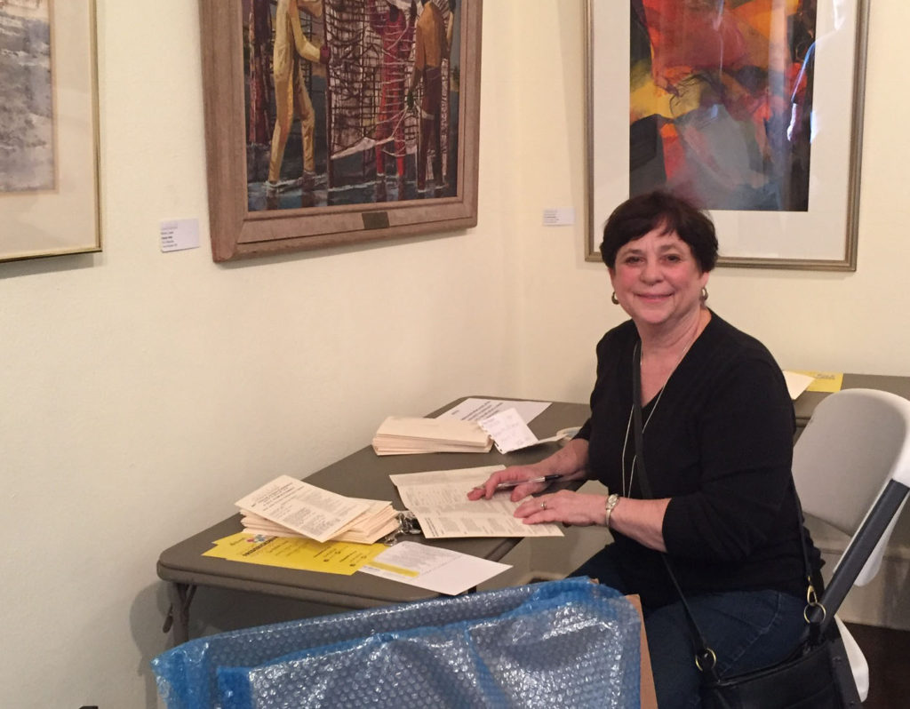
My pal Michelle Belto fills out her paperwork at the Art League for her submissions

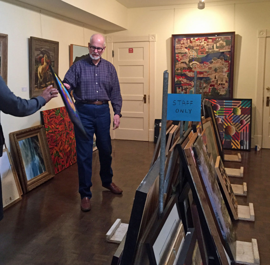
It was a huge workload for Juror Michael Ettema from Santa Fe, who spent Sunday (yesterday) making his decisions. Three members of the exhibition committee were there to help (and so was I, a presidential perk!), but the process was closed to everyone else.

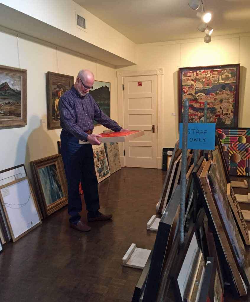
Juror Michael Ettema from Santa Fe evaluates the artwork

I got to be a fly on the wall as I watched and listened to Michael. He was amazing – fair and meticulous in his selections. I talked to him at our lunch break and found out that he has been involved in art since he was 16 – starting out as an intern at a museum in Dearborn, MI, and pursuing a career as a gallery manager, a museum curator and director, and a successful art appraiser. Wow.

He made at least five rounds of selection, narrowing by about a third each time. Every piece received close scrutiny and constructive comments. He did take a break to take a walk around the King William neighborhood, but worked steadily through the day.

Once the final selections were made, he was left by himself to award the monetary prizes. And nobody knows who got those – not me, not the committee chair – just Michael! And he ain’t tellin’ 🙂

Last night, Bill and I hosted an informal dinner for Michael and the committee and Art League board. Michael explained his criteria for selection. Basically, he looks for an original idea that is carried out with confidence – concept and skill were the keywords.

Michael Ettema is not the kind of juror who picks landscapes or portraits or abstracts or any other specific genre. He based his selections on what he observes regarding the artist’s purpose and how successfully that was conveyed.

Acceptance notices are going out today. Awards will not be revealed until the opening on April 15th. I will say this – if you were one of the selected artist, congratulations. It was a very competitive field. If you were not selected, know that your piece was expertly and respectfully considered by a truly knowledgeable juror and a nice guy, to boot!

Special thanks to all the artists who submitted. Henri Matisse said, “Creativity takes courage.”It’s a risk to put your work out there for a juror. And special thanks to Francis Huang, committee chair (and wonderful artist himself) who found Michael Ettema for us. We know Michael has good taste, because he fell in love with San Antonio! I hope he’ll be back soon.

New critters on the block . .

Oh, boy – the First Friday Art Walk in Marble Falls is this week (February 2nd, 5-8 pm), and as part of it Marta Stafford’s gallery is having a bee-youtiful celebration featuring jazz, honey wine, valentine-inspired jewelry, and my beeswax photocollages and B Beautiful dishes.

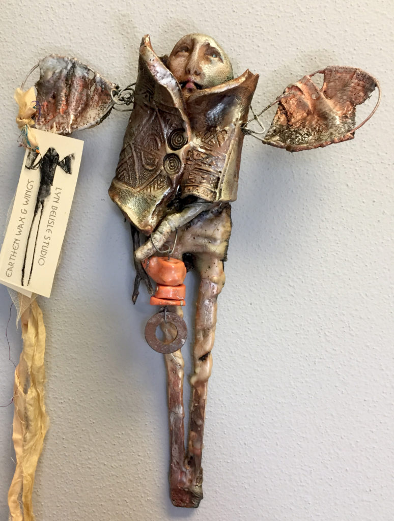
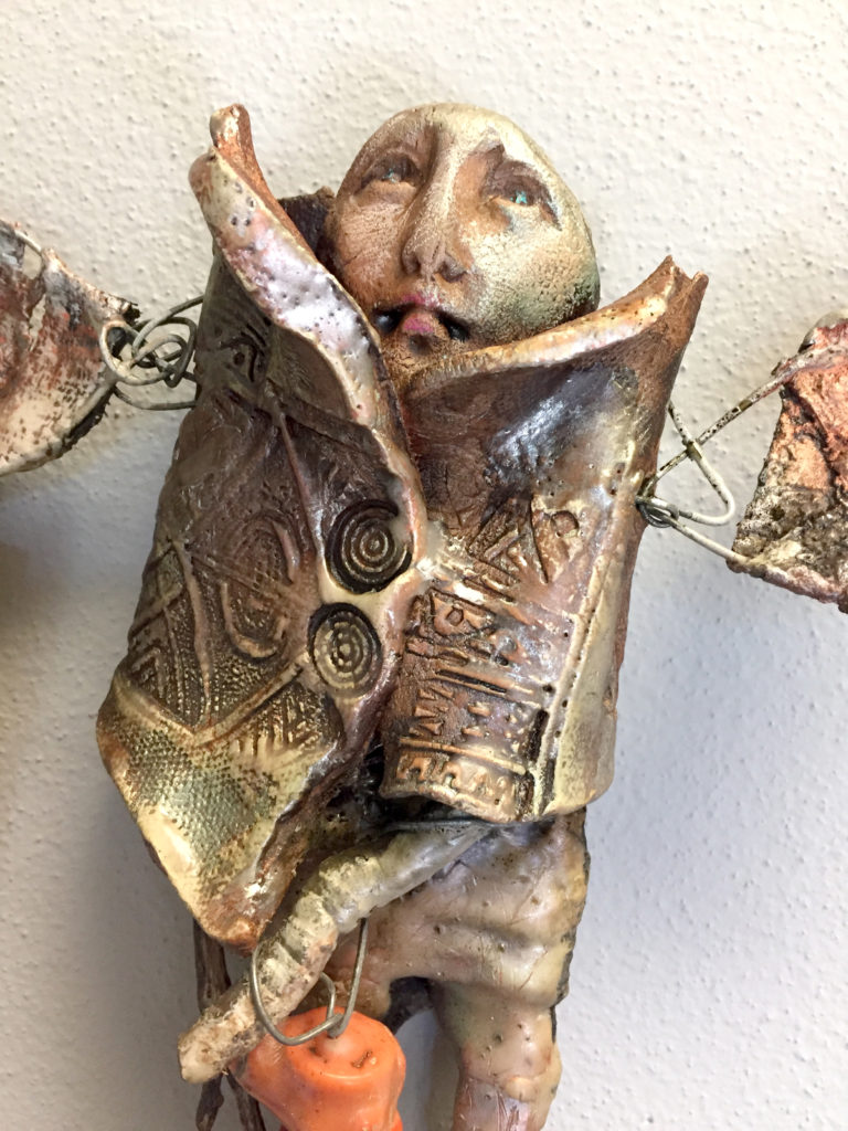
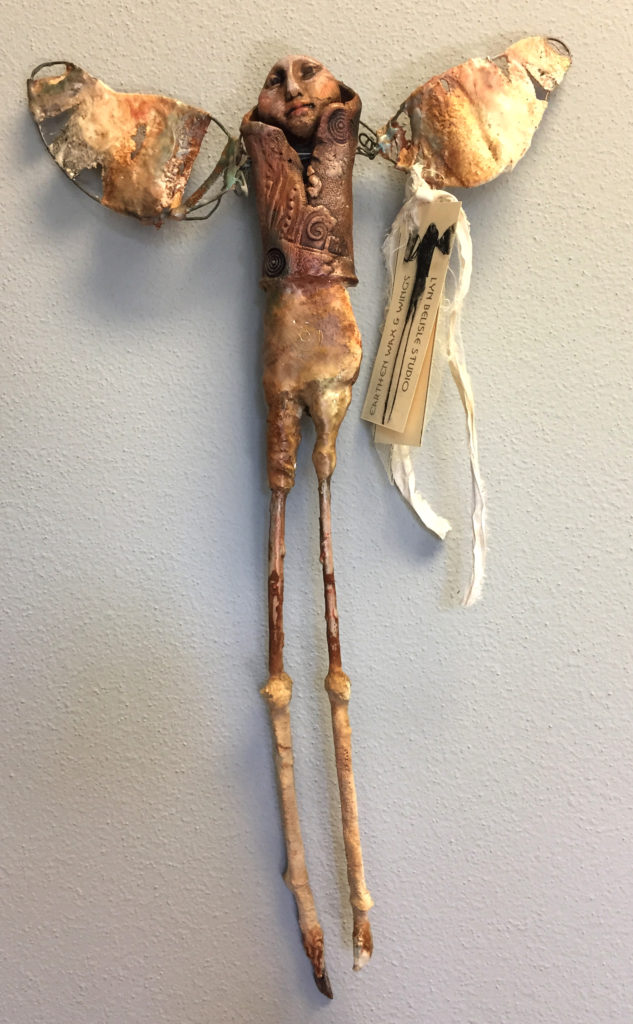
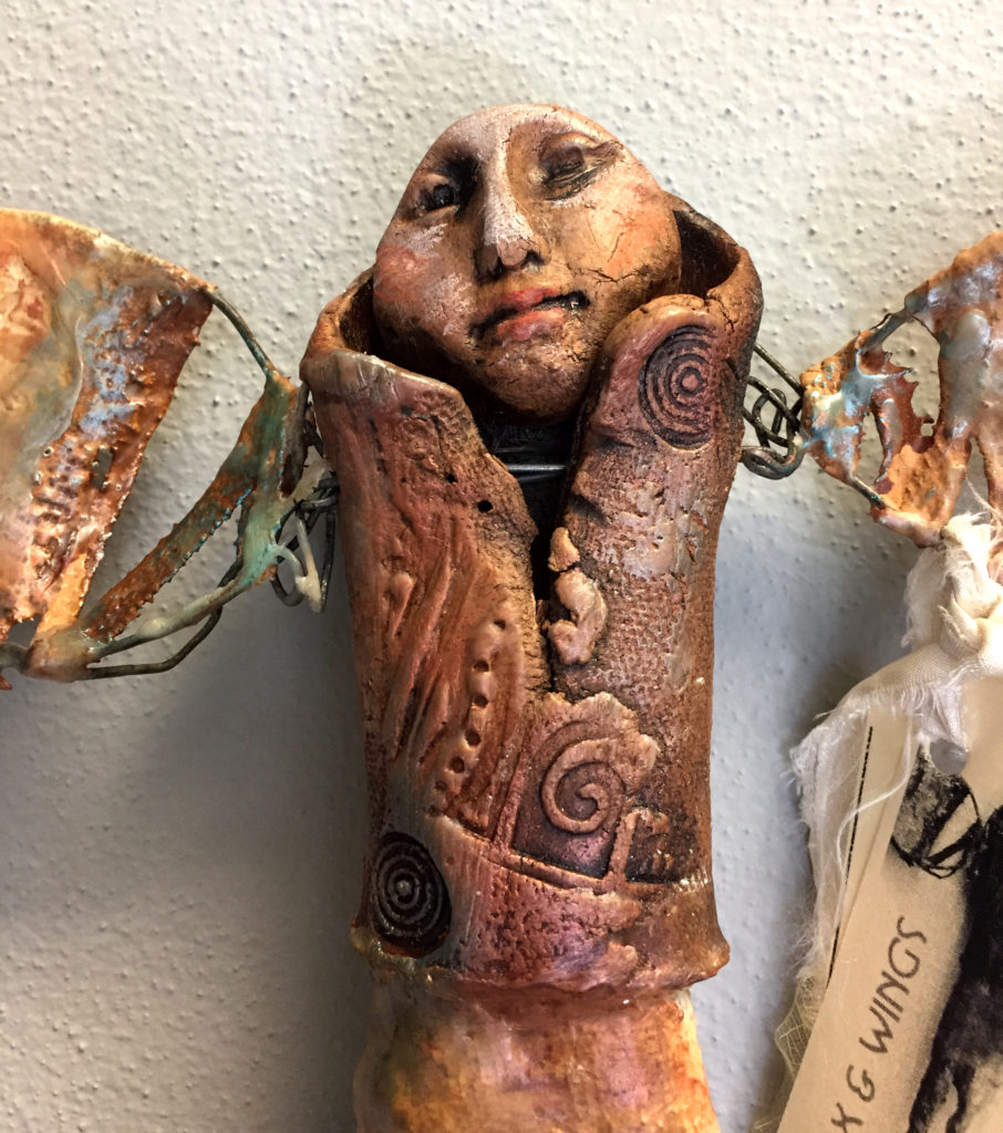
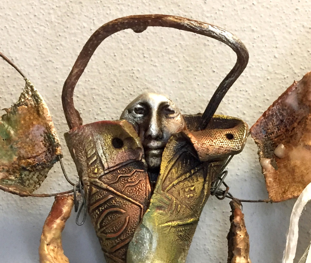
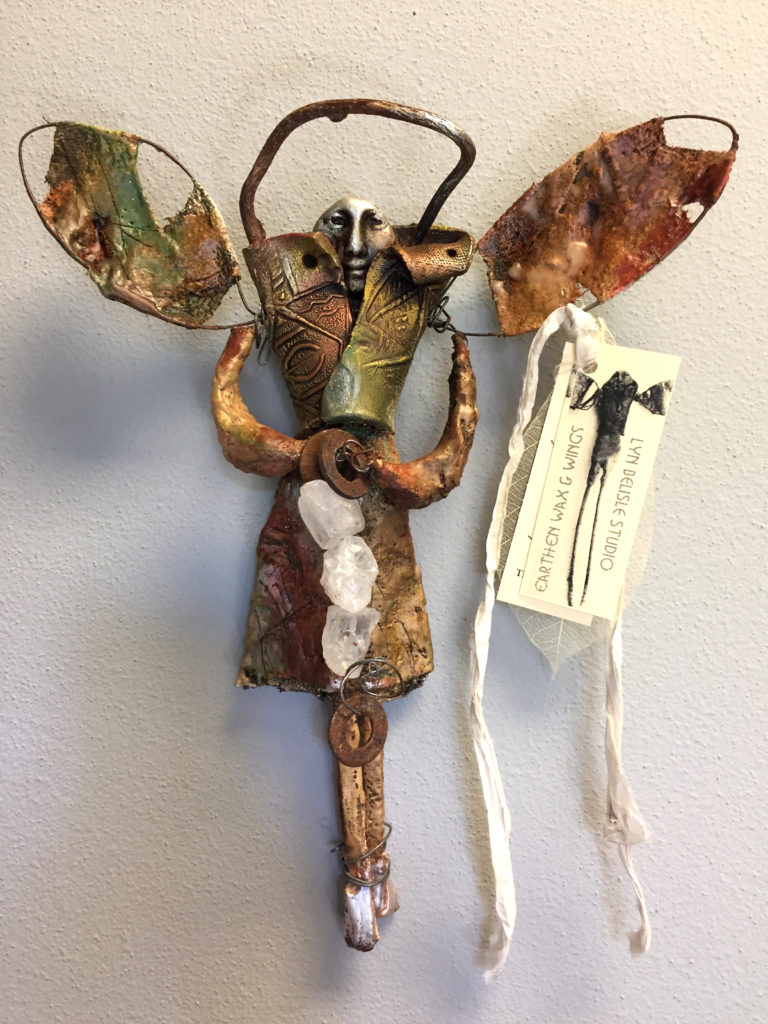
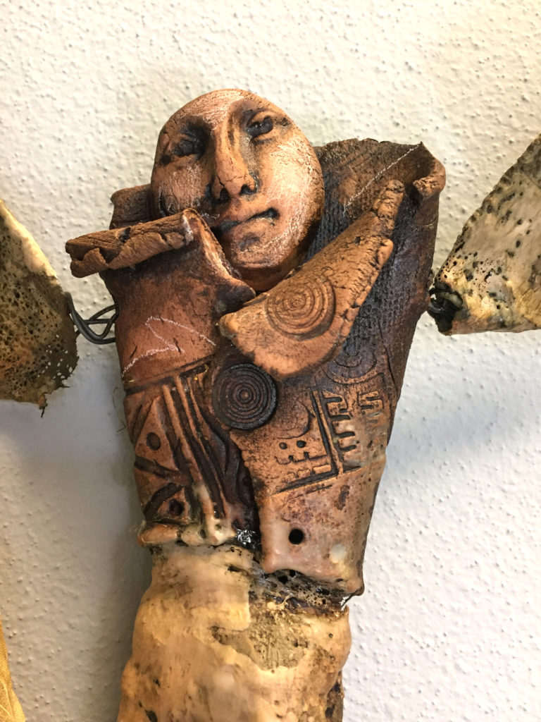
I wanted to do something extra and different for this show, something that uses beeswax in a new way for me, and I came up with these five fun wall sculptures using earthenware, gauze, sticks, wire and beeswax and Secret Sauce (aka walnut ink).

Here’s the first one, called “Sacred Sentry”.

I’m calling this series “Earthen Wax & Wings,” and I have a feeling that I’ll be doing more of these. This one’s called “Cloudhopper” – a very happy creature.

Each piece has a tag with its name – and each one has a story that you can read in the faces if you use your imagination. Here’s “Icebound Angel” – so what’s HER story? You might not want to mess with her.

And here’s the “Messenger” – kind of androgynous? I guess they all are. Wings are non-gender specific!
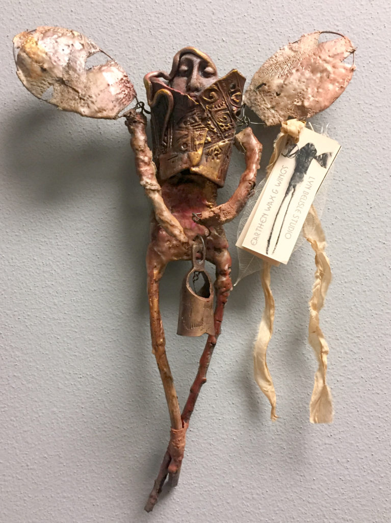
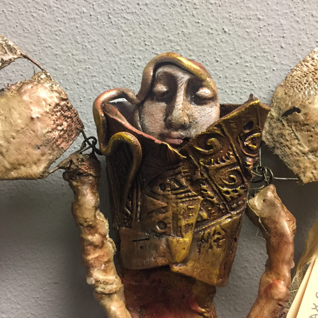
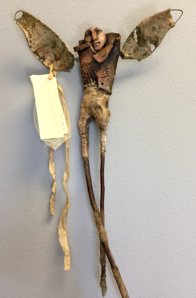
Finally, here’s my fave – “Peacemaker.” Simple and serene – I may keep this one.

It’s funny how things work – I made the little earthenware “blanket” faces weeks ago  without knowing exactly what I was going to do with them. Then I got an idea from Linda Rael that turned out to be the perfect extension for the earthenware.

And when Marta announced her “bee and honey” theme, I tried beeswax and walnut ink on the exterior and it all works together beautifully. Trust the process!

PS – the cataract surgery went very very well! Thanks for the good wishes – I practically have X-ray vision now!


SAAL&M meets the phallic alien claw

The favorite so far, but not yet a winner

So let’s talk logos – the results are in. And, boy, are they mixed. Overall, designs 2 & 3 were the favorites but we still have lots of work to do to perfect a new logo for the San Antonio Art League & Museum.

I wanted to share some of your comments so you can see what a funny, complex job it is to design a logo for an organization. Among my favorites were, “The tree looks like an alien claw,” and, simply, “Phallic.”

These particular comments came from the online survey, although I received lots more via email and messaging.Here we go:

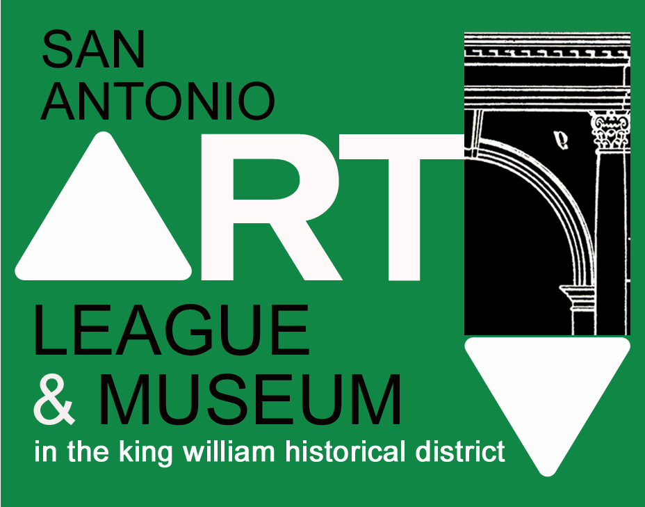
LOGO #1

SELECTED COMMENTS:

  • This is my first choice! I don’t care if the background color is green, but I like the overall feel of this logo the best❤️
  • nope the “A” look like arrows that go nowhere
  • This one feels a little chaotic to me and my eyes keep getting drawn to the “arrows and away from the pertinent info
  • I like this one best because it says today, modern, forward thinking, and it shows respect for yesterday. I would like to see it with small green triangles added to both large triangles.
  • the swoop after the T is distracting, although i love that graphic. the two triangles, of which one is an A, are confusing.
  • My favorite because of the triangle shapes. Eye catching.
  • I don’t like this one. The downward-facing arrow that’s connected to the arch has a negative vibe to me….as if it’s suggesting “down with art”.
  • Phallic
  • Not too crazy about this one. Not sure why.
  • Don’t like the triangles
  • First choice

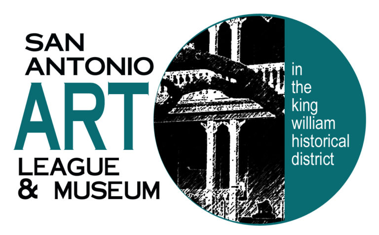
LOGO #2

SELECTED COMMENTS:

  • Does not really reflect art but only the building
  • This is my favorite.
  • Nice but not my first choice.
  • I like this logo the best! The Turquoise and black stand out and the image of the house gives it a lot of flavor. What about the paintbrush from #3 placed under “& Museum” on its side? #3 is my second choice. Not crazy about the background color.
  • nope like the building but not the branch in front of it looks like an alien claw
  • This one is my favorite. I love the whole package. #3 is my second choice. They all look great.
  • My fav! I emailed you with comments about each one…Your survey page worked!
  • I like this one!
  • My favorite, hands down! Easy on the eyes, the relevant information is right up front, and then I’m drawn to the lovely rendering which captures visually the historic nature of the place.
  • This one would certainly encourage me to go there… love the design in the circle.
  • I like this one the best
  • Probably my favorite.
  • hard to see the photo. why is there a tree branch?
  • don’t like at all
  • This is my favorite. The circle suggests timelessness, and the type names who you are – in plain, simple letters. You might play with the color, however. The teal blue feels dated.
  • classy. favorite
  • I think this is my favorite. And since you like that bronze color, in my mind’s eye this would look fabulous in bronze!
  • LOVE LOVE LOVE this one.

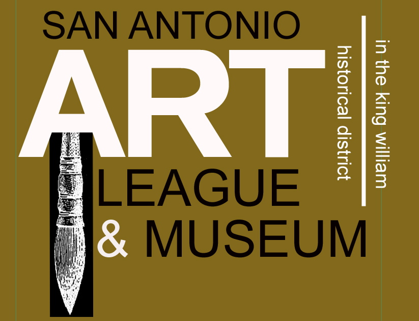
LOGO #3

SELECTED COMMENTS:

  • This is my choice. Simple, elegant and to the point
  • This is the one I like best–crisp and clean, “ART” stands out, love the contrast of the vintage-looking brush against the contemporary lettering (because I did like the architectural elements in the 1st two logos).
  • I like the bold letters. It is contemporary!
  • This is super easy to read. ART being the main focus. Simplify, simplify……..great logo. Anne Brennan
  • Like the design although paint brush might lead people to only think of painting.
  • yes yes yes classic classy tells it like it is
  • I don’t care for this one. It’s not clear (maybe I’m dense) whether I’m seeing a brush or a table leg. 🙁 Of course it’s a brush because it’s art but then there’s the change in text direction. Despite the clean lines, it feels like too much to figure out at a glance.
  • The color and graphics say it all – and, in spite of no visible purple, draws me in.
  • My second choice
  • looks scatological, under the A. colors are not interesting.
  • clean, simple. love the colors: I personally like black and brown together.
  • This one is too busy, and nothing is gained from the paintbrush coming down from the ‘A’.
  • paint brush is overused
  • Not crazy about this one either.
  • OK, not very exciting
  • Third choice

LOGO #4

SELECTED RESPONSES:

  • I was too busy trying to look at the background drawings before I got around to reading the Museum part… last choice
  • I don’t like the purple and the logo is very hard to read and distinguish what it is advertising.
  • nope too busy
  • My favorite!
  • Here, I feel frustrated trying to figure out what the image is and what the dots mean. It also feels too top-heavy to me, despite the grounding line at the bottom. Please pick #2 – it’s perfect! (Let us know what you decide.)
  • What about this one in the bronze?
  • hard to see, and the purple dots don’t jibe with the (column?).
  • I like this too. The & symbol is a little lost. King William District could be a little larger.
  • This would be my second choice, but I don’t understand the meaning/reason behind the circles up top. A few suggestions: 1. Eliminate the dots/circles at the top, 2. make the top and bottom horizontal blocks less deep, and move the “In the King William Historical District” line up so that it is closer to the top of the bottom block.
  • might run into problems with the purple
  • This is probably my second choice. But, like you, I’m not too fond of the purple color here. … Also I think I don’t care for the placement of the King William banner; maybe it could be thinner: just tall enough to hold the letters. ???
  • Too confusing
  • Last choice

Thanks for all of the comments!! The are hugely helpful – I’m going (literally) back to the drawing board and refining your favorite designs – stay tuned.

Designer Milton Glasser said, “There are three responses to a piece of design – yes, no, and WOW! Wow is the one to aim for.” That’s what we wanna do for the San Antonio Art League and Museum!

Save

Bill Bristow – artist, mentor, friend – visits the Art League

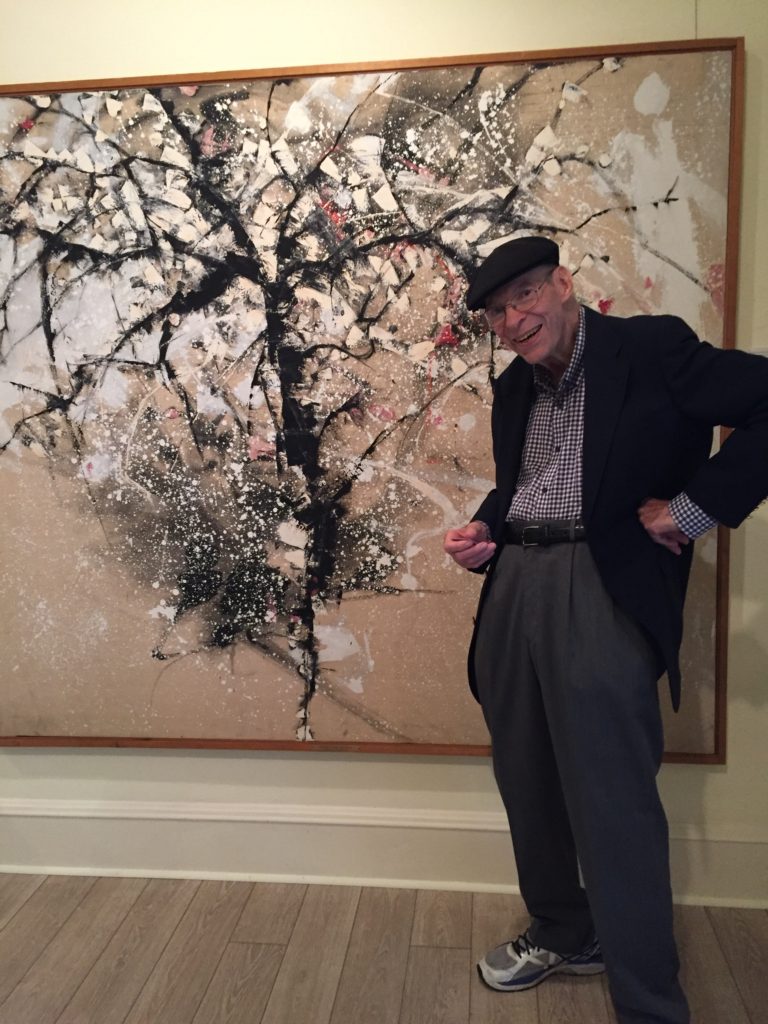
Art Professor Bill Bristow with his 1961 painting, Cherry Tree in Snow,

Former Trinity University Art Professor Bill Bristow with his 1961 painting, Cherry Tree in Snow, at the opening of the “Visions of Summer” exhibit on June 18th, 2017

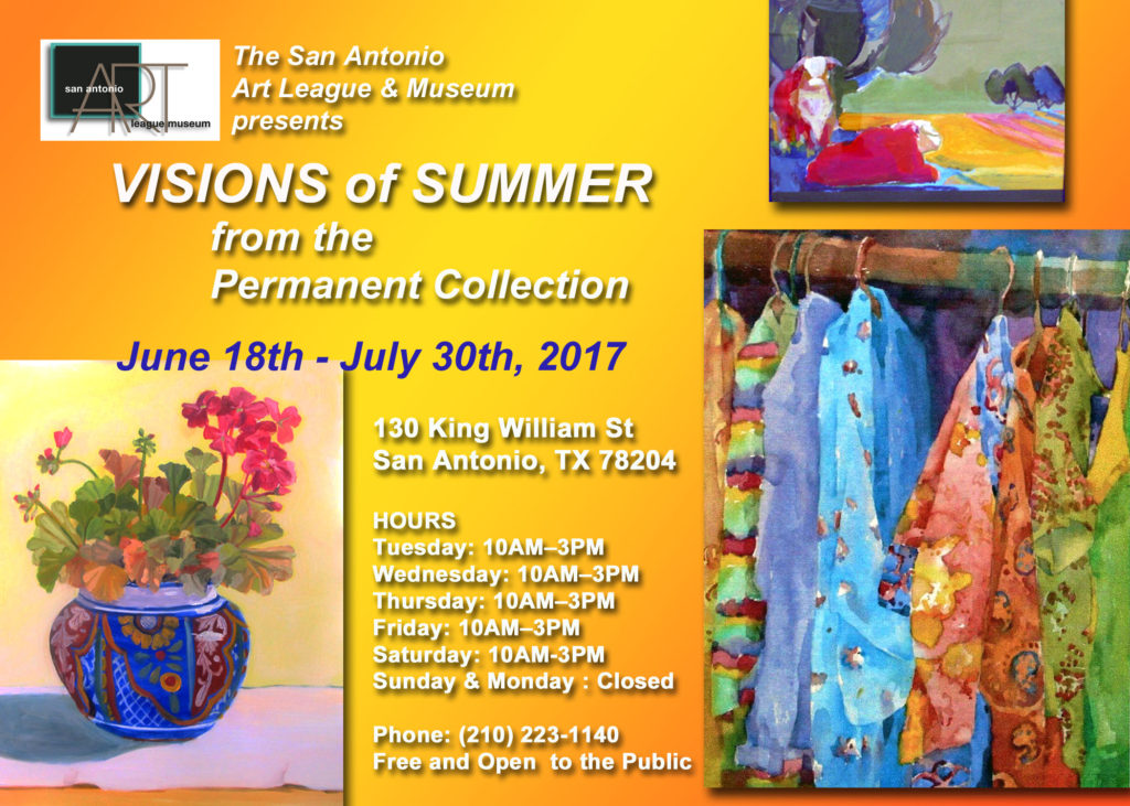
The year was 1961, and a young professor, new to Trinity University, won the prestigious Onderdonk Purchase Prize at the San Antonio Art League and Museum. And this past Sunday, that remarkable fellow – Bill Bristow – came back to the Art League for an exhibit called “Visions of Summer,” which featured his painting. It was a thrill to see him there. He was my art professor at Trinity and influenced me more than any other teacher.

One of the advantages of getting to curate a show from the SAALM Permanent Collection is choosing paintings by my favorite artists! And many people who were at the opening we just as delighted to see him as I was.

I’m definitely not the only one who loves Bill Bristow – there are legions of successful artists and other creative Trinity grads who love this man. John Hartwell of Hartwell Studio Works in Atlanta who graduated in ’91 says:

“Bill Bristow, department of art, was a phenomenal mentor at Trinity – encouraging and generous with his time. Much of what I teach is based on Bill’s teaching talent. It’s how I learned to teach creative arts.”

Bristow and I have kept in touch since my undergrad days, and he came out of retirement a couple of years ago to teach several workshops at my old studio.

Bill’s paintings are included in the private collections of the late John Connally and Mrs. Lyndon B. Johnson, as well as in the permanent collections of the Dallas Museum of Fine Arts, the Houston Museum of Fine Arts, and the Longview Art Museum. A veteran of sixteen major exhibits from Texas to New York, Bristow has been a prolific painter whose artistic observations appeal to a wide variety of viewers and collectors.

Can you tell I like this man? I’m sure you all have had a special teacher in your life, too.

I invite you to come to the San Antonio Art League and Museum between now and July 30th to see the entire exhibit, “Visions of Summer.” There are two upstairs galleries filled with images of trees, but Bill Bristow’s is the one dearest to my heart.

Save

Save

Save

Wax and trees and happy meetings

Opening night at ASmith Gallery in Johnson City, Texas

Opening night at ASmith Gallery in Johnson City, Texas

In an earlier post, I mentioned I was taking work to ASmith Gallery in Johnson City for an encaustic show. The show(s) opened this past Saturday, and the exhibited works are a wonderful combination of diverse photoencaustic and lyrical photographs of trees in every artful interpretation. And the gallery is gorgeous. Here’s a description:

Established in May, 2010, A Smith Gallery is located in Johnson City, Texas in the Nugent Avenue Arts District. The gallery exhibits the work of both amateur and professional photographers through juried and invitational exhibitions. Amanda Smith and Kevin Tully are the Gallery Directors.   Izzie, Be and WeeGee are the official gallery cats.

Amanda Smith is the director. She and co-director Kevin Tully also teach workshops in encaustic and photograpy. In addition, they provide printing, matting and framing services for photographers whose work is selected for juried show.

I love the layout of the exhibit space – there is a small “salon” area inside a larger gallery perimeter. Meeting Amanda was such a pleasure – I am adding her to my “steal-ideas-from” list!

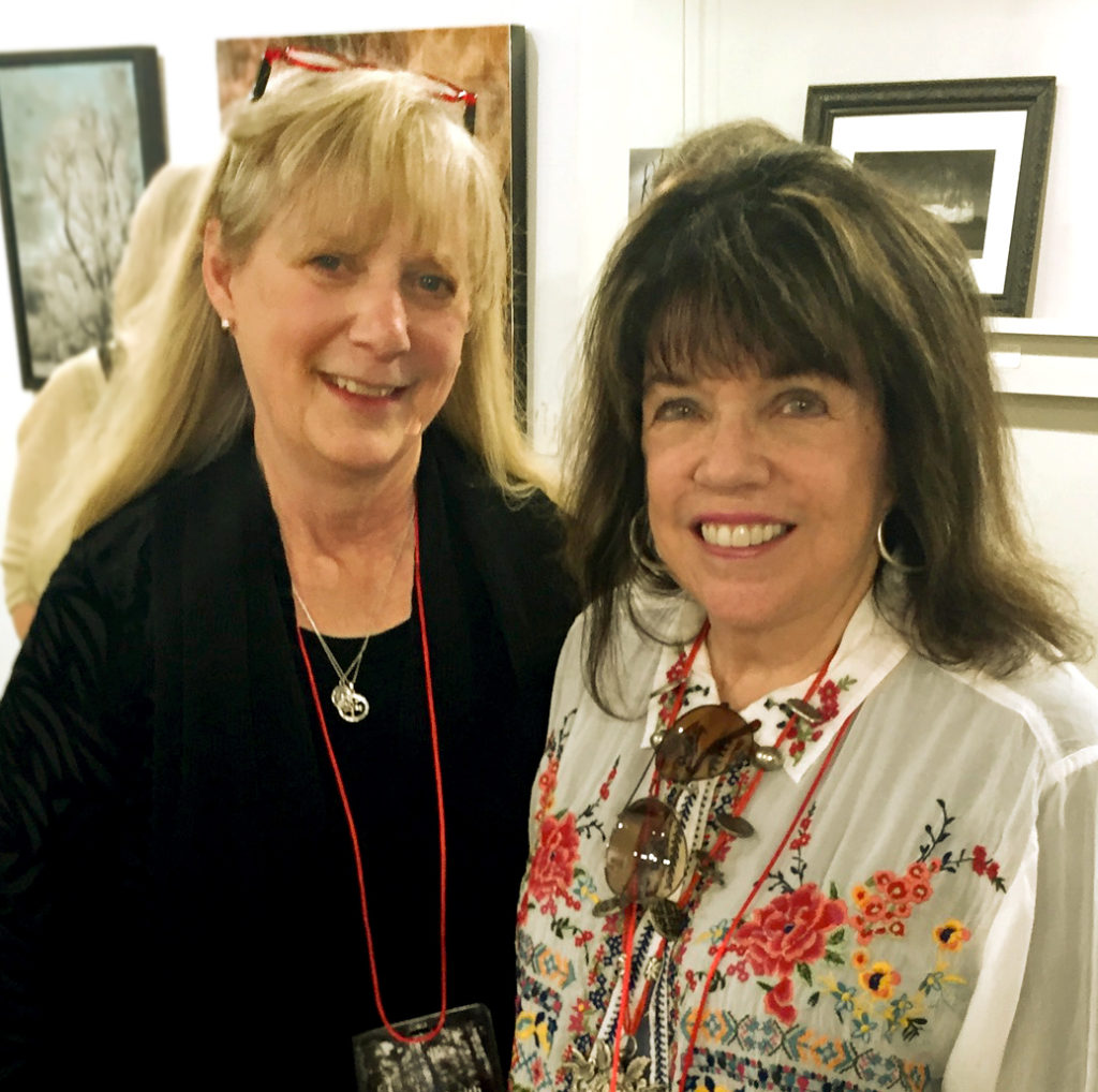
Amanda Smith and me at the ASmith Gallery last Saturday

Amanda Smith and me at the ASmith Gallery last Saturday

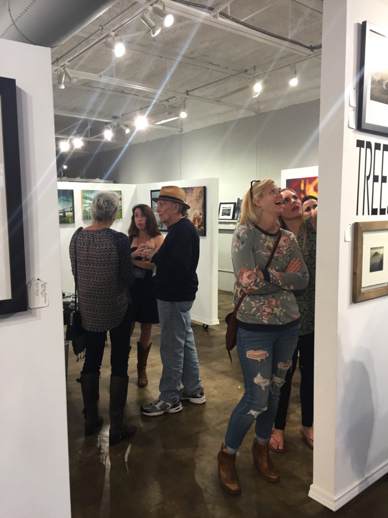
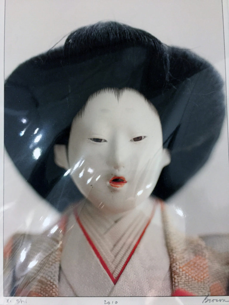
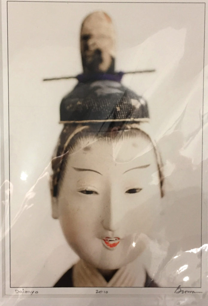
I also met two artists whose work resonated strongly with me. Pat Brown is the first. I was looking at matted work in the bins and every piece I picked up seemed to be hers! Here are two and, oops, all of the photos I took at the show that were framed have reflective light spots on them, but you can get the picture :).

6

pat2

The other artist whom I met (and whose work I loved) is Keith Kesler. Here is one of his photoencaustic pieces.

Keith Kesler

Keith Kesler

When he’s not wearing his artist/photographer hat, Dr. Keith Kesler is a Board-Certified Psychiatrist with an active psychotherapy and coaching practice in Austin, Texas. He and I talked about encaustic process. I got some great ideas about layers with tissue and wax from Keith. His work is very dreamlike and symbolic. Nice!

The theme of the photography portion of the exhibit was “trees.” When you visit the exhibit, take your time walking around the gallery walls – you will be delighted with the fascinating interpretations of trees through the eyes of master photographers. Here are just a few (please ignore the light reflections in the photos – these are taken with my iPhone)

Amanda has had a number of excellent photography exhibits at the ASmith Gallery – I had fun looking through her catalogs and at the archives on her website. Great inspiration! She also has a wonderful assortment of curiosities and small works that grace the walls and table tops.

12 14

Here’s the best news of all – if you’d like to make a quick trip to Johnson City (which is just a little over an hour north of San Antonio) and visit ASmith Gallery and the Nugent Avenue Art District, there is a second reception for this show on January 28, 2017 from 4 to 8pm. I’ll be there – hope to see you!

Save

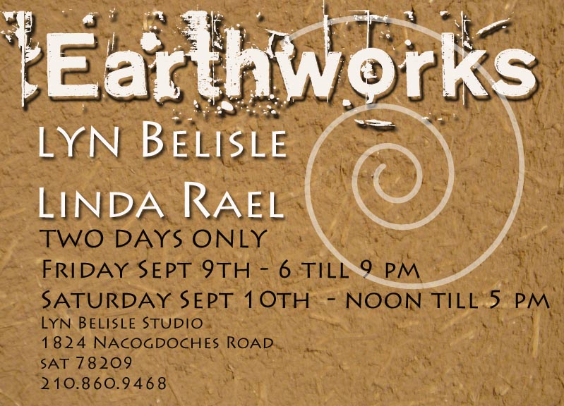
EARTHWORKS: September 9-10

She Cat – created by Linda Rael, owned and cherished by Lyn Belisle

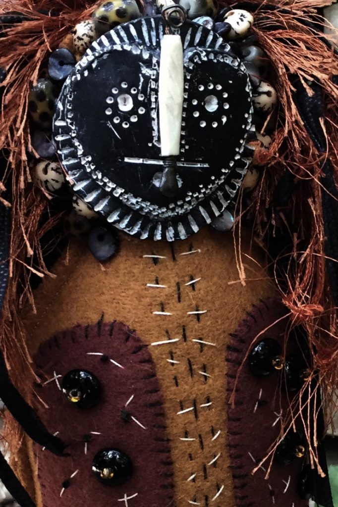
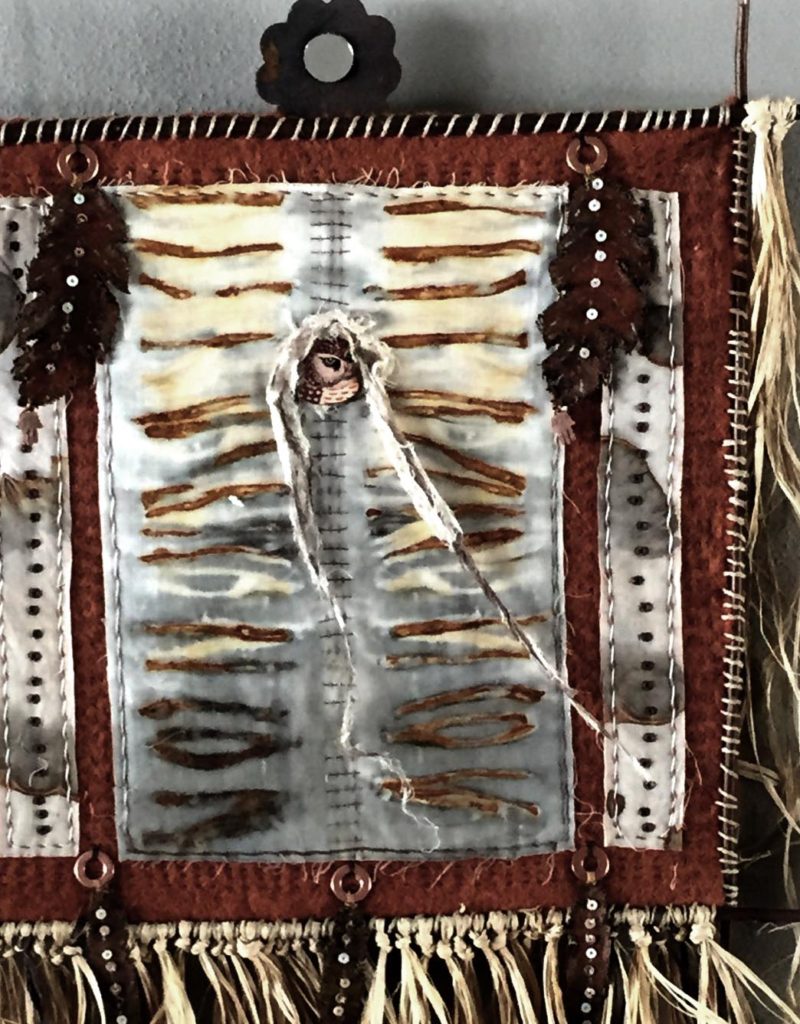
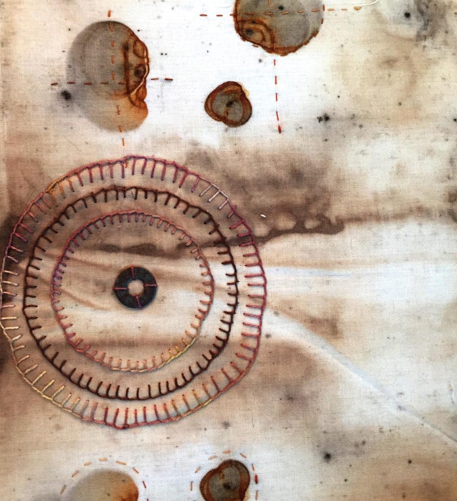
I know of no other artist whose works resonate in my heart as much as those of dear friend Linda Rael. Everything she creates makes me think, “Dang, I wish I had done that.” She incorporates animal bones and porcupine quills and rust and earth and tattered linen and other stuff that myths and magic are made of. I purely love her art!

Linda Rael 2016

Linda Rael – Fiber, Rust, Found Objects –  2016

It’s been a dream of mine for several years to collaborate with Linda on a show, and recently, over a long lunch, we decided to go for it! We are calling this show “Earthworks” – it reflects a direction that we’ve both been exploring, going to ground, leaving behind bright color and adding elements one might find along a stream bed or sacred path.

earthworks copy

The works will be on exhibit at my Studio for just two days during the second weekend of September. 

Many of Linda’s new pieces are fiber-based and hand-rusted with the natural patterns adorned and enhanced with hand stitching. My own pieces will be mostly sculptural, much like my neo-santo series, but less refined, more weathered.

Want to see a few sneak preview photos? Please take a look, then mark your calendar now because the availability of these works is limited to September 9-10 only.  You won’t want to miss this event – it’s always fun to visit the Studio, and I am thrilled that Linda is joining me in this amazing two-day exhibit called Earthworks.

Linda Rael 2016

Linda Rael 2016

Linda Rael 2016

Linda Rael 2016

Linda Rael 2016

Linda Rael 2016

Lyn Belisle 2016

Lyn Belisle 2016

Lyn Belisle 2016

Lyn Belisle 2016

Save

Save

Save

Save

Art openings this weekend – gotta love the San Antonio art scene!

awt

OK, all you local art lovers – we’ve got some gallery hopping to do this weekend. Friday night there are at least two don’t-miss openings.

The first one is at Blue Star (Studio Building B) , sponsored by the San Antonio Art Educators Association. Called “Artists Who Teach 2016,” this exhibit showcases the best art educators in the region. I got a sneak preview when I dropped off my work there.

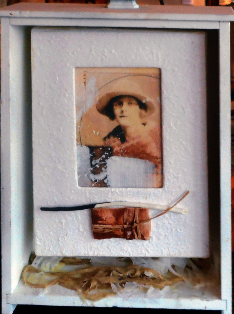
It’s going to an excellent show – I particularly loved Deborah Keller-Rihn’s illuminated photographs. This is one of the pieces I submitted, a photoencaustic assemblage titled “Loving Virginia Woolf” which was constructed inside a vintage drawer. Opening hours for Artists Who Teach reception are 6-9 pm.

virginia

Loving Virginia Wolff – encaustic and found objects – Lyn Belisle


Not far away at 1800 Fredericksburg Road, Centro Cultural Aztlan present an exhibit of new paintings by Andy A. Villarreal called Indigenous Jaguar Spirits from the Yucatan. Opening Reception is also Friday April 8, 2016 from 6-9. Andy’s work is powerful, colorful, and magical.

On Saturday, fiber art stars at the Fiber Artists of San Antonio Runway Show at Oak Hills Country Club. The luncheon has been sold our for weeks, but the vendors tables’ open at 10:00 and are always exciting. I know that Monika Astara will be there – if you miss her at the FASA event, she’ll be at my Studio on April 24th – more about that soon.

Bryce Milligan constructs hand-sewn chapbooks

Saturday evening is a must-see event – Bryce Milligan’s World of Words and Design opens April 9, 6-9 pm, at Bihl Haus Arts. Bryce (above) is a  Renaissance Man – poet, publisher, artist, designer, musician and all-around iconic fellow. The show opens with a reception, which is free and open to the public, on Saturday, April 9, from 6 to 9 pm. The evening includes poolside jazz by George & Aaron Prado, libations and light hors d’oeuvres. More on the exhibit and related special events here.

The San Antonio Art League and Museum

Last but definitely not least, The San Antonio Art League and Museum’s Annual Juried Exhibit opens on Sunday.  This venerable exhibit is highly competitive and was juried this year by Peter Trippi, Editor of Fine Art Connoisseur Magazine. The opening reception is this Sunday, April 10th, 2016 from 3 to 5pm. The SAALM is located at 130 King William Street.

I was thrilled to learn that two Belisle Studio alums (Gloria Hill, Mary Beth Swofford) were not only accepted but had won awards for their work – congrats, you guys!

Here’s a sneak preview piece from this exhibit by one of my favorite artists, Billy Keene, who is the SAALM’s 2016 Artist of the Year. Don’t miss this exhibit and one of the city’s prettiest gallery locations!

bk

It’s almost showtime . . .

coeur

danmeat

William Henke’s Uptown Henke Meat Market, now a contemporary art gallery

Michelle Belto and I went to Fredericksburg, Texas yesterday to check out the space for our upcoming duo exhibit at  Dan Pfeiffer’s gallery. The space is an architectural wonder, a 120-year-old meat market which Dan converted into a stunning art gallery.

Dan’s architectural background gave him a reverence for the original structure, and you can see lots of the original trappings of the market, such as the huge meat grinder, which looks kind of like a contemporary metal art object. Dan’s own work is fantastic – carved wood sculptures and furniture that are an amazing blend of artistic form and practical function.

_DSC3746_300ppiOur show is called “Coeur Samples,” and I thought of the name when Michelle first showed me her new sculptural pieces. They resemble blocks of iridescent material that could have come from the heart of a mysterious planet –  and they fit well with my PhotoEncaustic work which samples a moment in time through vintage photographs. “Coeur” is French for “heart” – so, voila – the show became Coeur Samples: Encaustic Explorations. Although Michelle and I have taught together many times, we have never exhibited together, so I hope you can get yourself to Fredericksburg to see our first-time duo show next month. Here are a few photos from yesterday’s visit with Dan at the gallery – we’re excited, and grateful to Dan for hosting our work in this amazing space.