Part of the fun of Thanksgiving is remembering all the food that we liked as kids, the stuff that came out only at holidays. I loved to watch my mother make “Ambrosia,” which is a Southern tradition. According to Alabama Chanin, “Ambrosia began appearing in cookbooks in the late 1800s when citrus fruit became more prevalent in markets across the country. These early recipes were very simple, usually including only orange slices, coconut, and sugar layered in a glass dish.”
Mother would spend a long time peeling, de-seeding, and sectioning orange segments, which made the kitchen smell wonderful. It was labor-intensive, for sure. She added coconut and pecans and Maraschino cherries. A bonus for me was getting to sip the juice from the Maraschino cherries after she had drained them – turns your tongue red and gives you a major sugar rush.
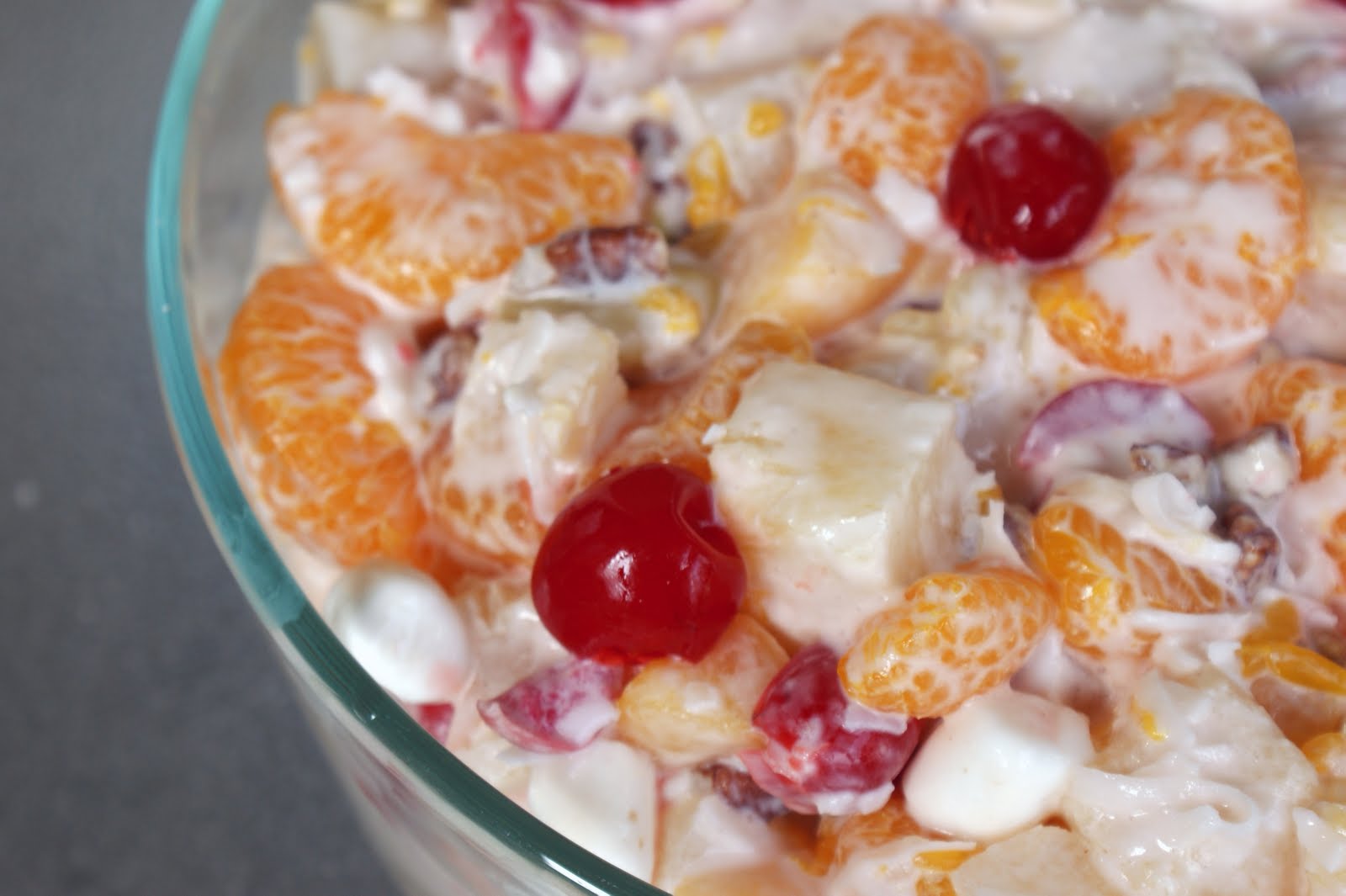
I’m making a shortcut version of Ambrosia this year, and so far, it looks pretty good. I have all of the fruit ready and will add the rest of the ingredients, including the coconut, tomorrow morning. It’s pretty already!
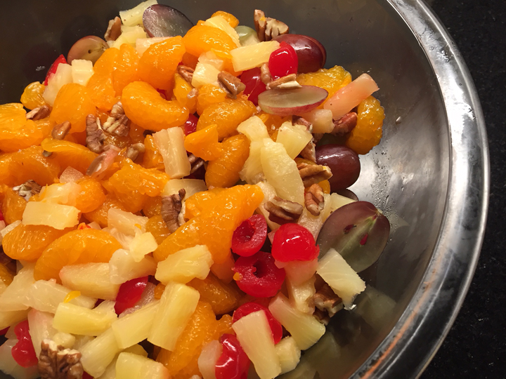
Shortcut Ambrosia in progress – trust the process!
Here’s the recipe if you want to give it a try – and if you can get to the grocery store today without losing your sanity.
Ingredients:
1 (8 oz.) tub of whipped topping, thawed
1 cup sour cream
1 (20 oz.) can pineapple tidbits, drained well
1 (15 oz.) can mandarin orange segments, drained well
1 cup red or green seedless grapes, sliced in half
1 1/2 cups sweetened coconut flakes
1 1/2 cups mini marshmallows
1 (10 oz.) jar of maraschino cherry halves, drained very well (optional)
1/2 cup chopped pecans (optional)
Then you just mix the whipped topping (think Cool Whip), the coconut, sour cream and marshmallows together and fold it in with the fruit. It’s neither huate cuisine or health food, but hey – it’s a Thanksgiving tradition!
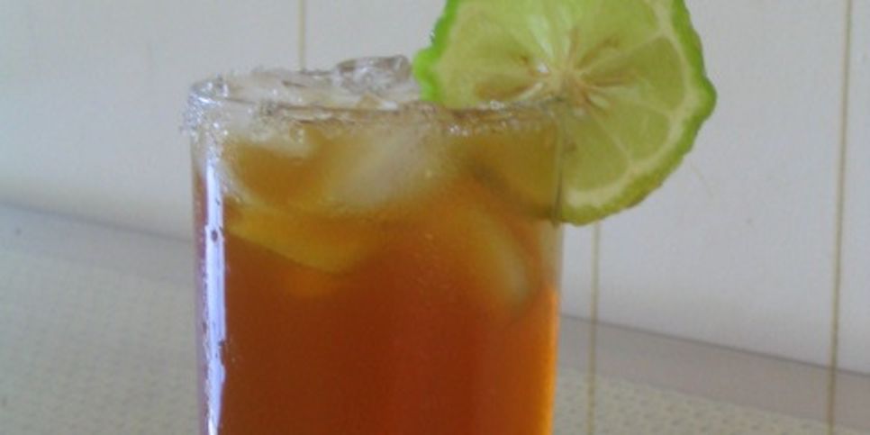
The “nectar” part of this post is Almond Tea, which showed up at a lot of Southern holiday parties. It’s a gusssied-up version of Sweet Tea, and it’s non-alcoholic so kids can have some.
Ingredients
3 tablespoons instant iced tea powder
1 cup white sugar
2 cups boiling water
1 (12 ounce) can frozen lemonade concentrate
2 teaspoons vanilla extract
1 tablespoon almond extract
Directions
In a 1 gallon container, mix together the instant tea powder and sugar. Pour in the boiling water and lemonade concentrate, and mix well. Stir in the vanilla and almond extracts. Fill container the rest of the way with cold water. Stir and serve over ice, or refrigerate until ready to serve.
Actually, you can just add a little almond extract to regular iced tea and it tastes great, different and kind of exotic.

I mentioned the Alabama Chanin Journal earlier – if you want an imaginative, feel-good source of information and inspiration, check out Alabama’s site and read about her beautiful and sustainable food, clothing and other makings. Slow Cloth founder Elaine Lipson introduced me to this journal. It’s a favorite.
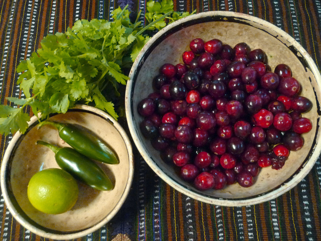
Finally, if you’re still in an “easy recipe” mood, take this link to my favorite Cranberry Jalapeno Relish that I published here in 2014.
I am so grateful to all of you for being SHARDS readers – Happy Thanksgiving!


 Some of you have been there – thanks! Because of downsizing, and new responsibilities at the