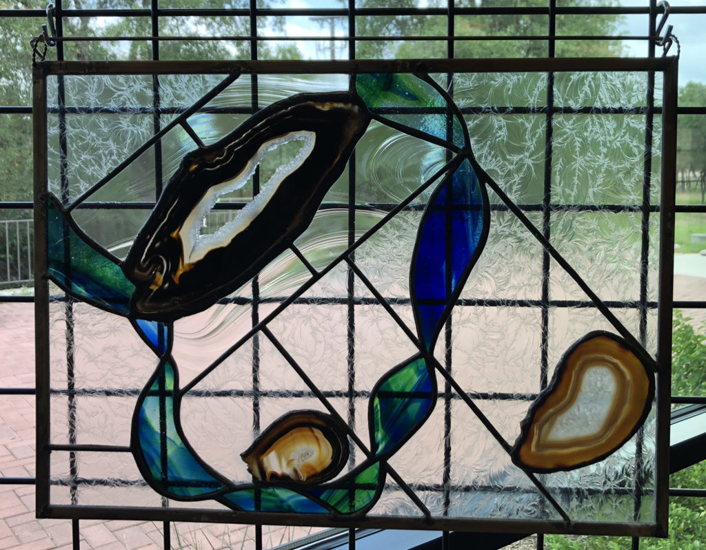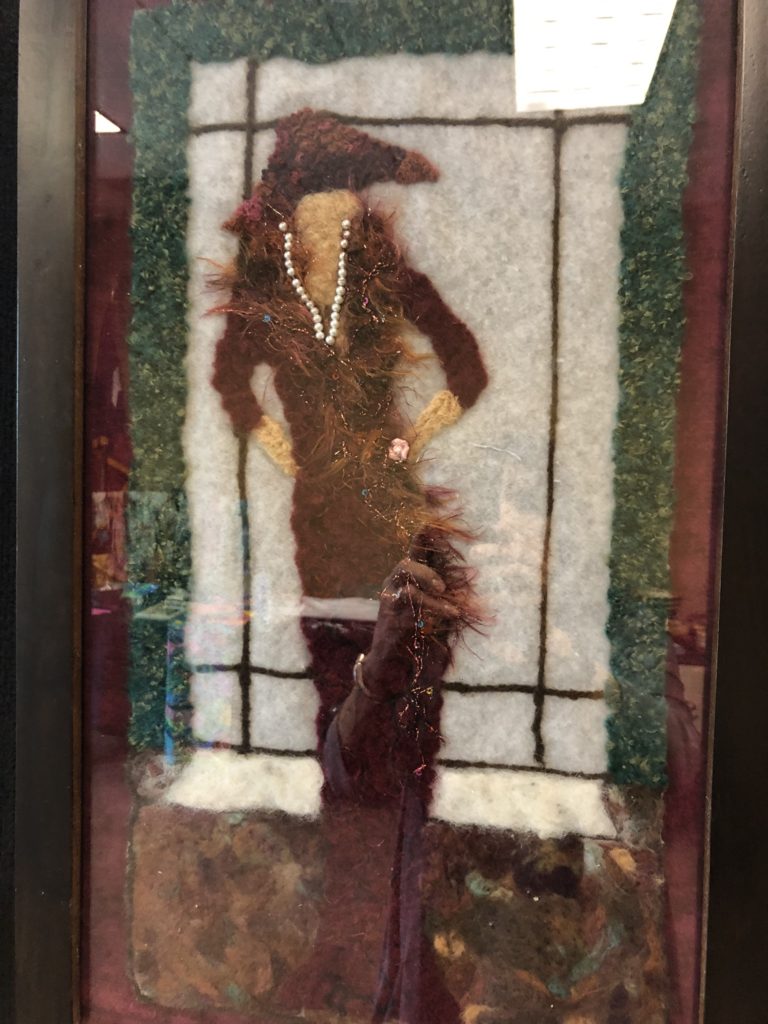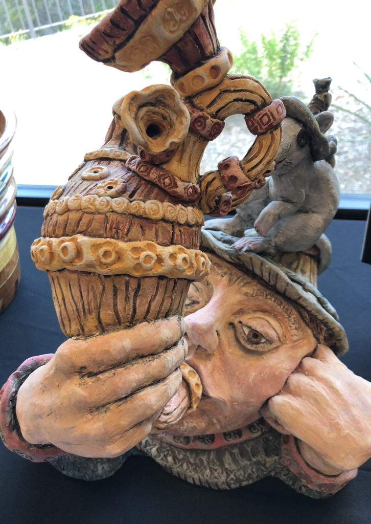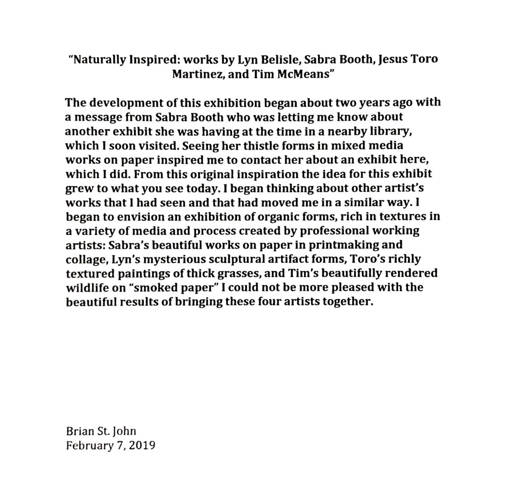
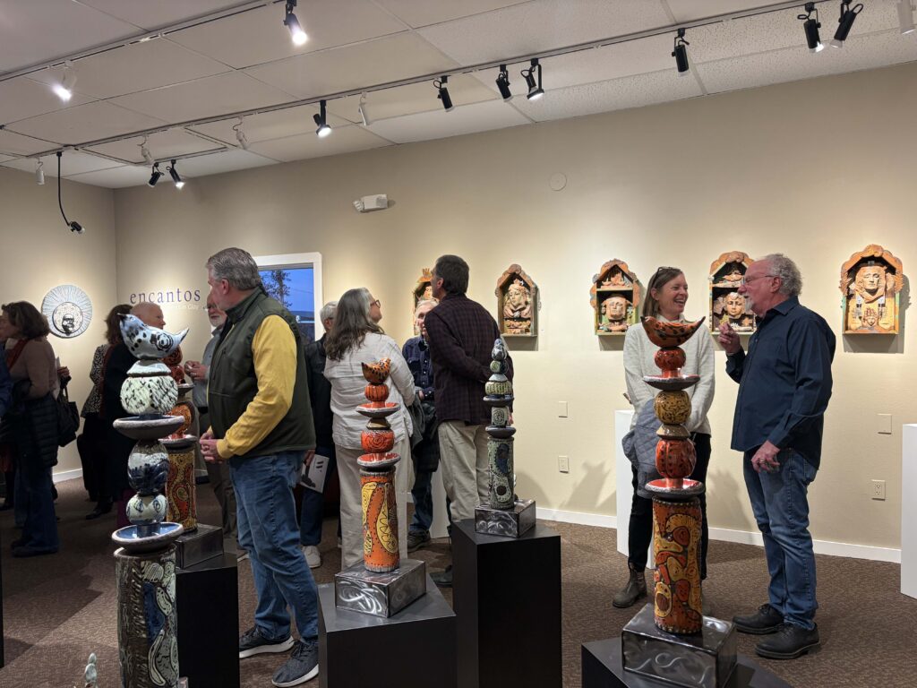
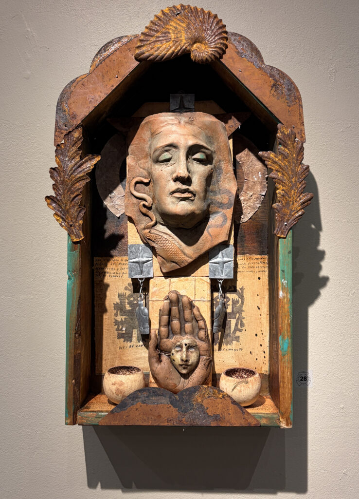
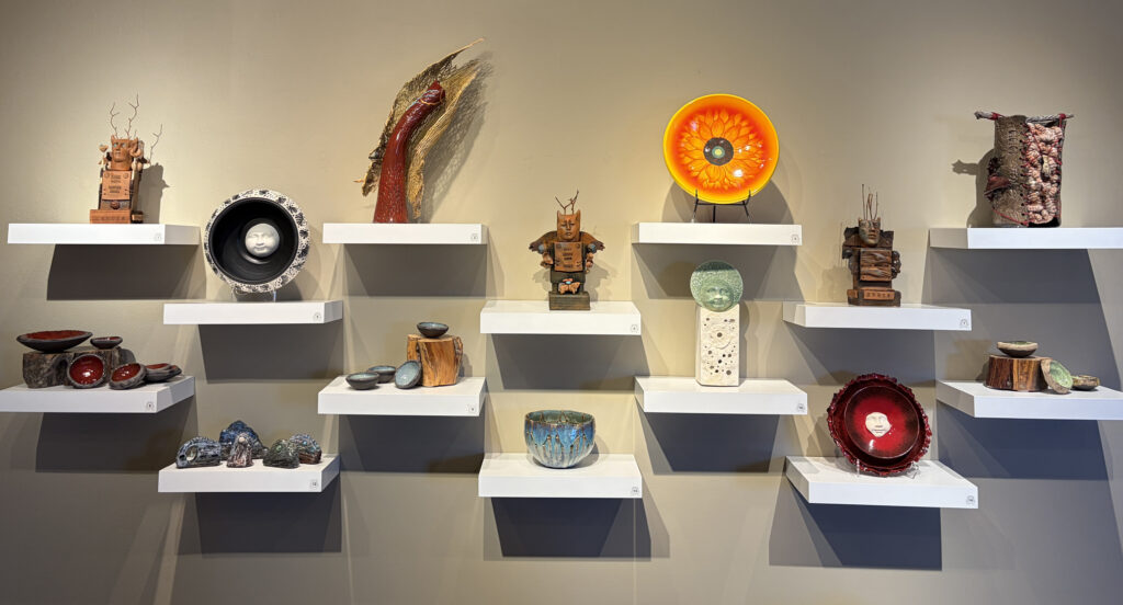
I just returned home from Taos and the opening of our Encantos Exhibition at the Taos Ceramics Center with fellow artists Linda Manning and Virginia and Andy Bally.
I’m still processing the experience. There’s a particular kind of moment at an exhibition opening that feels both exhilarating and disorienting—the moment when the work leaves your hands and begins its own conversations.
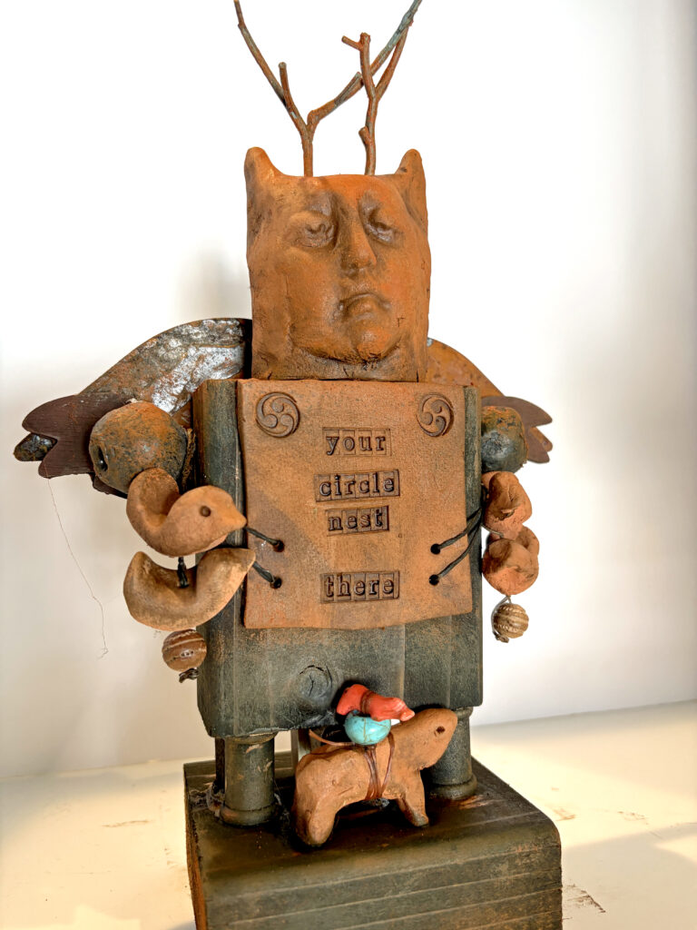
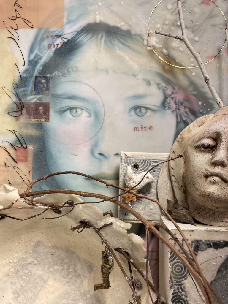
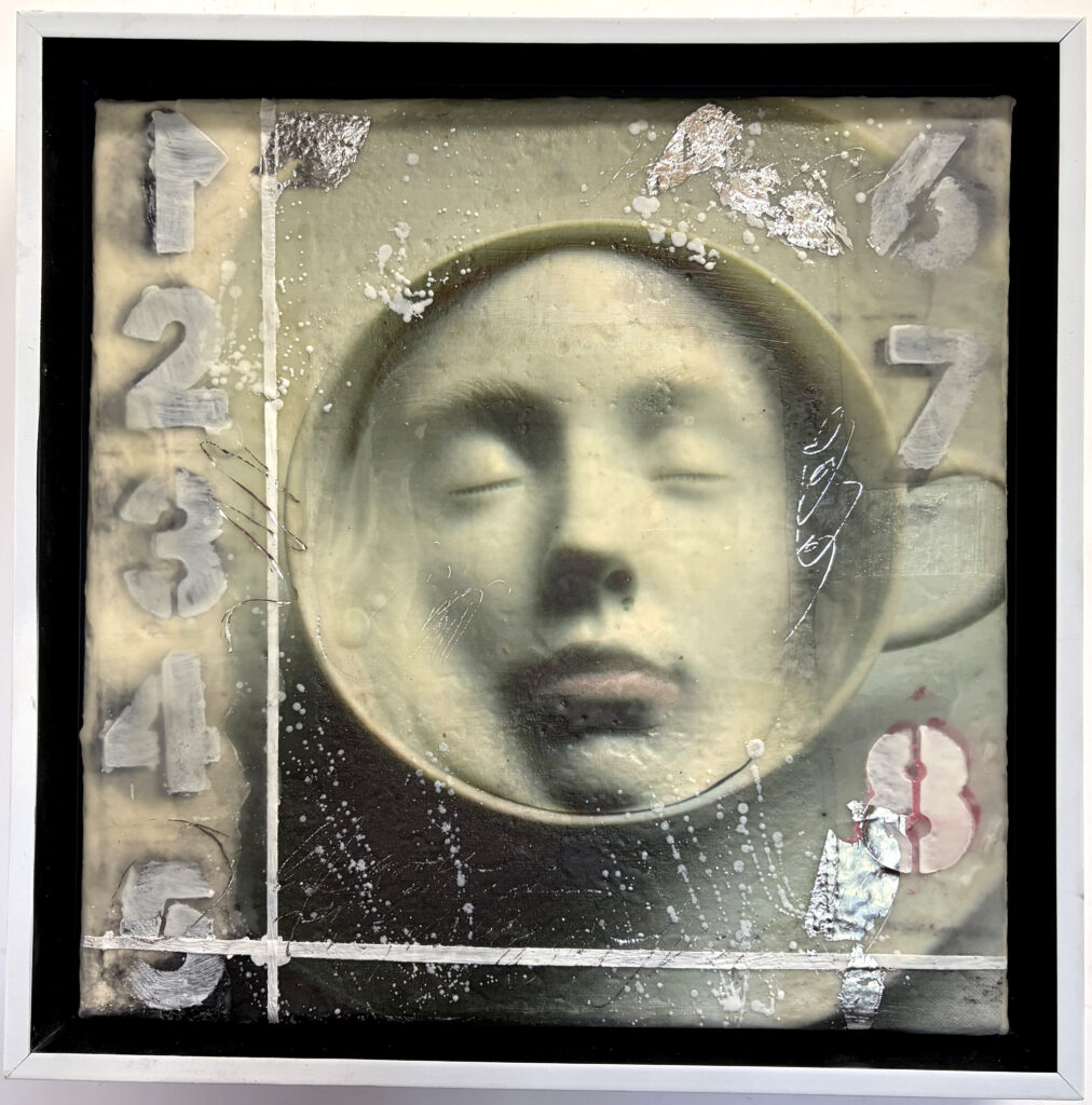
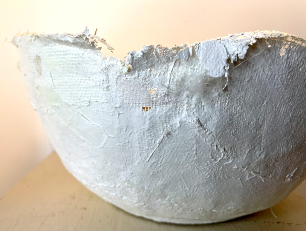
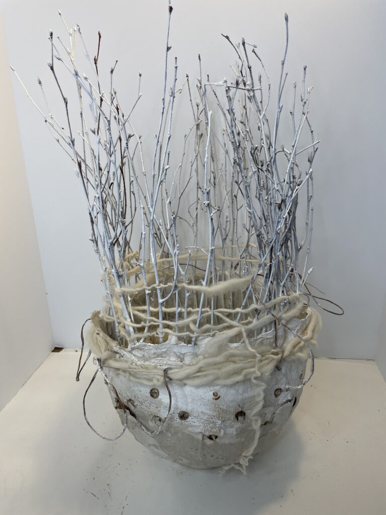
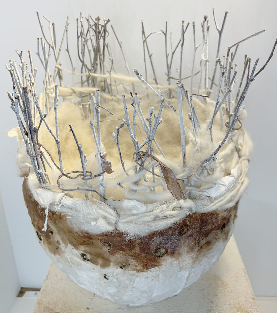
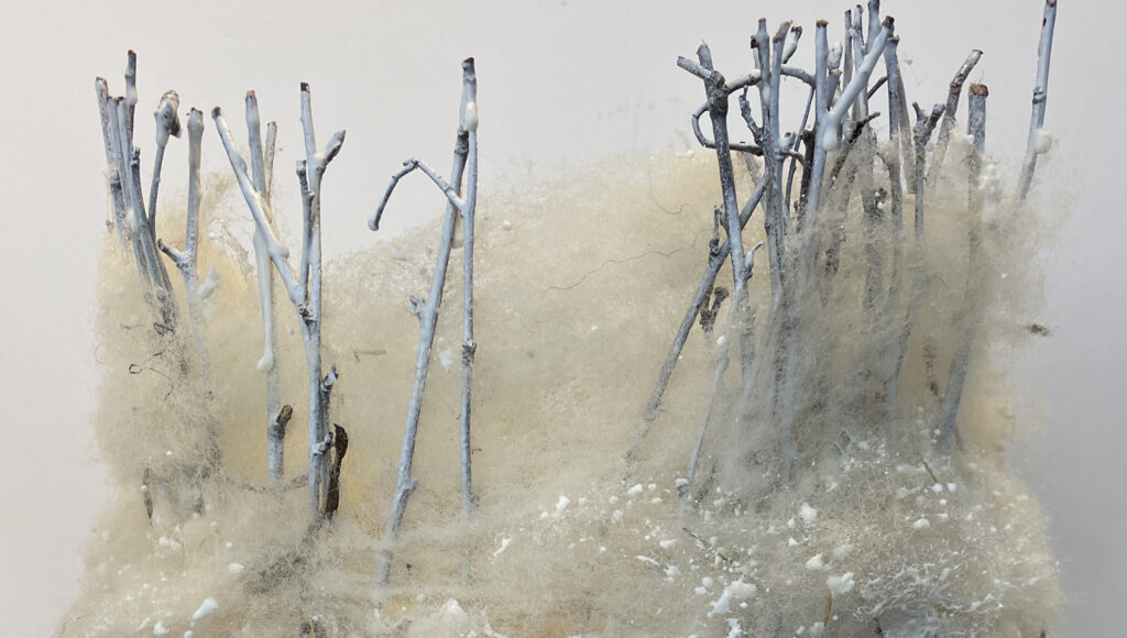
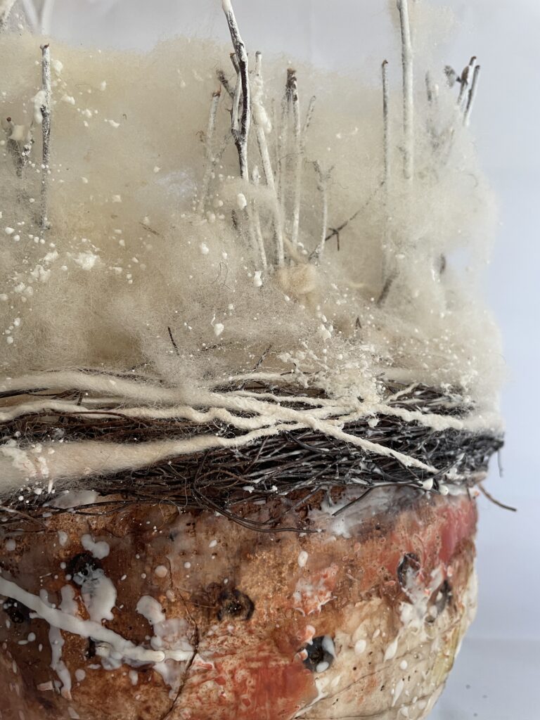
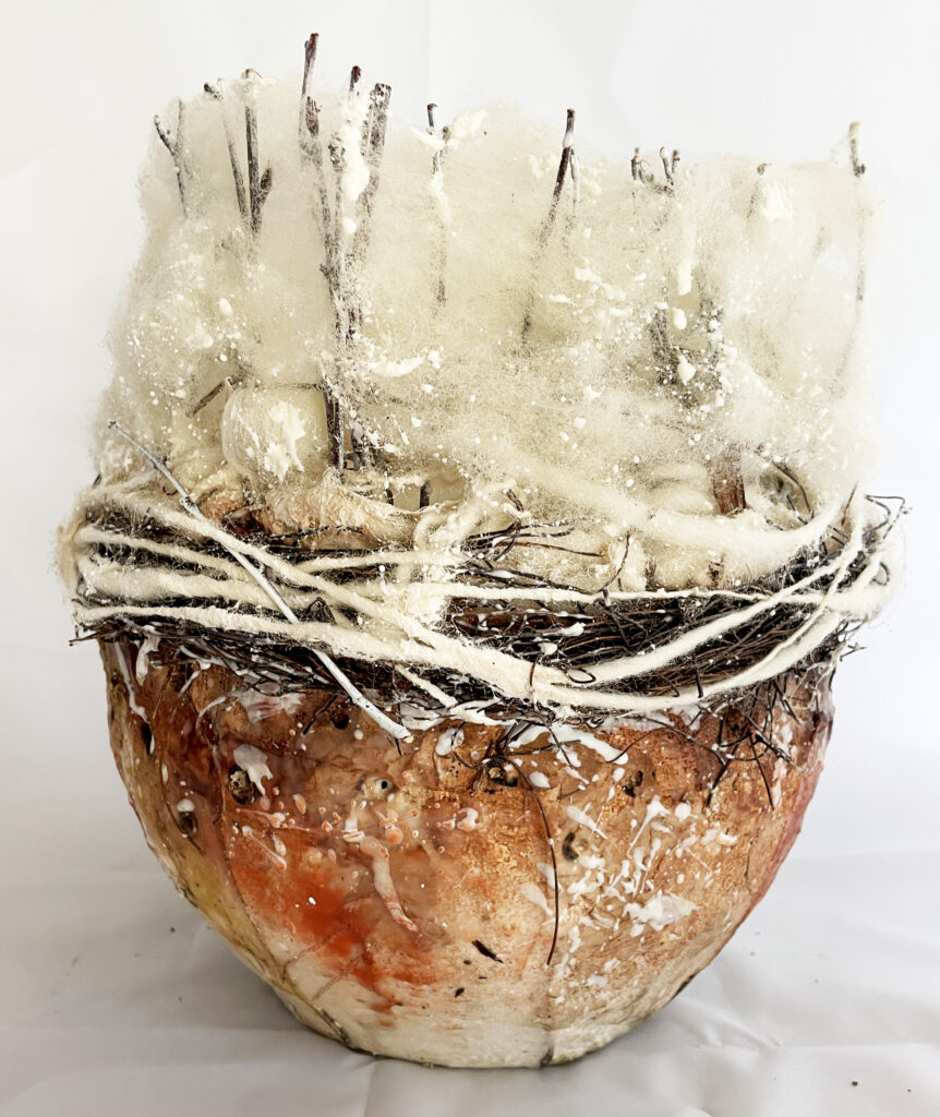
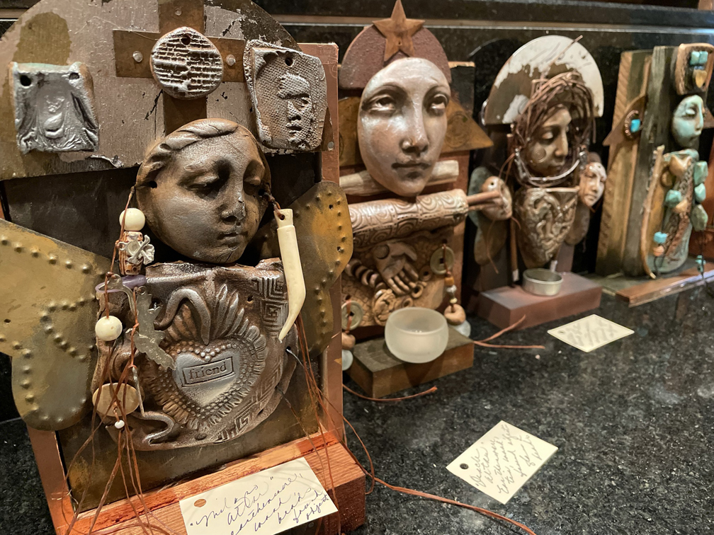
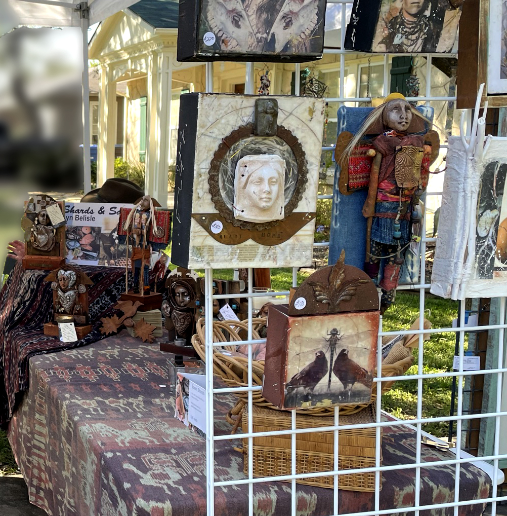
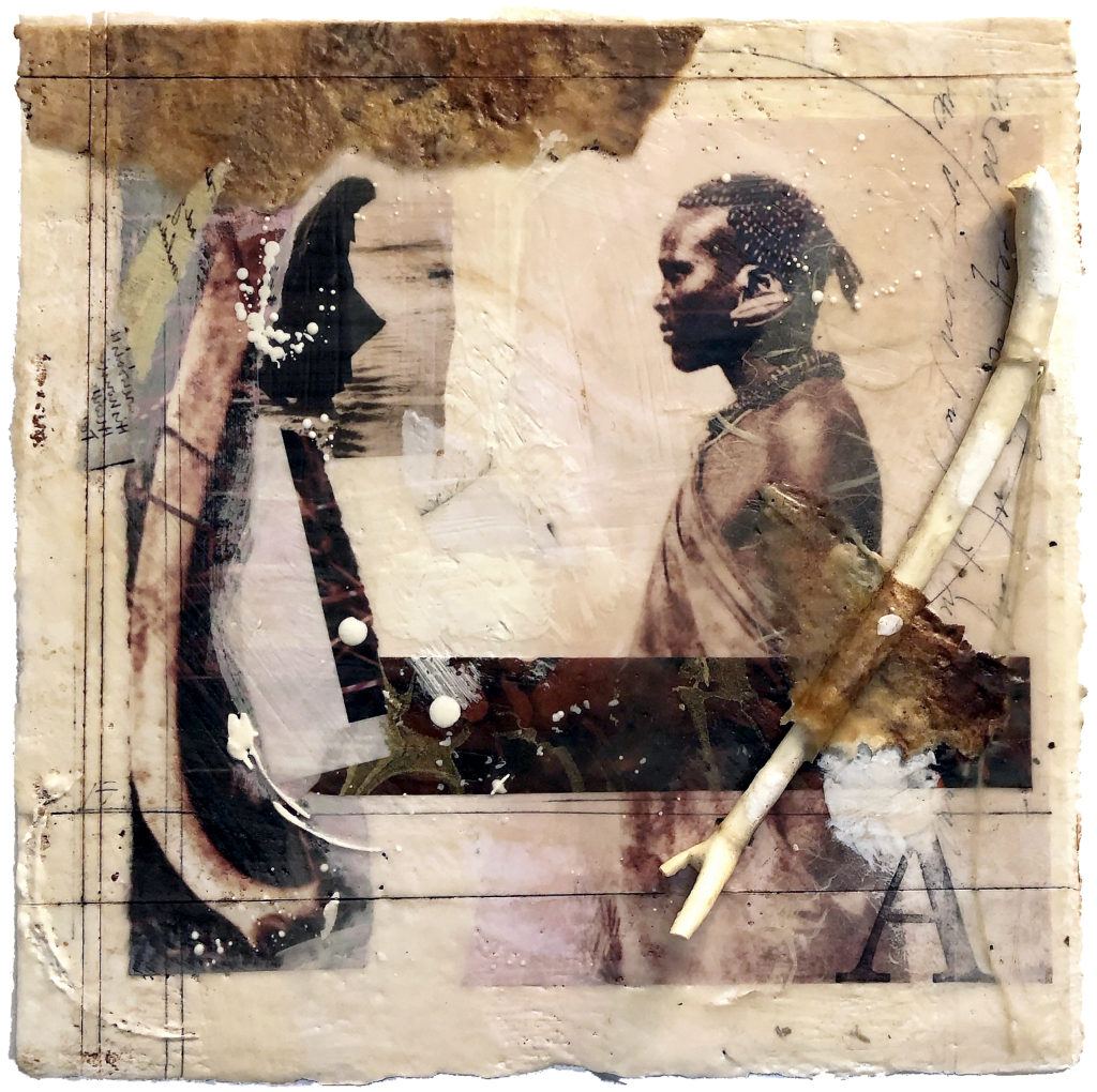
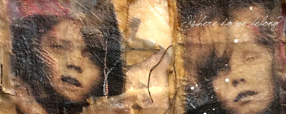
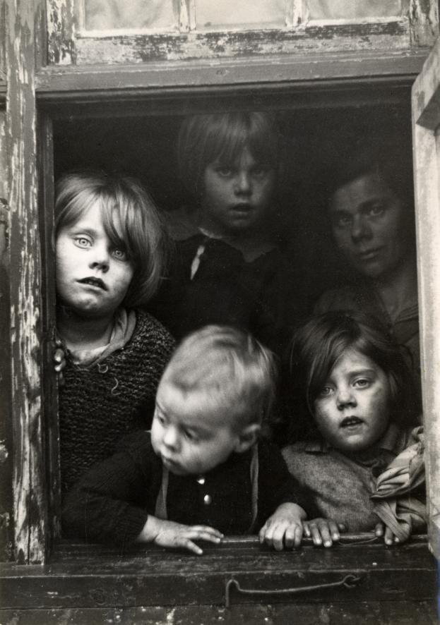
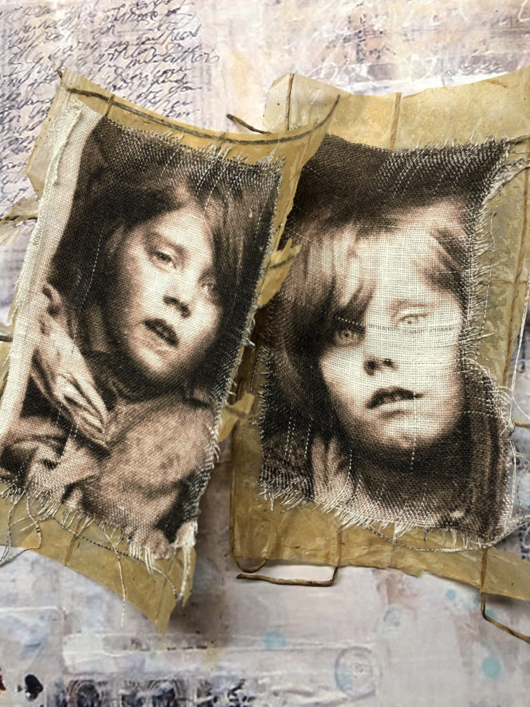
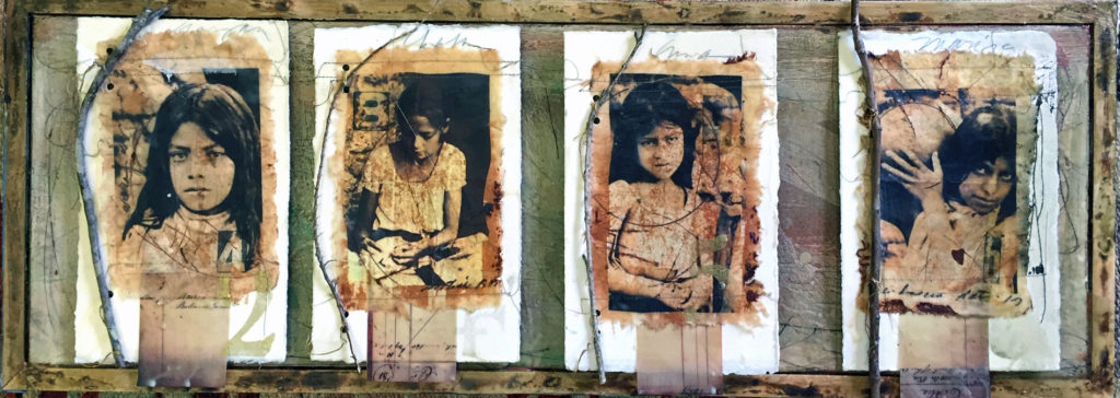
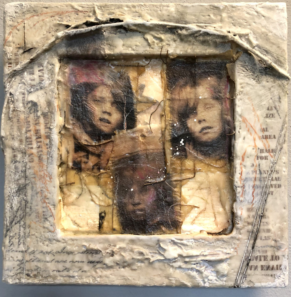
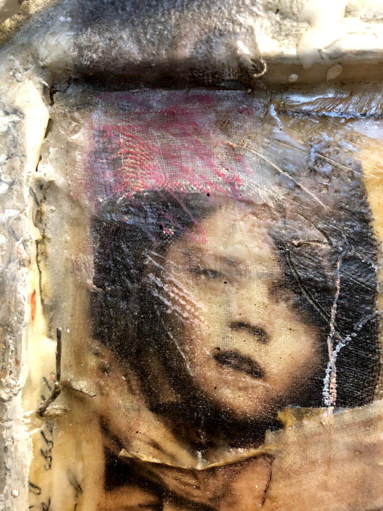
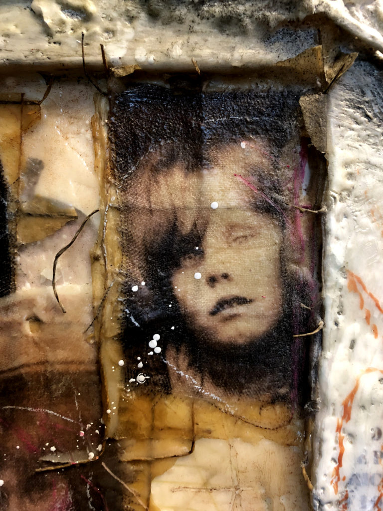
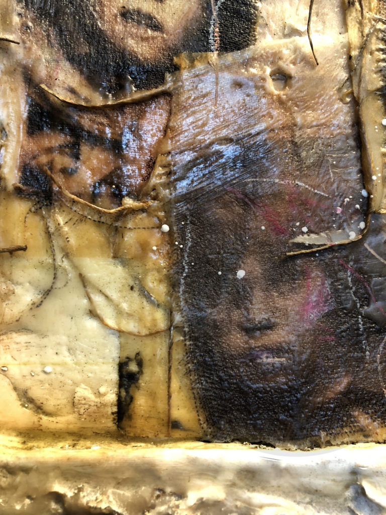
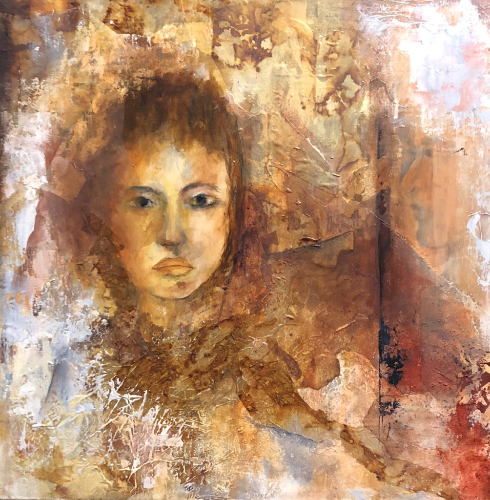
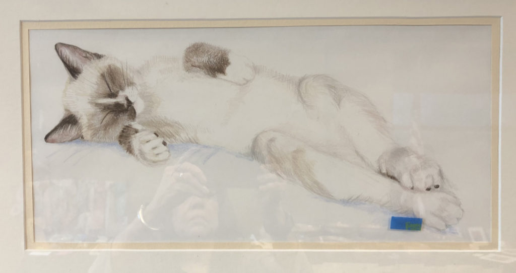
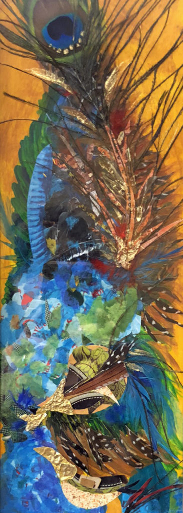
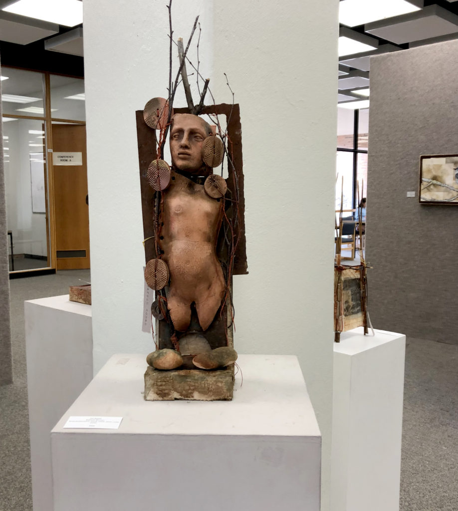
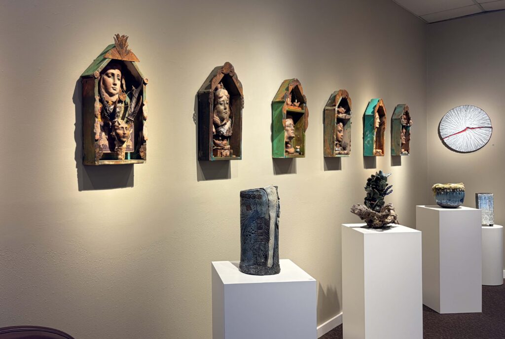
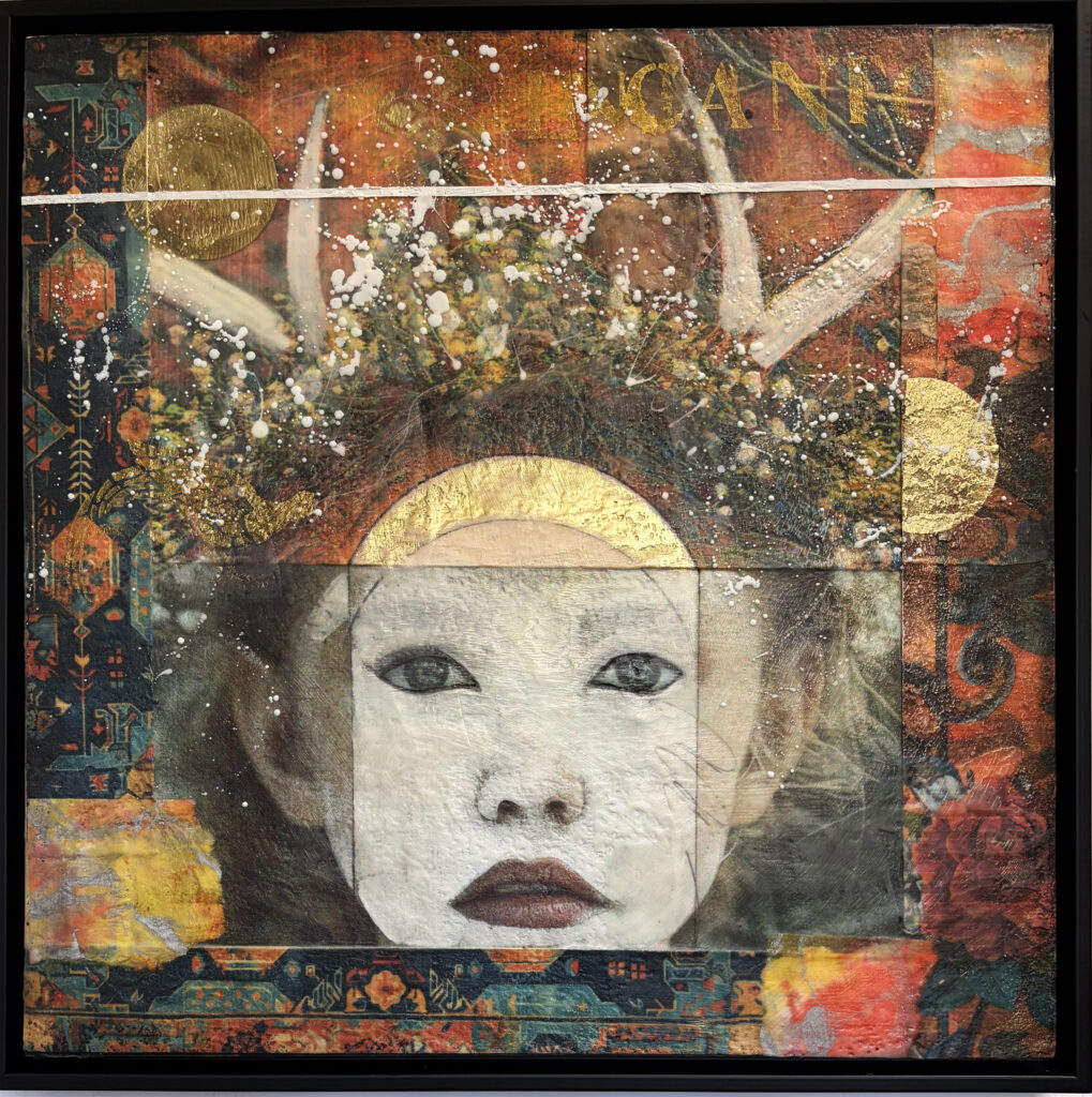
At the opening, that moment arrived quickly and unexpectedly. Within a short time, all four of the Santa Niña collages (below) had sold.
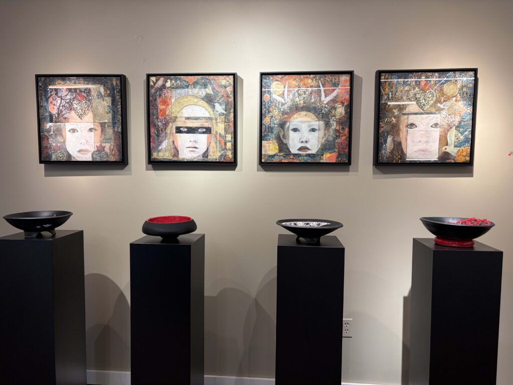
These were not the pieces I assumed would lead the way. I loved them, of course—but I hadn’t predicted they would be the first to be claimed. It felt less like a market response and more like recognition, as if those works had been waiting for the right room, the right eyes, the right moment to step forward.
That surprise relaxed me. It loosened and changed my expectations and opened me to the evening in a different way.
What followed was not just an opening, but a long, layered exchange—one conversation flowing into another. People asked thoughtful questions about symbolism, materials, saints and fragments, memory and devotion. I spoke about the work more than I usually do, and perhaps more openly. But just as important, I listened. I asked others about their work—their processes, their obsessions, the stories that quietly fuel what they make. And I learned so much.
There’s a misconception that openings are about standing beside your work and explaining it, as if clarity were the goal. But what struck me that night was how much richer the experience became when explanation turned into dialogue.
When I asked, “What are you working on?” or “What draws you to this?” the room shifted.
- Artists spoke about uncertainty, about being mid-question, about following symbols they didn’t yet fully understand.
- Two of my workshops students talked about the excitement of their new directions since we all worked together.
- Collectors shared what they live with, what they notice over time, what stays with them years after a piece comes home.
- An actor who “moved to Taos 55 years ago in the great hippie migration” shared with me his work on Samuel Beckett’s plays.
- And my new friend, Japanese/American architect and master woodworker, Sam Takeuchi came up from Santa Fe to talk about portraits.
It reminded me that exhibitions aren’t endpoints—they’re crossings.
Still, I won’t pretend that speaking about one’s work comes easily. There is something inherently vulnerable about explaining art that is born from intuition, memory, and personal myth. Much of my work emerges before I have language for it. The words come later—sometimes much later. Standing in front of people and trying to translate that interior process can feel awkward, even frightening. There’s always the fear of saying too much, or not enough. Or sounding pretentious or too woo-woo.
But then something extraordinary happens. Someone listens closely. Someone nods. Someone offers a reflection that mirrors back what you were reaching for—sometimes in language clearer than your own. And in that moment, the work feels understood not because it’s been decoded, but because it’s been met.
What Encantos offered me was a renewed trust in that exchange. Trust that the work carries more than I consciously put into it. Trust that certain pieces know where they belong Trust that conversation—real conversation—is part of the creative process, not a distraction from it.
I left the opening feeling deeply grateful: for the collectors who welcomed the Santa Niñas into their homes; for the artists whose generosity and curiosity enriched the evening; for the reminder that meaning doesn’t arrive fully formed in the studio.It completes itself in relationship—through artists like Andre and Virginia Bally and Linda Manning, whose thoughtful, generous work completed the Encantos cosmology and transformed the exhibition into a shared experience.
Encantos, after all, is about enchantment—not as spectacle, but as recognition. The moment when something familiar suddenly reveals depth. The feeling that a fragment holds a story larger than itself—and that night, I understood that Encantos was not an ending, but a threshold toward a new direction.
Thanks for reading!