Workshop: light a candle

Sometimes it seems as if the world gets scarier and scarier, and it’s awfully hard not to get discouraged. We just have to keep focused on creative ways to keep ourselves centered so we can continue adding a little beauty to life’s journey.
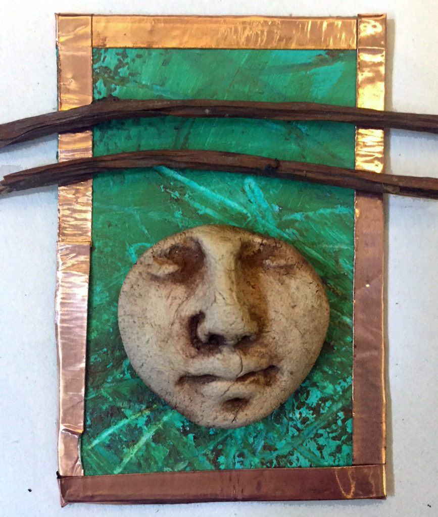
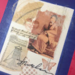
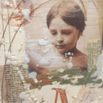
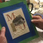
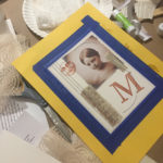
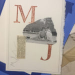
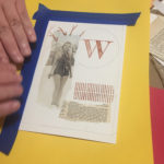
That’s not exactly the way I intended to talk about this upcoming workshop, but it seems fitting. I’ll be teaching once again at the San Antonio Art League studio on King William, and we’ll be lighting things up with a votive candle collage project. The date is Sunday, October 29th and the time is 2-5 PM.

I wrote about this project for Cloth Paper Scissors magazine a couple of years ago, but now I’ve added the idea of personal collage to the basic structure.

We’ll spend a relaxing three hours talking about art and life while we create these collage votive cards. I’ll provide all materials, including the little switch-on candles.

You’ll add your personal touches through the collage elements and the colors you choose.

There are four spaces left at this writing, and you can sign up here on my website.
A portion of the tuition will benefit the San Antonio Art League & Museum.

Let’s shine some light together. I am so grateful for you all —

Save

Assemblage assembly tricks – and a place to get inspired

Stick with me, Kid – I’m been furiously creating assemblages for the last month for Marta Stafford’s First Friday opening in Marble Falls – be there!

“Assemblages” by definition mean you have to stick stuff together, and I’ve learned more about attaching stuff to other stuff than I ever thought possible. Here’s a quick look at some adhesives and glues and how I use them.

GLUE STICKS:

I use these to tack layers of lightweight material to each other before attaching them to more permanent surfaces. In this photo, you can see that the layers of amate paper are stuck together to keep them from shifting. I’ll go over the surface with beeswax soon, but right now a glue stick is perfect to keep them from shifting. I like Scotch Permanent glue sticks, BTW.

E6000:

If you have two different materials, such as clay and wood (below) and can weight the pieces for several hours, E6000 is a great solution. The self-leveling formula forms a powerful bond with most any material and will remain flexible once cured. You just have to be patient (which sometimes doesn’t work for me).

HOT GLUE GUN:

This is the method I most often use in my workshops because you get an instant bond. You can work quickly and It is the most versatile adhesive you will find. I have had some pieces come loose after a few years, so I discovered a trick that I’ll share.

When you are ready to hot glue two objects together, such as a clay face to a piece of archival matboard, put a small dab of E6000 on the substrate and then hot glue the objects together right over the E6000. The hot glue will bond immediately, and the E6000 will cure gradually and provide a stronger bond. And you get instant gratification.

2P10:

I have to thank my contractor for this tip – he told me about this stuff. Man, 2P10 is scary strong and scary fast! The piece below got its designed changed because I made a crooked bond, but it turned out great – happy accident.

You have to be absolutely ready to make the attachment and work quickly. I would advise you to practice with some scrap pieces before using the two-part system. Follow the cautions. But if you want to glue a Volkswagen to a tree, this is the stuff for you!

This piece has metal glued to paper glued to clay glued to wood glued to canvas – etc – but 2P10 works on almost all surfaces. Use with care.

Hope some of this helps you with your own assemblages.

BUT WAIT!! If you want to see some of the most beautiful assemblages in the universe, go to the Bijou Theater tonight at 6:00 for Celebration Circle’s Altar show!!

ONE PEOPLE, MANY PATHS: The Sacred Art of Altars 14th Annual Exhibit & Silent Auction is a must-see!

Tickets are just $15 and are available at this link.

Here’s a list of participating artists, and you can bet you’ll be inspired to get out there and glue stuff to other stuff after you’ve seen this spiritual altar assemblage exhibit!

Maria Alvarado, Zet Baer, Lyn Belisle, CeeJay Black, Bill Bonham, Pam Bryant, Susan Calkins, Sofia Dabalsa, Susan Damon, Steve Daniel, Lynn Denzer, Sandy Dunn, Jane Dunnewold, Dani Ferguson, Sarah Ford, Betty Franklin, Karl Franklin, Joan Frederick, David Anthony Garcia, Skip Gerson, Suzy Gonzalez, Martha Grant, Rudi Harst, James Hendricks, Jon Hinojosa, Dawn Horten, Jagwired Art, Julie Jarvis, Joy Jimenez, Stefani Job Spears, Amy Jones, Deborah Keller-Rihn, Mark Kohnitz, Kevin Lewis, Fontaine Maverick, Marcia Rae McCulley, Jeff McDaniel, Beverly Meyer, Kathy Miner, Jose Mojica, Susie Monday, Alexandra Nelipa, Ray Palmer, Cindy Palmer, Junanne Peck, Cynthia Phelps, Kathleen Pittman, Theresa Powers, Tomas Ramirez, Thom Ricks, Patsy Sasek, Ron Schumacher, Bill Simons, Chuck Squier, Jodi Stauffer, Melanie Strybos, Pamela Taylor, Dean Valibhai.


In retrospect . . .

Delaware artist Rebecca Raubacher at her retrospective exhibit, Rehoboth Art League

What is a “retrospective”? In art-speak, it’s an exhibition showing the development of the work of a particular artist over a period of time. I met Rebecca Raubacher last Friday in Rehoboth Beach, Delaware, at an event honoring her and her retrospective show at the Rehoboth Art League. Here’s one of her early drawings.

Debby, Rebecca Raubacher, 1976

Talking with her got me thinking about how our paths as artists change and build over the years. Rebecca has always been a consummate draftsman, and her current paintings have a lot of mixed media drawing techniques with oil sticks and metallic inks. Her themes of faces and figures has continued throughout her career.

Rebecca Raubacher, 2015, Watercolor, graphite, sepia ink, and metallic and opaque markers on paper 11 in x 14

So here’s the question for you – have you gone back recently and looked at your earlier work? (This is not a “have-you-gotten-better” question – who even knows what “better” is anyway.) And it doesn’t matter if you’ve been making art for one year or fifty. All of us choose what to keep and what to leave behind. That choosing and abandoning gives us our “style.”

Thanks to a house fire in ’83 (arg), I don’t have much of my earliest undergrad work back in the 60’s. I did take a photo of this piece called “Datachip” which I did in 1979. It’s hard to get a good photo of a drawing behind glass, but you get the idea.

Lyn Belisle, Datachip, graphite and PrismaColor, 24×30″, 1979

Shortly after that, I abandoned drawing for a while and started making a series of large-scale origami kimonos and other large collages which sold well in the ’80s and ’90s.

And like a lot of other artists, I was doing commercial art along the way, like these covers for the NEISD Community Education program – they were mostly collages, too:

And my love for clay has always followed me around – here’s a bowl I did in the 80’s – faces and clay!

So the things I’ve kept are clay, collage, images of faces, and earth colors. I’m still experimenting within those areas. And, overall, the idea of “shards” – constructing new things from small found objects, images and clues from the past, connects the dots for me.

Go back and look at your own work. What colors and themes and images predominate? I read a lot of those advice-for-artist blogs that say, “Get out of your comfort zone! If you like neutrals, go wild with color! If you like watercolor, try oils!” I don’t necessarily agree. Our style develops from our intuition about what we do best.

Our personal retrospective journey is just that, a journey. We take what we discover along the way and build on it. More likely than not, the work of other artists influences us but it doesn’t define us as we keep what resonates and forgo the rest.

So your homework is to find the oldest piece of personal artmaking that you have, and give it a good look. Post it on Facebook if you like! See what changes you’ve made. Think a bit about your personal retrospective. It’s fun and enlightening.

Georgia O’Keeffe, drawing of hand, age 14


Save

Save

Save

Monika and more – spectacular art-to-wear for fall

New from Monika Astara – Alison Jacket “Tapestry”

Monika Astara is one of those designers who makes everyone look good. Her garments are created individually from artful fabrics and her patterns are designed to flatter. If you have some of her designs, you understand, and you love them as much as I do.

Sooooo – I’m delighted to announce that Monika will be in San Antonio on Saturday, September 30, for a Trunk Show from 11-3. And she’ll have it in my home! Talk about convenient for me (and for you).

Monika is also getting pretty tech-savvy! She just sent me this short video of some of the things she’ll be bringing. Wow, love those silks!

MA Trunk show Invitation Sept. 30, 2018 from Lyn Belisle on Vimeo.

So here’s the deal – if you’d like an invitation to see this fabulous collection, just send me an email for directions and details. Monika always has deep discounts for my friends – woohoo!

______________________________________________________________________

But wait! There’s more!! My friend Mary Ann Johnson from the Fiber Artists of San Antonio has organized an evening with Doshi, nationally-known fiber artist who will be here to juror the annual FASA Exhibit.

Doshi creates exquisite hand dyed clothing in original designs that range from contemporary to traditional.  Shibori, an ancient Japanese textile dyeing process, is the method she uses for her artistic expression.  The technique uses knotting, pleating, rolling, pressing or sewing during the dyeing process.  The resulting designs are the memories of the method used to resist the dye.

Doshi’s wearable art is represented in numerous galleries across the United States.  Buyers are invited to browse the on-line catalogue or, better yet, come to the Trunk Show while Doshi is here in San Antonio!

It’s going to be so much fun seeing these new designs and getting a special look for fall. Fiber art-to-wear is everywhere this fall – look at this Artful Home collection. – but we will have a better selection right here in San Antonio at these two Trunk Sales.

Now, I’m off to the Fiber Artists meeting where we will be hearing from another nationally known artist, Elaine Lipson.  In 2007, inspired by the Slow Food movement, she began to form and write about the concept of Slow Cloth. Her textiles writings articulate links between food and fiber, the importance of sustainable and ethical production practices for artists, designers, and entrepreneurs, and the joy, contemplation, and connections inherent in any textile medium.

I can’t wait to hear her and see her work! Come join us at the Garden Center at 10:00 this morning if you want to learn more – it’s free, and guests are welcome.

Fall and Fiber Art go together like peanut butter and jelly, love and marriage, ham and eggs, Pancho and Lefty . . . . get your art on!


Critters for Marta

Marta Stafford

One of the nicest surprises of the summer came from the amazing Marta Stafford, who invited me to be a part of her hugely popular gallery, Marta Stafford Fine Art, in Marble Falls.

This is a dream come true – I loved Marta’s gallery from the first moment I saw it six or seven years ago.She has the absolute best in mixed media, sculpture, contemporary and traditional painting, and more. Marta will represent me and my work (woohoo), and I’ll be featured in the exhibit that opens Friday, October 6th.

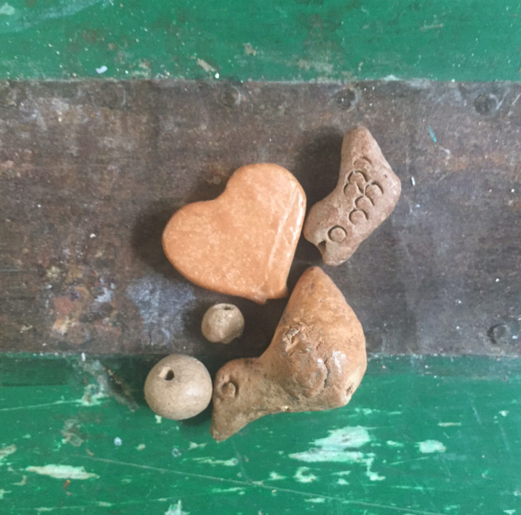
I need to create some nifty new work for this show, especially imaginative assemblages, so I started digging around for earthenware body parts! Heh, heh.

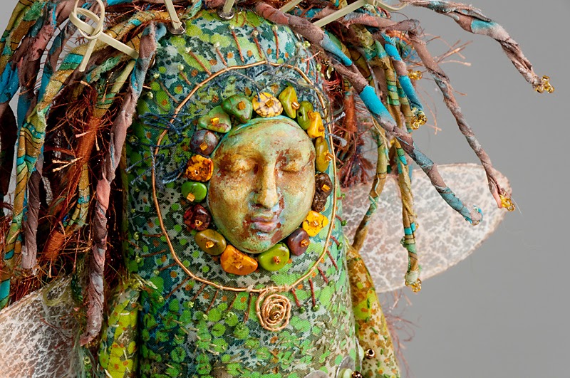
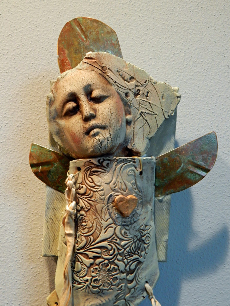
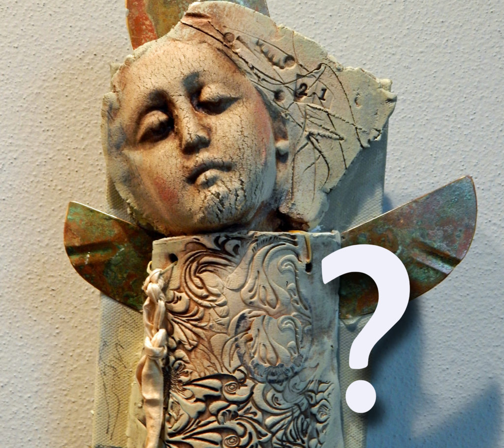
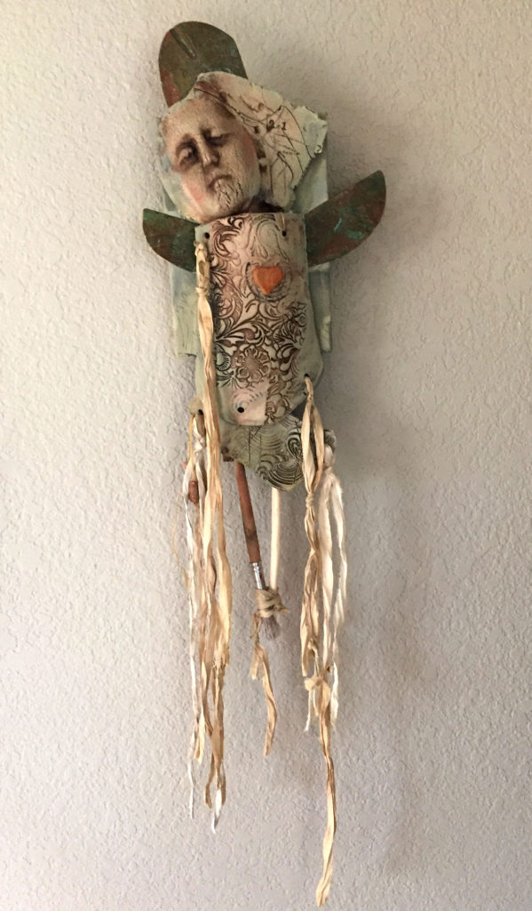
It’s so much fun putting my clay shards together with found objects and watching new critters emerge. Here’s the progress so far – some are not finished, as you can see – perhaps you can see where they are going? One never knows, do one?

This is a details of a piece I really like

There is actually another face underneath the one you see. Her arm moves in a sweet, spooky way – she’s about 12″ tall.

Save

Save

Save

The one below is just started, but I like the simple elegance so far.

When finished, this piece will be about 18-20″ tall

Shades of spirit dolls! This construction, below, has some hand-dyed and rusted mulberry paper.

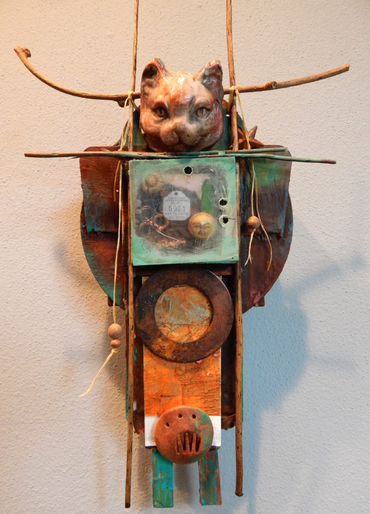
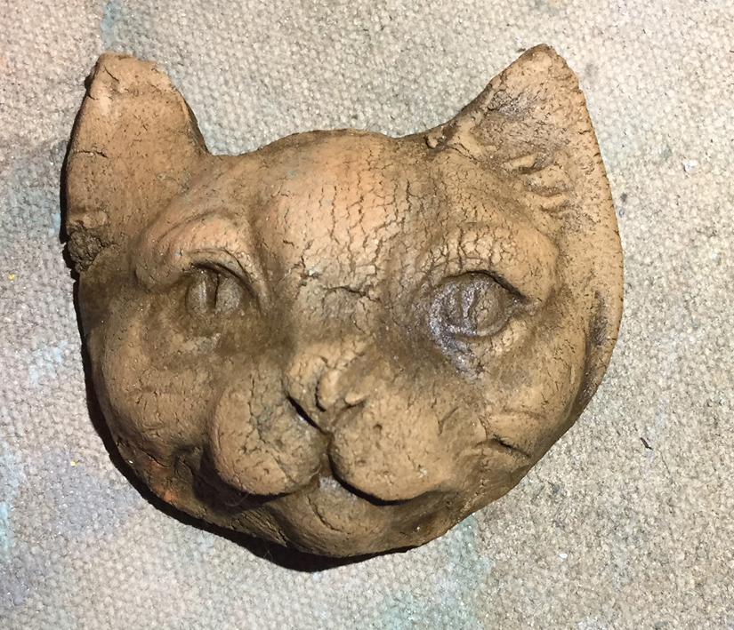
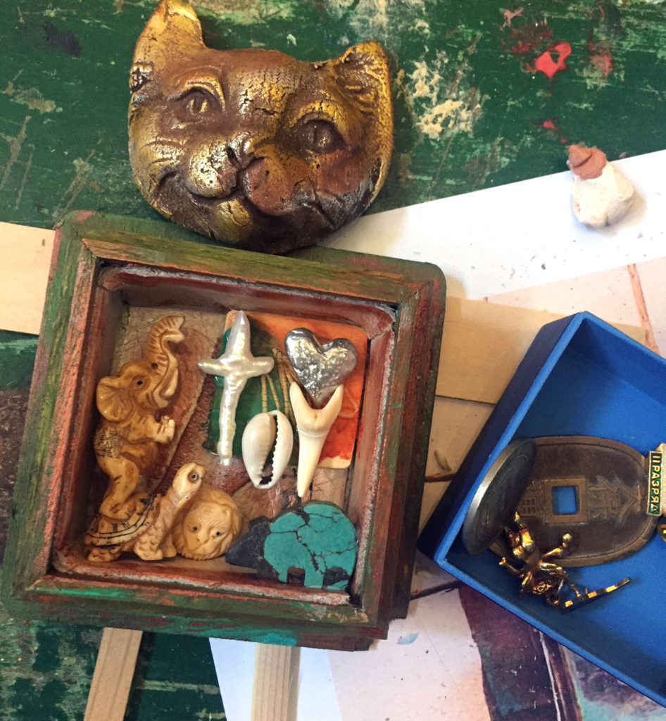
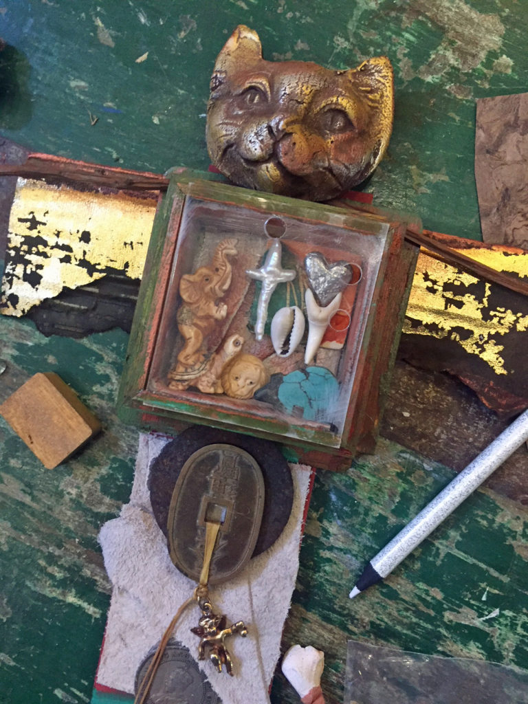
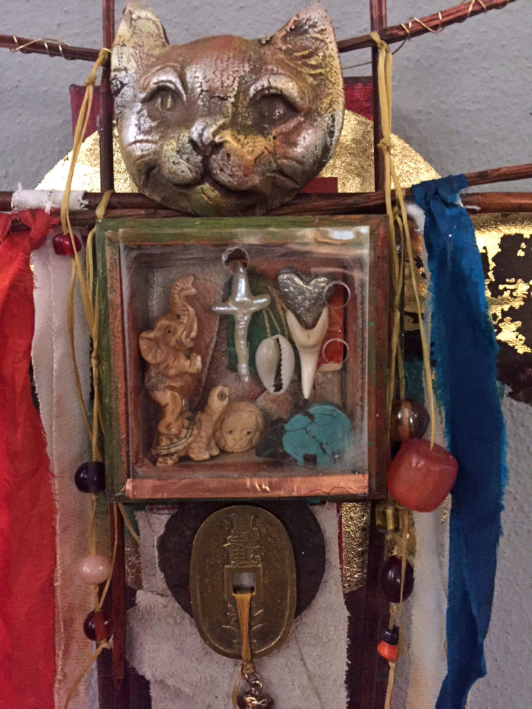
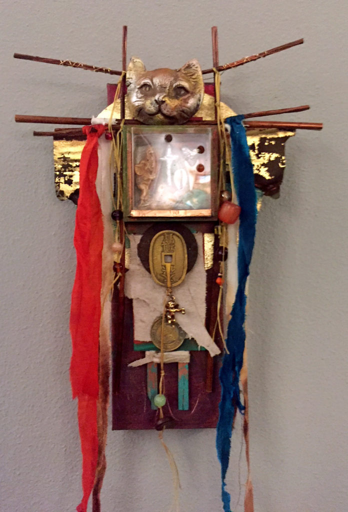
And while I was looking for clay body parts, I found this cat head! It’s now a new Cat Shaman.

Finally, here’s one I started a couple of weeks ago and it’s finally starting to come together. It looks like some sort of ancient goddess staff.

So far, every piece is different from every other one interesting.

I plan to have a number of these assemblages as well as some paintings and collages for Marta’s opening on Friday, October 6th at the Marta Stafford Fine Arts in Marble Falls.

Thanks, Marta, for the invitation – prepare for a critter invasion! ♥

Save

Save

Save

Goodbye, ol’ pal – CraftArtEdu closes doors, leaves freebies

Waaa-aay back in 2013, I wanted to learn how to teach online classes. CraftArtEdu was a place I’d heard of from another artist, so I emailed them and asked if they needed teachers. They told me to develop a proposal, and they’d give me 30% of the tuition (wow) that I earned.

So I designed a simple composition class that later became the AB3 System that I’ve taught at workshops all over the country.

In retrospect, CraftArtEdu wasn’t really a good fit for me since most of the classes were about polymer clay, but I learned how to upload lessons and how to create content. I didn’t earn much money at all, but I’ll always be grateful to them for what I learned in my first time out on the Internet.

Now they are closing their doors – but they are leaving behind a library of free intro classes on Vimeo that you might want to take a look at. Most of these are photo-based rather than video based. There’s still lots of good step-by-step information, though. For example:

You can check out all 166 of these freebies at this one link:

All of them are short, basic lessons that might give you some inspiration. I have to say, the video lessons and DVDs I’m doing now for Artful Gathering are a lot more rewarding, but you gotta start somewhere, and CraftArtEdu was that place for me.
Thanks, Donna and Vern! Adios!

Save

Save

Hurricane worries

Yesterday, I was working on a blog post about a new project, and, as all of us here in South Texas, was distracted by worsening news about the hurricane looming off our coast. That blog post is on hold until the storm is over – too hard to think about anything else.

The photo above is the current view of Hurricane Harvey as I write this. It’s a menacing spiral, not the nice kind of spirals we use in design, but spirals come from nature, and this is definitely a natural but blessedly rare example. We have friends and family in the Corpus Christi area, and some have already evacuated here to San Antonio.

What do artists do when they have to wait and worry? Well, one way they cope is to use the event for inspiration and try some creative distractions. It helps with the waiting.

Here’s the first creative distraction – spirals. I found this tutorial on drawing them.

How to draw an Archimedean Spiral

This is an easier method than trying to draw the “Golden Spiral” that you see in ammonites (and hurricanes).

And while I was thinking about tidal surges and monsoon rains, I remembered another project that I used to love (and still do). It’s called “Monsoon Paper,” and it was invented by art and business coach Quinn McDonald.

Quinn McDonald’s “monsoon paper”

It involves literally allowing rain to create natural pattern on paper that has been prepared with water media. Here’s a link to the instructions.

Quinn McDonald Monsoon Paper Tutorial

Now it’s back to watching the Weather Channel and waiting for updates from loved ones – be safe, everyone! Like all storms, this one will eventually pass.


Revival! Workshop at the Art League studio opens new doors

Nine pioneering participants joined me on Sunday to test-drive the decades-old studio space at the San Antonio Art League & Museum.

Our workshop was called “Postcards to Myself” – it’s all about learning to trust the creative process without exactly knowing where it will take you – no preconceived notions allowed.

Here’s a little video of the intuitive work that the participants created during the three-hours session.

Lyn Belisle, “Postcards to Myself” -The First SAAL&M Workshop from Lyn Belisle on Vimeo.

The time together was fun and informative. One of the best parts was the feedback everyone gave about the space itself as a venue for workshops and art gatherings. We all are excited about its potential and had plenty of ideas for improving the old studio to make it even better. Our wish list so far . . . .

  • lots of skylights!
  • another bathroom!
  • more storage space!

I’m determined to find funding to make this studio space even more vibrant as it comes back to life. It would be a perfect place for guest artists, small lectures demonstrations, and beginning art classes. It’s already very accessible.

If you’re interested in attending another session of “Postcards to Myself” at the Art League Studio in the next month or so, send me an email. And stay tuned to what’s happening at The Studio of the San Antonio Art League & Museum by signing up for our newsletter here on our website.


Save

Save

Save

Save

Save

Save

SAAL&M meets the phallic alien claw

The favorite so far, but not yet a winner

So let’s talk logos – the results are in. And, boy, are they mixed. Overall, designs 2 & 3 were the favorites but we still have lots of work to do to perfect a new logo for the San Antonio Art League & Museum.

I wanted to share some of your comments so you can see what a funny, complex job it is to design a logo for an organization. Among my favorites were, “The tree looks like an alien claw,” and, simply, “Phallic.”

These particular comments came from the online survey, although I received lots more via email and messaging.Here we go:

LOGO #1

SELECTED COMMENTS:

  • This is my first choice! I don’t care if the background color is green, but I like the overall feel of this logo the best❤️
  • nope the “A” look like arrows that go nowhere
  • This one feels a little chaotic to me and my eyes keep getting drawn to the “arrows and away from the pertinent info
  • I like this one best because it says today, modern, forward thinking, and it shows respect for yesterday. I would like to see it with small green triangles added to both large triangles.
  • the swoop after the T is distracting, although i love that graphic. the two triangles, of which one is an A, are confusing.
  • My favorite because of the triangle shapes. Eye catching.
  • I don’t like this one. The downward-facing arrow that’s connected to the arch has a negative vibe to me….as if it’s suggesting “down with art”.
  • Phallic
  • Not too crazy about this one. Not sure why.
  • Don’t like the triangles
  • First choice

LOGO #2

SELECTED COMMENTS:

  • Does not really reflect art but only the building
  • This is my favorite.
  • Nice but not my first choice.
  • I like this logo the best! The Turquoise and black stand out and the image of the house gives it a lot of flavor. What about the paintbrush from #3 placed under “& Museum” on its side? #3 is my second choice. Not crazy about the background color.
  • nope like the building but not the branch in front of it looks like an alien claw
  • This one is my favorite. I love the whole package. #3 is my second choice. They all look great.
  • My fav! I emailed you with comments about each one…Your survey page worked!
  • I like this one!
  • My favorite, hands down! Easy on the eyes, the relevant information is right up front, and then I’m drawn to the lovely rendering which captures visually the historic nature of the place.
  • This one would certainly encourage me to go there… love the design in the circle.
  • I like this one the best
  • Probably my favorite.
  • hard to see the photo. why is there a tree branch?
  • don’t like at all
  • This is my favorite. The circle suggests timelessness, and the type names who you are – in plain, simple letters. You might play with the color, however. The teal blue feels dated.
  • classy. favorite
  • I think this is my favorite. And since you like that bronze color, in my mind’s eye this would look fabulous in bronze!
  • LOVE LOVE LOVE this one.

LOGO #3

SELECTED COMMENTS:

  • This is my choice. Simple, elegant and to the point
  • This is the one I like best–crisp and clean, “ART” stands out, love the contrast of the vintage-looking brush against the contemporary lettering (because I did like the architectural elements in the 1st two logos).
  • I like the bold letters. It is contemporary!
  • This is super easy to read. ART being the main focus. Simplify, simplify……..great logo. Anne Brennan
  • Like the design although paint brush might lead people to only think of painting.
  • yes yes yes classic classy tells it like it is
  • I don’t care for this one. It’s not clear (maybe I’m dense) whether I’m seeing a brush or a table leg. 🙁 Of course it’s a brush because it’s art but then there’s the change in text direction. Despite the clean lines, it feels like too much to figure out at a glance.
  • The color and graphics say it all – and, in spite of no visible purple, draws me in.
  • My second choice
  • looks scatological, under the A. colors are not interesting.
  • clean, simple. love the colors: I personally like black and brown together.
  • This one is too busy, and nothing is gained from the paintbrush coming down from the ‘A’.
  • paint brush is overused
  • Not crazy about this one either.
  • OK, not very exciting
  • Third choice

LOGO #4

SELECTED RESPONSES:

  • I was too busy trying to look at the background drawings before I got around to reading the Museum part… last choice
  • I don’t like the purple and the logo is very hard to read and distinguish what it is advertising.
  • nope too busy
  • My favorite!
  • Here, I feel frustrated trying to figure out what the image is and what the dots mean. It also feels too top-heavy to me, despite the grounding line at the bottom. Please pick #2 – it’s perfect! (Let us know what you decide.)
  • What about this one in the bronze?
  • hard to see, and the purple dots don’t jibe with the (column?).
  • I like this too. The & symbol is a little lost. King William District could be a little larger.
  • This would be my second choice, but I don’t understand the meaning/reason behind the circles up top. A few suggestions: 1. Eliminate the dots/circles at the top, 2. make the top and bottom horizontal blocks less deep, and move the “In the King William Historical District” line up so that it is closer to the top of the bottom block.
  • might run into problems with the purple
  • This is probably my second choice. But, like you, I’m not too fond of the purple color here. … Also I think I don’t care for the placement of the King William banner; maybe it could be thinner: just tall enough to hold the letters. ???
  • Too confusing
  • Last choice

Thanks for all of the comments!! The are hugely helpful – I’m going (literally) back to the drawing board and refining your favorite designs – stay tuned.

Designer Milton Glasser said, “There are three responses to a piece of design – yes, no, and WOW! Wow is the one to aim for.” That’s what we wanna do for the San Antonio Art League and Museum!

Save