They found their wings. . .

. . . and, boy, did they soar! The women in yesterday’s class surpassed every expectation I had for our NeoSanto workshop, creating beautiful symbol-filled personal icons on canvas. And, as Robin said during our critique, “This is much more than just a canvas.”

I showed you the construction process in my last post, but what the students brought to it was the intangible sense of self. The idea of the NeoSanto is to interpret the traditional “santo” figure from the Southwest into a personal guardian. What resulted was one of the most meaningful art-making sessions and discussions that I can remember. I was honored to be there!

Take a look at their work in the video, below.

This may be the subject of the next workshop eBook! Many thanks to DeeDee, Pam, Robin, Marilyn and Lily for the amazing workshop synergy and generosity of spirit.

Up next – on to Artful Gathering! Meet me there in our virtual classroom – registration is open.

Save

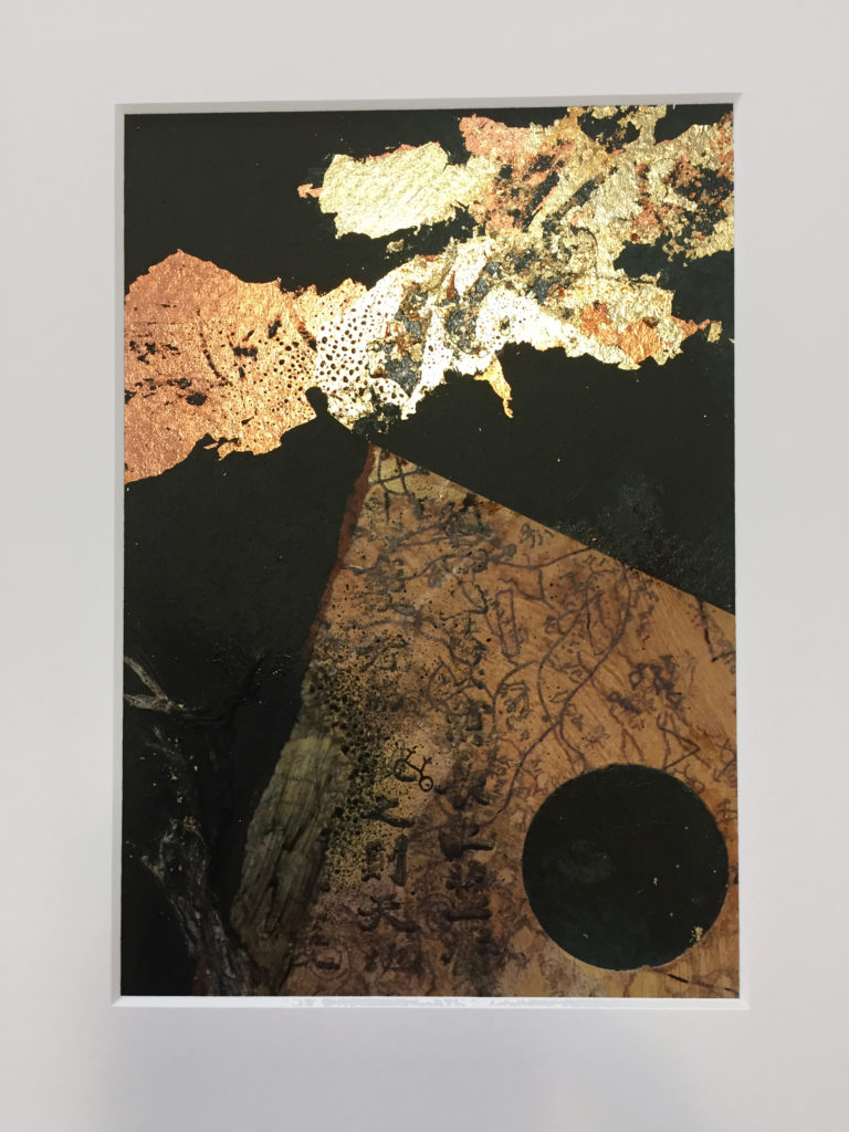
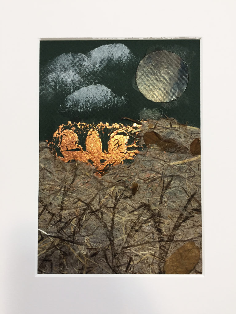
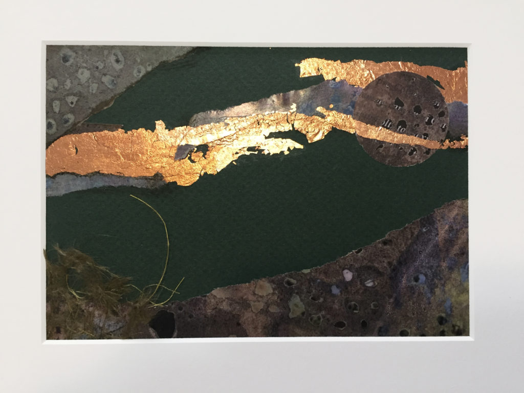
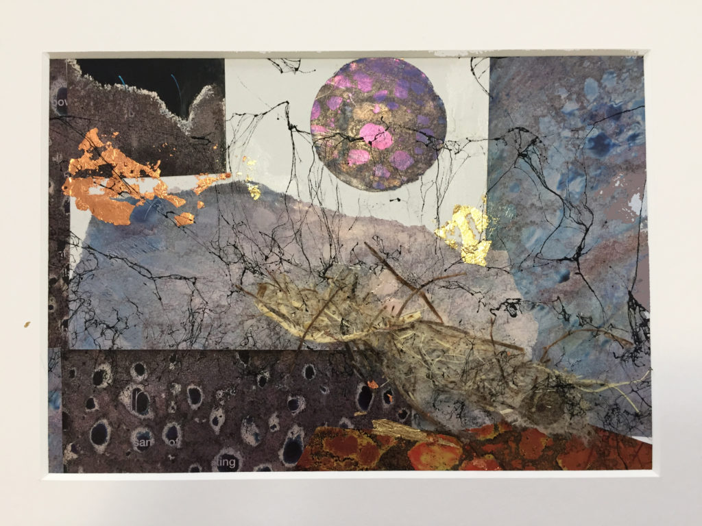
Altered paper, enduring magic

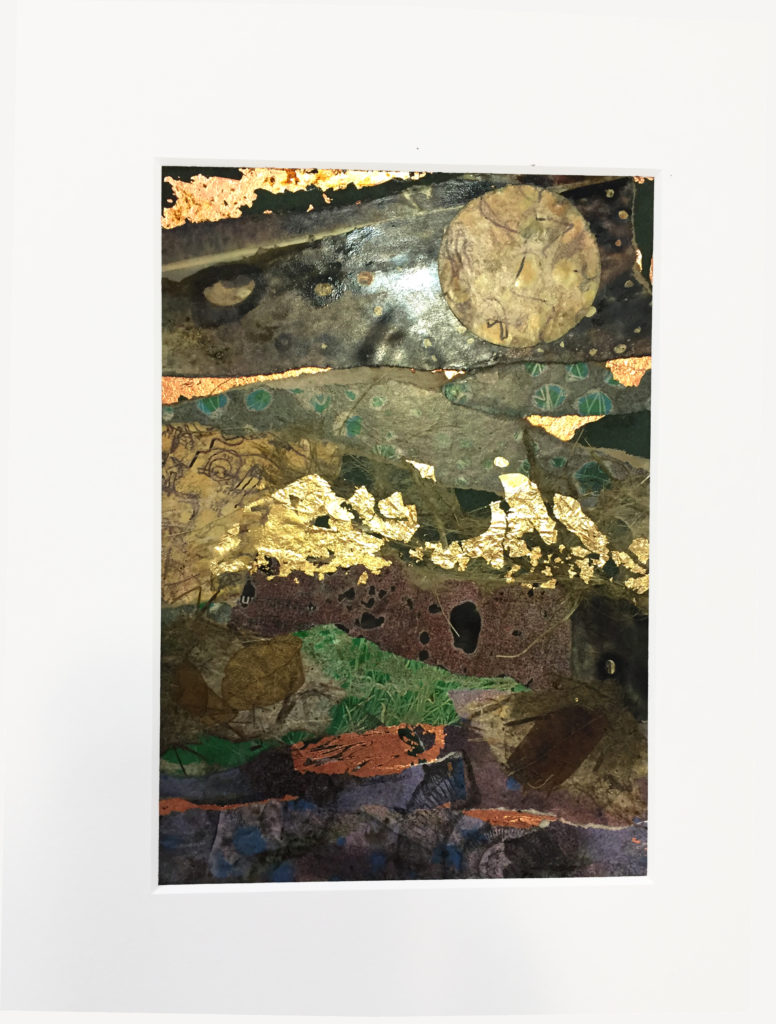
Ahhh – the smell of Citrasolv was in the air yesterday afternoon. Brushed onto the pages of National Geographic magazine, it never fails to turn photographs into otherworldly abstract patterns. When strips and scraps of this paper are combined, magic happens!

No matter how many times I teach this workshop, the results are fabulous – fresh, original and intriguing. Here’s a short video of the workshop participants creating their outstanding work in yesterday’s Small Worlds: Abstract Landscapes and Altered Paper gathering (If you can’t see the video, click here):

Lyn Belisle Workshop: Altered Paper Collage from Lyn Belisle on Vimeo.

Each person chose one of his or her works to mat, and here are their favorites:

Wally

Wally

Mackenzie

Mackenzie

Claire

Claire

5

Jan

Pamela

Pamela

3 copy

Linda

I taught a comprehensive version of this class at Artful Gathering several summers ago, and the DVD is available here.

There are also a number of free, online resources on this technique, including this really good one from Cathy Taylor.

This is one of those simple processes that rarely fails and is a lot of fun to put together! Happy Citrasolv sniffing!

Save

Save

Save

Save

Save

Save

Whiter Shades, the Sequel!

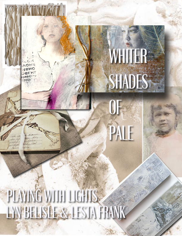
Lesta Frank and I had been wanting to repeat this popular Whiter Shades of Pale  workshop collaboration, and yesterday we got to! Yay! Plus we got to teach it at Lesta’s cozy studio – what a treat.

We added a few more things to the mix this time, including beeswax and gold book foil. Some of the participants had not worked with encaustic techniques before and they loved it.

As usual, the results from this workshop were fantastic. We had a full day to work on this project, including a lunch break in Lesta’s sunny back yard.

Take a look at the video, and then, at the end of the post, I’ll share some of the things we did in the workshop.

These were some of the ways we created our own pale papers:

Methods

  • Tissue “glued” to gray palette paper with matte medium
  • Brushed with gesso, sprayed with walnut ink while wet
  • Deli paper stenciled with gesso, dipped in coffee when dry
  • White stamps on kraft paper – ink, acrylic paint with felt
  • Walnut ink on kraft paper, dried, brushed with gesso
  • Tinted white paint stenciled
  • Circles stamped with cups and objects
  • Cheesecloth
  • Walnut ink through lace
  • Silver and gold acrylic glazes

There really are no rules, just guidelines and suggestions. Discovery comes through experimental play.

After we made the papers, we constructed a collage on canvas:

Constructing the Ephemeral Collage on Canvas:

  • Review the AB3s of composition
  • Pale images manipulated and printed on plain paper
  • Glue stick to matboard, add small collage elements and wax
  • Sand edges
  • Punch holes
  • Add torn hand-decorated paper to canvas
  • Add box
  • Add sticks
  • Add fiber
  • Sew with tapestry needles
  • Attach with hot glue
  • Overpaint with gesso
  • Overspray with walnut ink, burnish
  • Glaze with metallic acrylic

You can see the steps in progress on the video – these steps, combined with everyone’s individual ideas, led to stunning (and pale) results!

Art unites. Keep up the good work with your creative life – onward through the fog, one step at a time!


What do you have to say to yourself?

That was the question in yesterday’s workshop at the studio called “Postcards to Myself.”

It’s a new workshop, one that I designed to see if we, as artists, create unconscious messages to ourselves as we work on art pieces that combine random images and text. The small works that were produced were amazingly lyrical, and many did seem to have meaningful messages.

The project itself was done in seven stages on an 11×14″ sheet of archival matboard.

  • Stage One – images and objects
  • Stage Two – veiling
  • Stage Three – vintage text chosen randomly
  • Stage four – enhancement and alteration
  • Stage five – selection
  • Stage six – wax or acrylic medium
  • Stage Seven – interpretation

When the collage layers were complete, 4×6″ post-card size areas were selected with transparent plexiglass rectangles. Those were cut out, and then finished either with beeswax or acrylic mat medium. We even wrote notes to ourselves on the backs of our “postcards.”

postcard

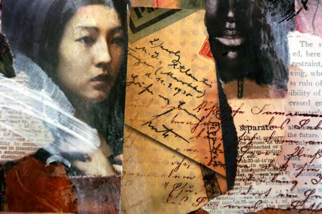
In the example above, this postcard-size section from the larger work shows faces from two different cultures and contains words such as “separate,” “restrain,” and “ruin.” It sounds like a trailer for a mini-drama! And yet it’s a completely coincidental juxtaposition within the larger collage.

We had such fun and learned so much from this project. I’ll definitely repeat it, and will probably create an eBook with with a list of materials and instructions. In the meantime, please enjoy the video from “Postcards to Myself.”

By the way, the first prototype postcard I did included text that said “eat one’s words” – so I was very careful about what I said during our critique!

proto

Save

Save

Save

New year collaboration with Lesta Frank: Whiter Shades of Pale

poster-copy

Lesta and I had such a great time teaching this workshop last September. We’ve decided to repeat it, this time at Lesta’s studio. The date is Saturday, January 21st and it’s an all-day workshop from 10-4. Click this registration link for more information.

If you’d like to take a look at the last Whiter Shades workshop at my old studio, here’s the video. Notice how mellowed out Mary Beth is – this workshop will totally calm you!

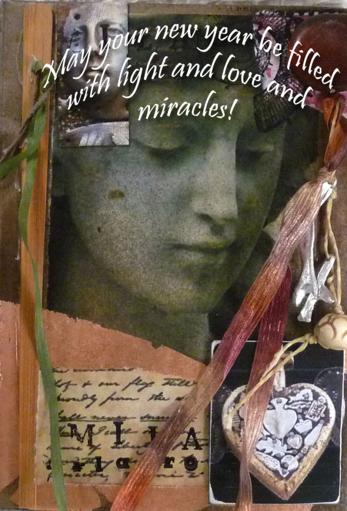
Remember that the best way to know when a new workshop is announced is right here on my SHARDS blog. Thanks for reading – and happy new year!

new-year-copy


Secret spaces and free stuff from the Graphics Fairy

What do you think? Actually, this is not really the new studio space, but it has possibilities . . .

So I found a studio space. I can tell you just a few things about it at this point . . .

  • It’s very close to my new home – yay!
  • It’s cozy, smaller than the old studio, but still roomy
  • You’d never know it was there – it’s very hidden
  • The number five (my lucky number) played an important part in finding it

I’m in the process of moving this week and will keep in touch. With luck (and the creek don’t rise), I’ll offer a December workshop there. You SHARDS readers will be the first to know, I promise.

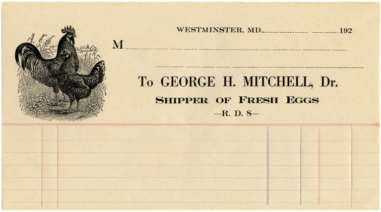
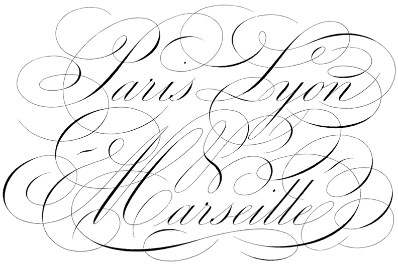
In the meantime, here’s a little creative inspiration from The Graphics Fairy. If you don’t know about this site, you should, especially if you work with collage and mixed-media. Here’s an example:

I’ve downloaded three more vintage scripts and graphics for you to print out (below), but you can search the Fairy’s site yourself to find many more. Just right-click on the images to copy them. They look especially cool printed out on tan parchment paper. Print ’em out, then rip ’em up and play with the pieces!

hand2  hand1

hand3

 OK, back to moving – stay tuned!

Save

Whiter Shades of Pale – playing in the no-color zone

Lesta Frank has a ray gun – she brought it to our all-day Whiter Shades of Pale workshop yesterday, and when anyone “called color” on another person (like, they were reaching for some red paint), they got blasted with flashing lights and wild beeps. It was pretty funny!

The whole day was a delight, as a matter of fact. In the morning, we made beautiful pale papers under Lesta’s expert tutelage – ecru, ivory, palest gold and silver – all breathtaking. A favorite was the string-embedded paper.

wlittle

In the afternoon, we used those papers to create stunning assemblage/collages with the hand-embellished paper and found objects tied into our canvases.

listalittle

Lesta’s collage

The video from the workshop is just pure eye-candy. It’s astonishing how much richness and variety can come from such a a limited color palette. Limiting the color choices allows you to concentrate on texture and composition.

Pale colors and textures are so wonderfully nostalgic that I thought I’d treat you to the original inspiration, the song called “A Whiter Shade of Pale” which won a Grammy for Procol Harum in (gulp) 1967. The video looks so sweet and goofy – very non-MTV. But boy, does it bring back memories!

Save

Save

Pale and painterly papers

A collection of pale papers by Lyn and Lesta

A collection of pale papers by Lyn and Lesta

Lesta Frank and I are teaching a workshop this month called Whiter Shades of Pale. Recently we got together at my studio to play with surface design of all kinds and create papers that have subtle painterly textures and intriguing variations of the palest tints.

The workshop has been sold out for a while, but I thought you might like to see some of the results from our pre-workshop experiments.

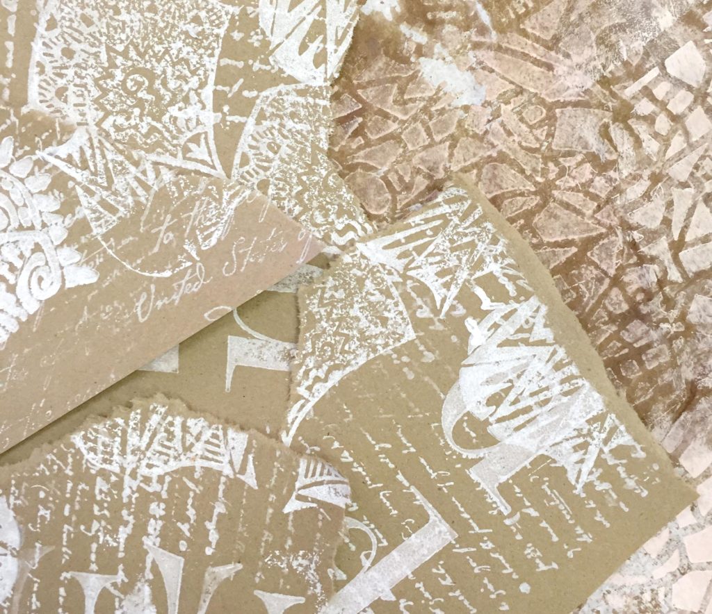
The first idea, below, is so simple – you just do a reverse stamp onto tan kraft paper (like a shopping bag) using a white stamp pad or white acrylic paint soaked into a damp piece of felt. Another variation we did was to roll white acrylic paint onto a textured placemat and print the design onto the tan paper.
blog1

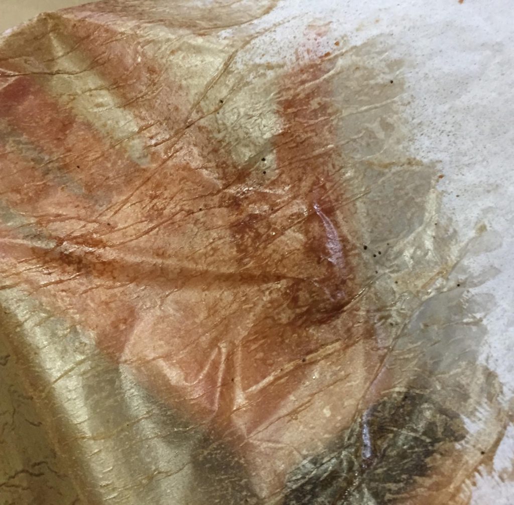
Below, tissue paper has been painted with clear acrylic matte medium, which causes the paper to wrinkle a bit, and then it was sprayed with walnut ink. It’s almost like tinted glass!
blog5
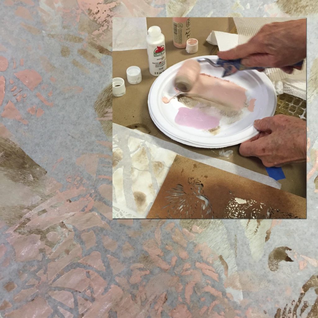
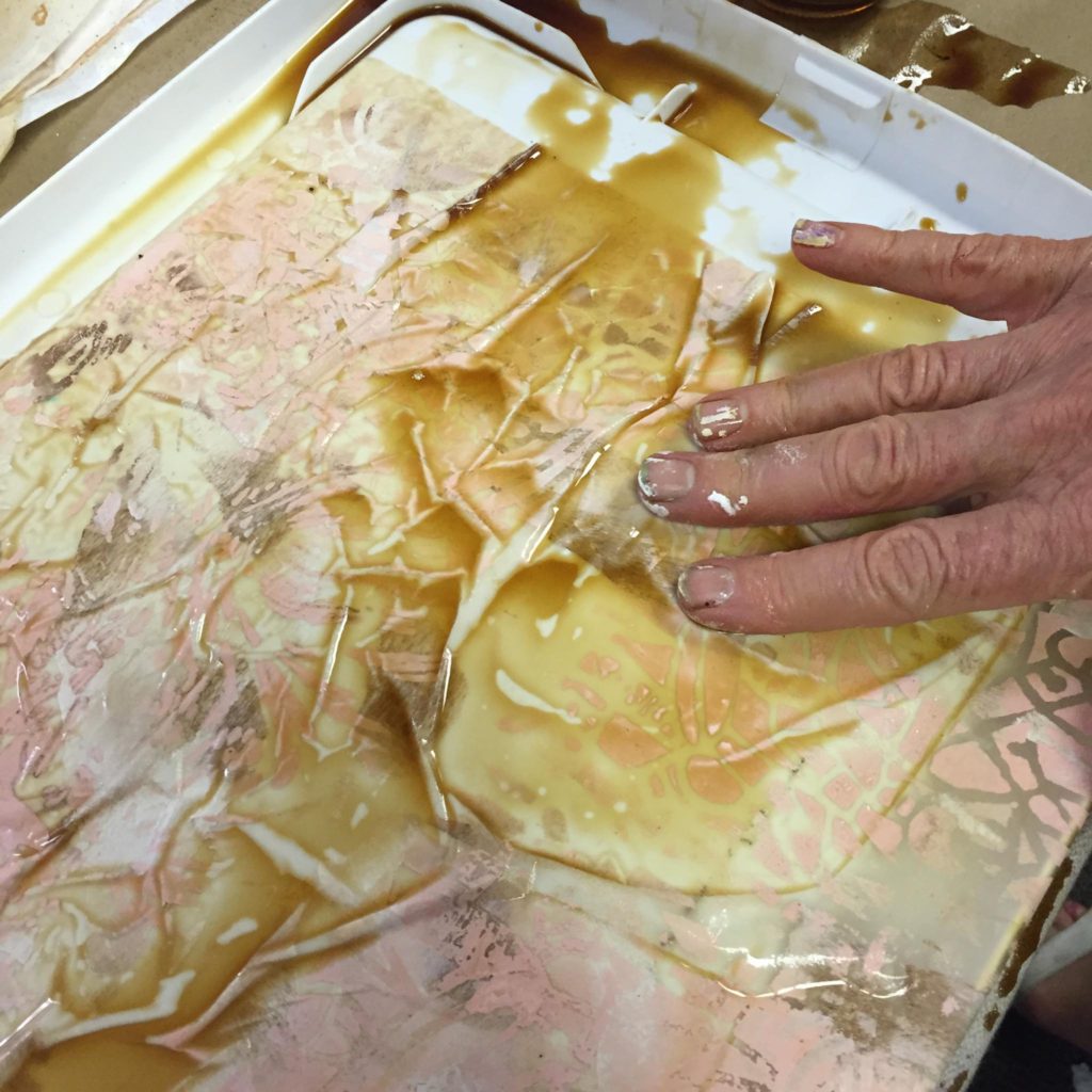
This is one of my favorites. Lesta stenciled white acrylic paint onto deli paper using a small paint roller, and after it was dry, soaked it briefly in strong coffee to “age” it.
blog8

blog7

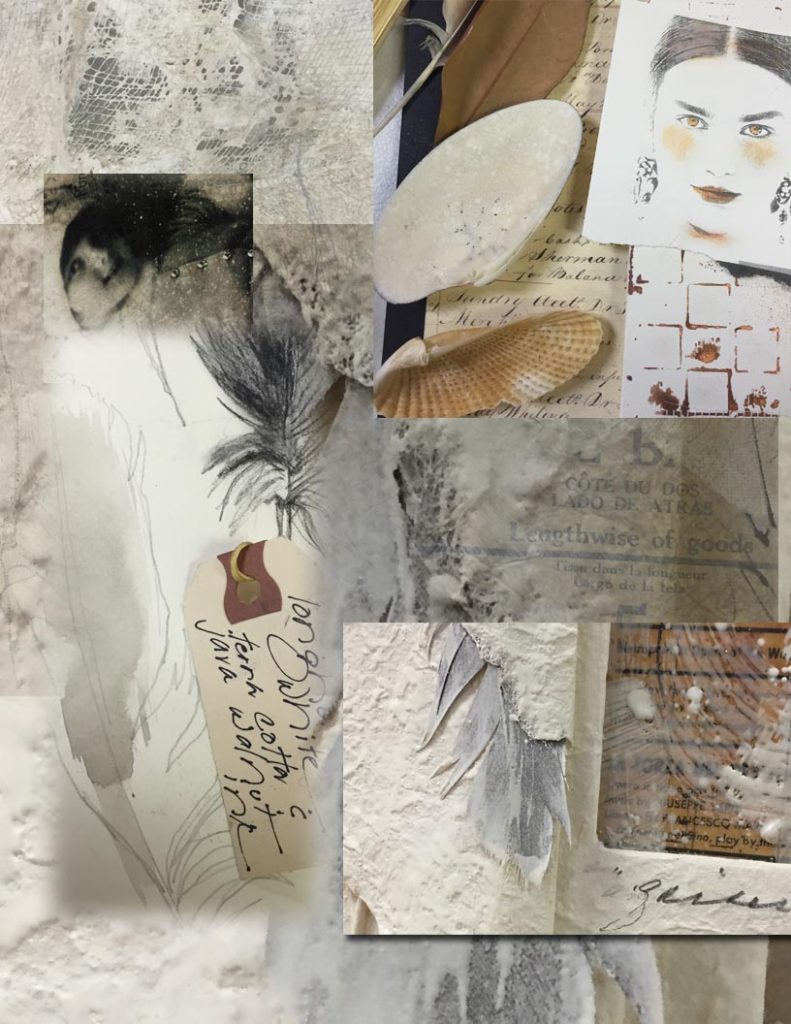
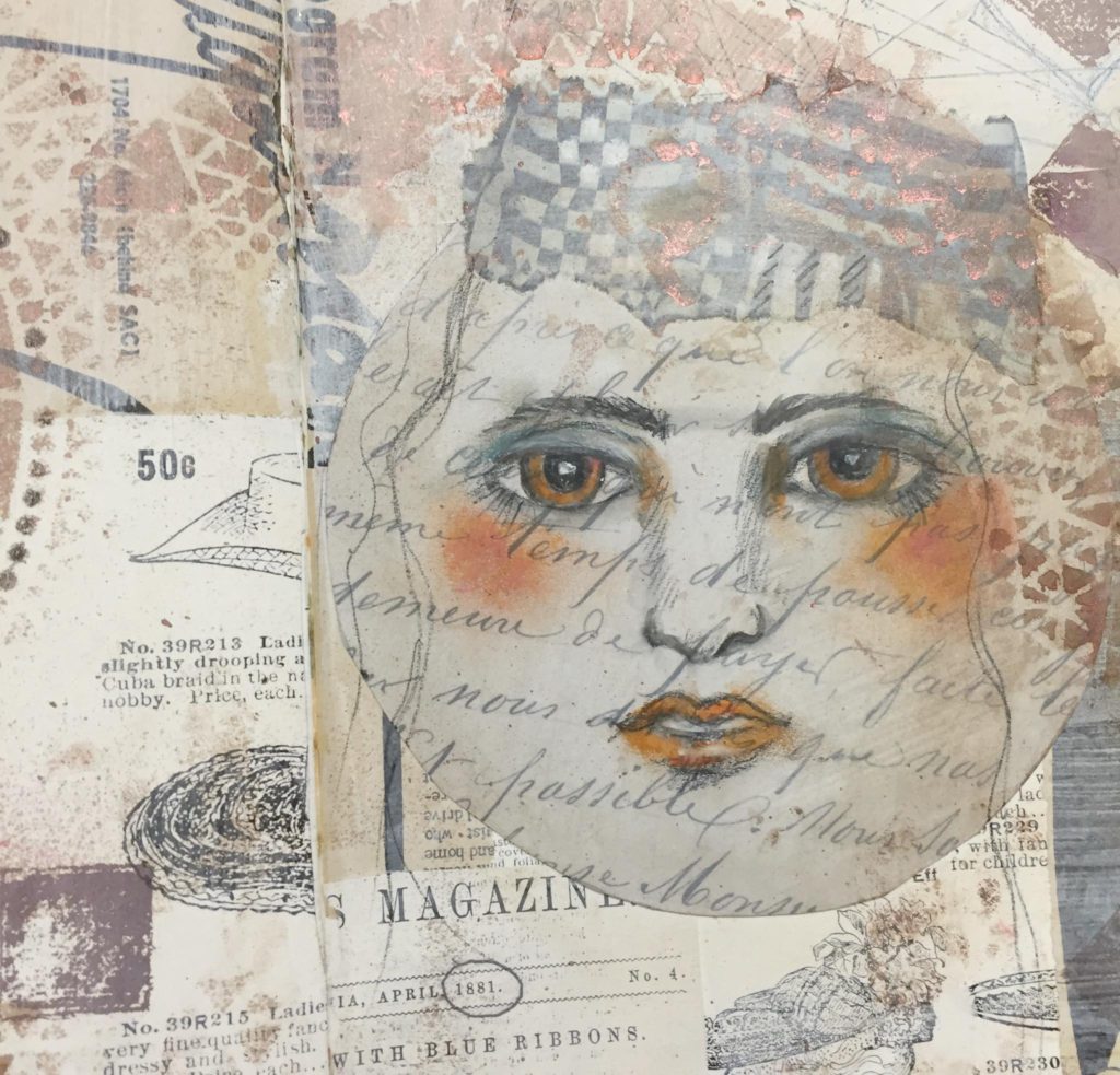
This is an easy “cheater-ly” way (below) to make multiples of subtle designs for ready-made custom collage paper. We just lay various pale papers on a scanner, scanned them in to the computer, and then printed out 8.5″x11″ composite-designed papers. Lesta tinted the face on the example below with Portfolio oil pastels.
blog2

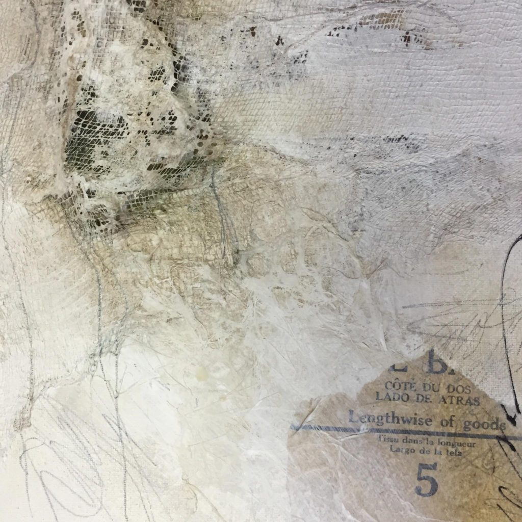
Cheesecloth can be used in so many ways to add interest to collages with pale papers. You can Gesso it and let is dry, then cut it into fragments. You can use Gold Gesso as well. You can also add it as a layer over textures, then paint over it with light tints of acrylic paint.
blog3

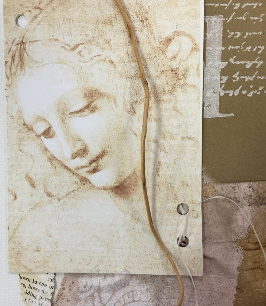
Finally, don’t forget that you can lighten images with your printer using MS Word – here’s a Renaissance face with its contrast decreased, printed on a plain piece of inkjet paper and mounted to matboard. I punched holes and will attach this to a collage as one of the final layers – hmm, and maybe cover it partially with tissue?
blog4

If you want to play around with pale papers, here are some materials you might want to try.

I hope you have a chance to use some of these ideas – you can make just a few pale papers and collage little 3×5″ creations for cards. Or whatever – pale is pretty!

Save

Save
Five friends learn composition, collage and beeswax

My friend Mary James organized a great private workshop for five friends at the Studio yesterday afternoon. We worked with vintage photos and beeswax. I really hadn’t worked with anyone but Mary before, but I loved every one of the participants! They were enthusiastic risk-takers – some first-time artists, some  with art backgrounds – all great students!

We followed my usual teaching sequence – explaining the AB3’s of composition, arranging the visual elements accordingly, layering and fusing wax and stamps and foil and – of course– spraying walnut ink to accent the incised lines. Some people brought photos of their grandmothers and mothers to work with – beautiful.

They got it all! You can see the incredibly individualistic results in this short video. Fun! Thanks, everyone, stellar work!

Kintsugi and Boro – fusion and inspiration

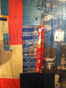
Celebrating the imperfect, the time-worn, and the re-invented resonates deeply with me, probably because I am a combination of all of those things. That’s why the Japanese arts of Boro and Kintsugi are so appealing. Boro, a Japanese word meaning “tattered rags,” describes lovingly patched and repaired cotton bedding and clothing used much longer than the normal expected life cycle.

Boro is enjoying a revival among fiber artists who treasure its indigo blue color and melange of textures and subtle patterns. In fact, the Fiber Artists of San Antonio are offering a Boro workshop taught by Mary Ruth Smith in July.

A Japanese houshold Boro textile

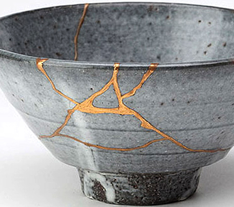
Linked to Boro by concept is Kintsugi, meaning “mended with gold.” It refers particularly to the Japanese method for repairing broken ceramics with a special lacquer mixed with gold, silver, or platinum.

The Kintsugi process usually results in something more beautiful than the original.

The Kintsugi process usually results in something more beautiful than the original.

Both Boro and Kintsugi are interwoven with the philosophy of wabi-sabi, which means “to find beauty in broken things or old things. ” See why I like this stuff so much?

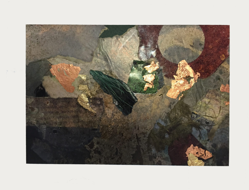
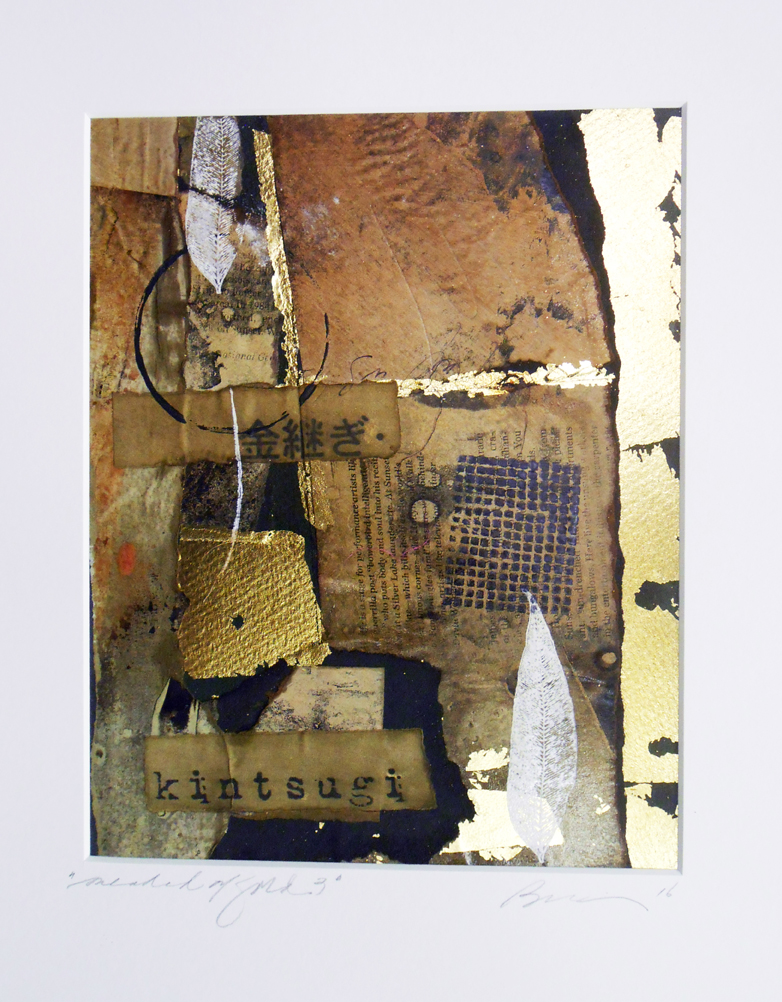
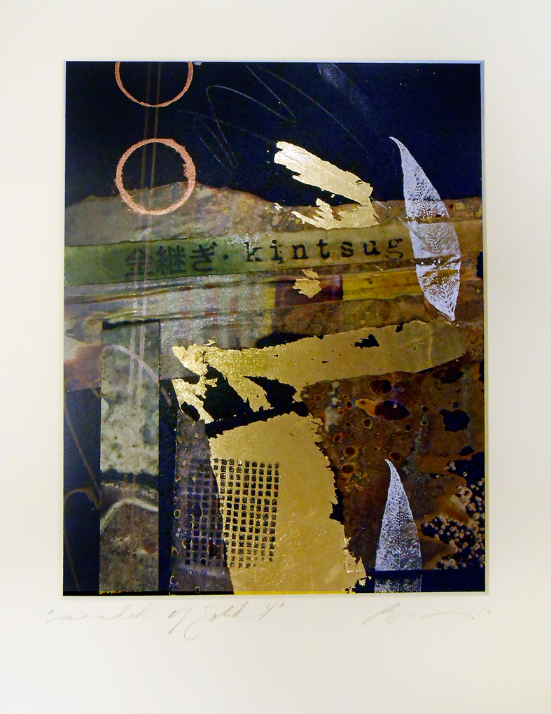
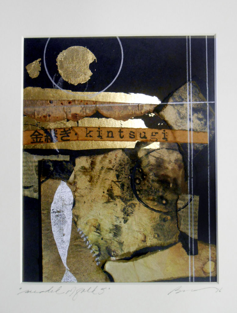
So today at the Studio, I was putting away materials from our Citrasolve and altered paper collage workshop, and I started thinking about torn paper scraps (Boro) mended with gold (Kintsugi). I printed out the word “kintsugi” and began arranging Boro-like tatters of paper (they would probably have been dumped in the trash) onto 8×10″ pieces of archival mat board.

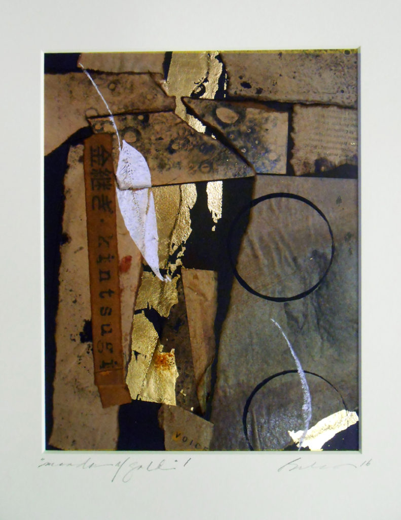
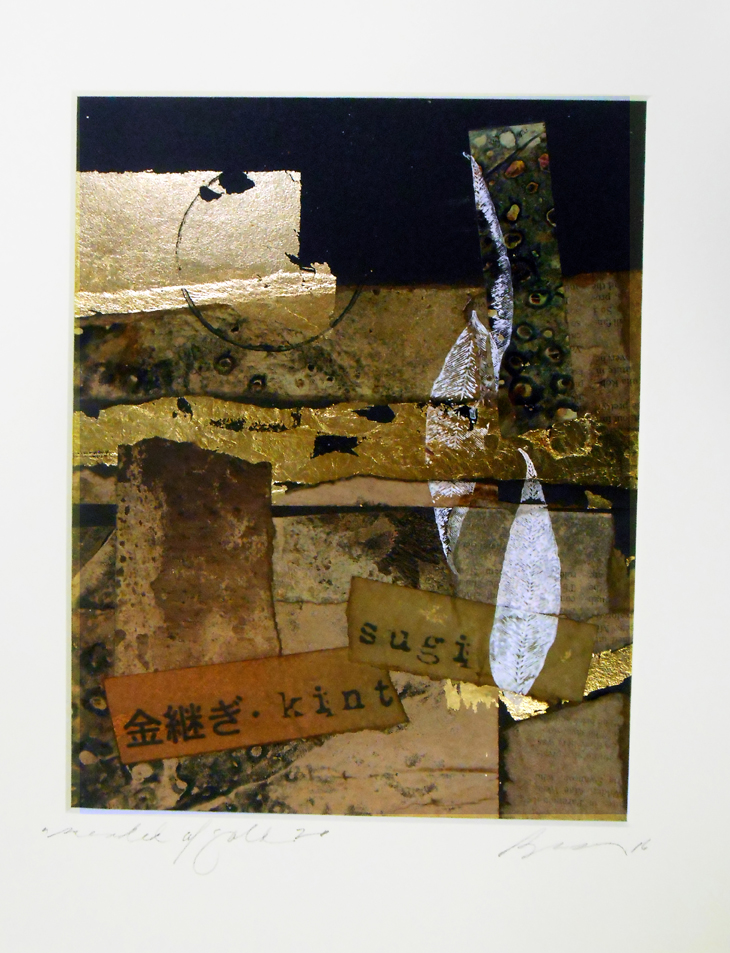
Then, inspired by the gold veins of Kintsugi, I “mended” the spaces between the scraps with gold leaf. It was amazing how fast time flew – I created five of these collages in about four hours. They almost pieced themselves together.

Here are the five collages – #3 is my favorite because it looks most “Boro-like.” These pieces are destined for the Beacon Hill Art Walk this Sunday, but when I come home from Boston, I’m going to continue to explore the idea of gold-mended tatters and the beauty of imperfection and re-invention.

Mended with Gold #1 Lyn Belisle 2016

Mended with Gold #1
Lyn Belisle 2016

Mended with Gold #2 Lyn Belisle 2016

Mended with Gold #2
Lyn Belisle 2016

Mended with Gold #3 Lyn Belisle 2016

Mended with Gold #3
Lyn Belisle 2016

Mended with Gold #4 Lyn Belisle 2016

Mended with Gold #4
Lyn Belisle 2016

Mended with Gold #5 Lyn Belisle 2016

Mended with Gold #5
Lyn Belisle 2016


Save

Save