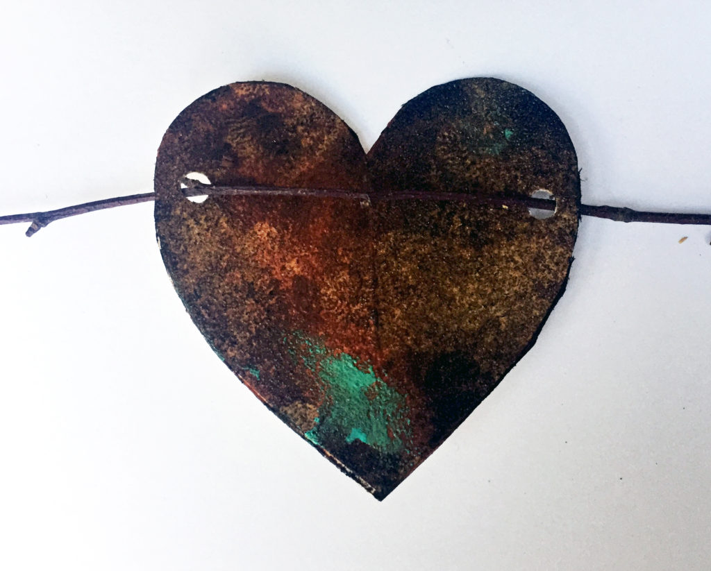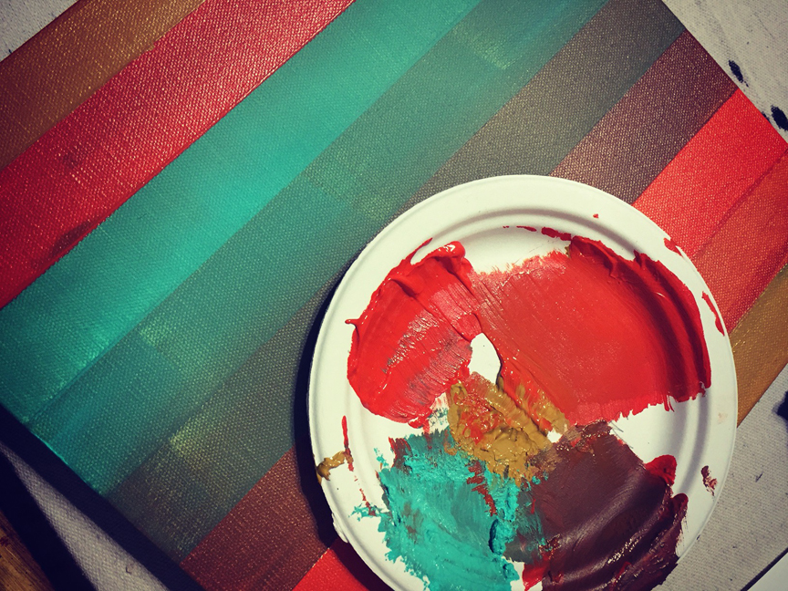
I was working in the studio yesterday on a striped background for a painting workshop, and when it was finished, I assumed it was going to be a horizontal composition. Then I wondered. . . why had I assumed that? Why was horizontal my default?
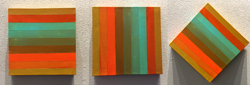
So I asked my Facebook friends what they thought. I wanted to see how weird was I compared to them. I posted the painting in three separate pics (combined, below) and asked if they like it better horizontal, vertical, or diagonal. (Remember, this isn’t a finished painting, just a striped canvas, so content isn’t really an issue).
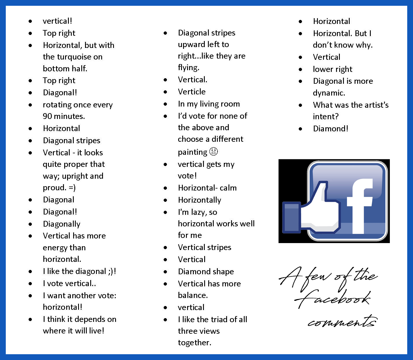
When the FB comments started, they were all over the wall, so to speak. Some people gave reasons, others just stated a preference. Some changed their minds, some had some cool out-of-the-box replies.
I decided that different kinds of people like different linear arrangements – well, duh. But why? Here’s an article from Vanseo Designs that explains part of the reason:
The Meaning of Lines: Developing A Visual Grammar
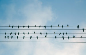
Horizontal lines are parallel to the horizon (hence the name). They look like they’re lying down, at rest, asleep. They suggest calm and quiet, a relaxed comfort.
Horizontal lines can’t fall over. They accentuate width. They’re stable and secure. The convey an absence of conflict, a restful peace. Horizontal lines by their connection to the horizon are associated with earth bound things and idea.
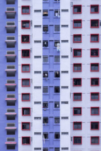
Vertical lines are perpendicular to the horizon. They are filled with potential energy that could be released if they were to fall over. Vertical lines are strong and rigid. They can suggest stability, especially when thicker. Vertical lines accentuate height and convey a lack of movement, which is usually seen as horizontal.
They stretch from the earth to the heavens and are often connected with religious feelings. Their tallness and formality may give the impression of dignity.
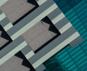
Diagonal lines are unbalanced. They are filled with restless and uncontrolled energy. They can appear to be either rising or falling and convey action and motion. Their kinetic energy and apparent movement create tension and excitement. Diagonal lines are more dramatic than either horizontal or vertical lines.
Diagonal lines can also appear solid and unmoving if they are holding something up or at rest against a vertical line or plane.
MY CONCLUSION, and how to decide on your New Year’s resolution:
After you have chosen your preference and know whether you are a Horizontal, Vertical, or Diagonal person, you can write a really cool New Year’s resolution. To wit:
- Horizontal people should resolve to get out of their comfort zones. Take a chance. Eat a squid taco. Experiment with fluorescent paint on a burlap canvas. Paint it with your toes.
- Vertical people should resolve to lighten up. Loose the formality. Eat a Cheesy Jane’s beanburger and don’t use a napkin. Toss the oil paint realism and go for a Jackson Polluck style with enamels. Get high on the fumes.
- Diagonal people (oh, how I wish I were one) should resolve to channel their crazy energy. Eat tofu, drink green tea. Paint with only shades of gray on white paper. Yeah, that’ll last about ten seconds.
See what one little question on Facebook can lead to? OK, now that I’ve helped you with your self-analysis and your resolutions, I’m headed out for a squid taco. Ewwww.

Happy New Year! And thanks for reading SHARDS, no matter how weird it gets.


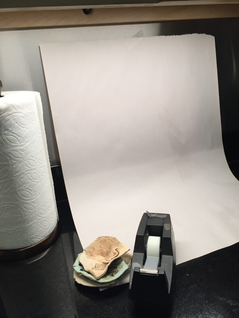
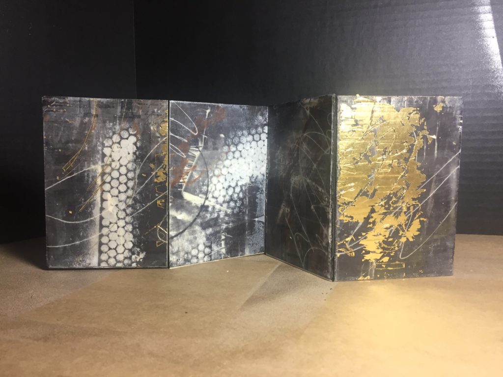
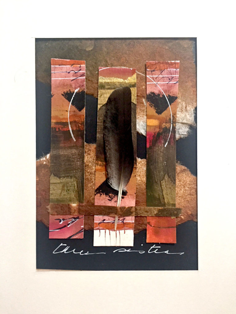
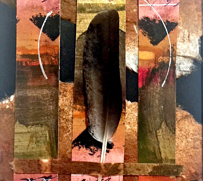
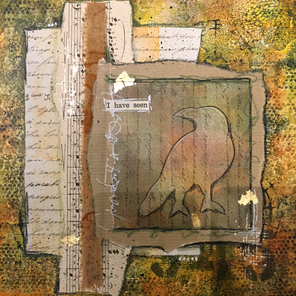
 But isn’t it amazing what a seamless background can do for a photo, even an iPhone photo? And nobody has to know that you took it on your kitchen counter.
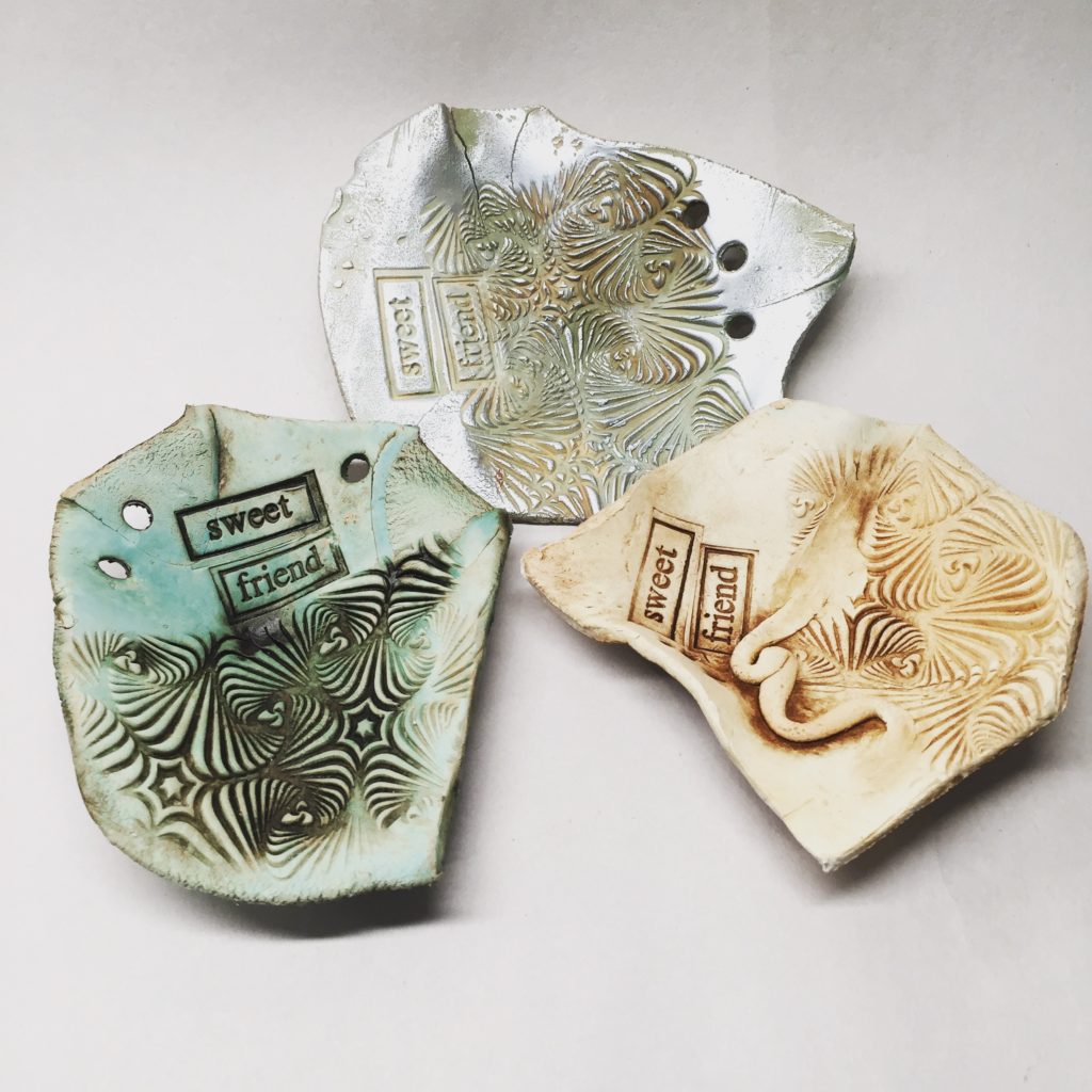
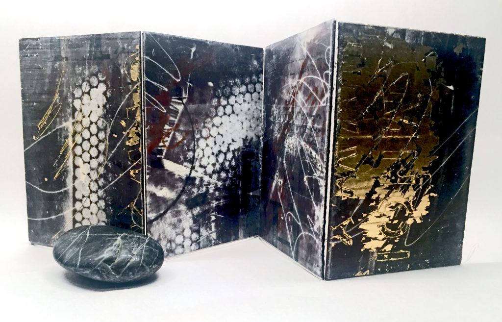