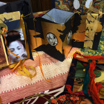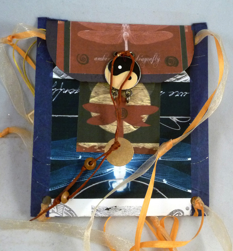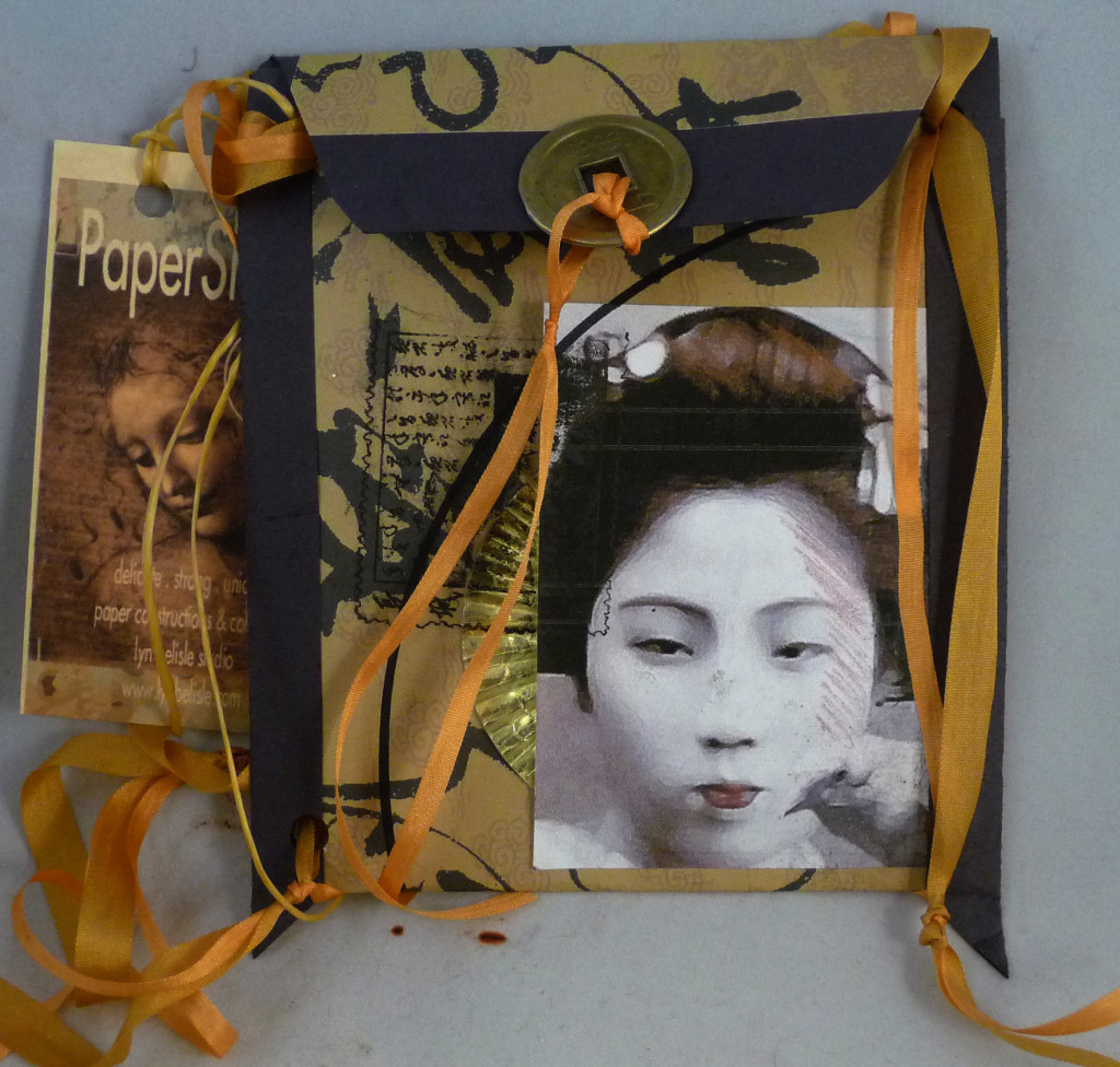
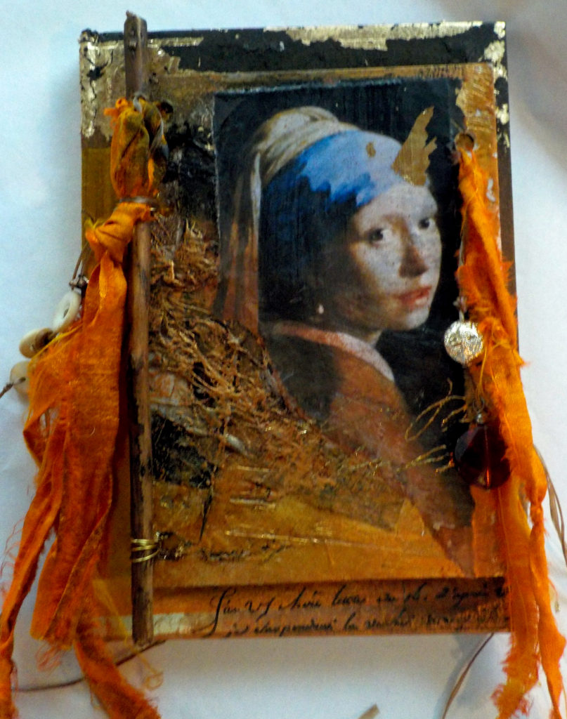
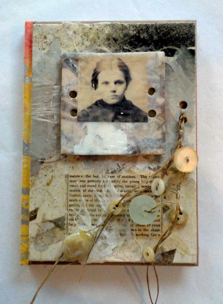
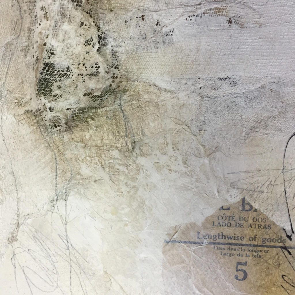
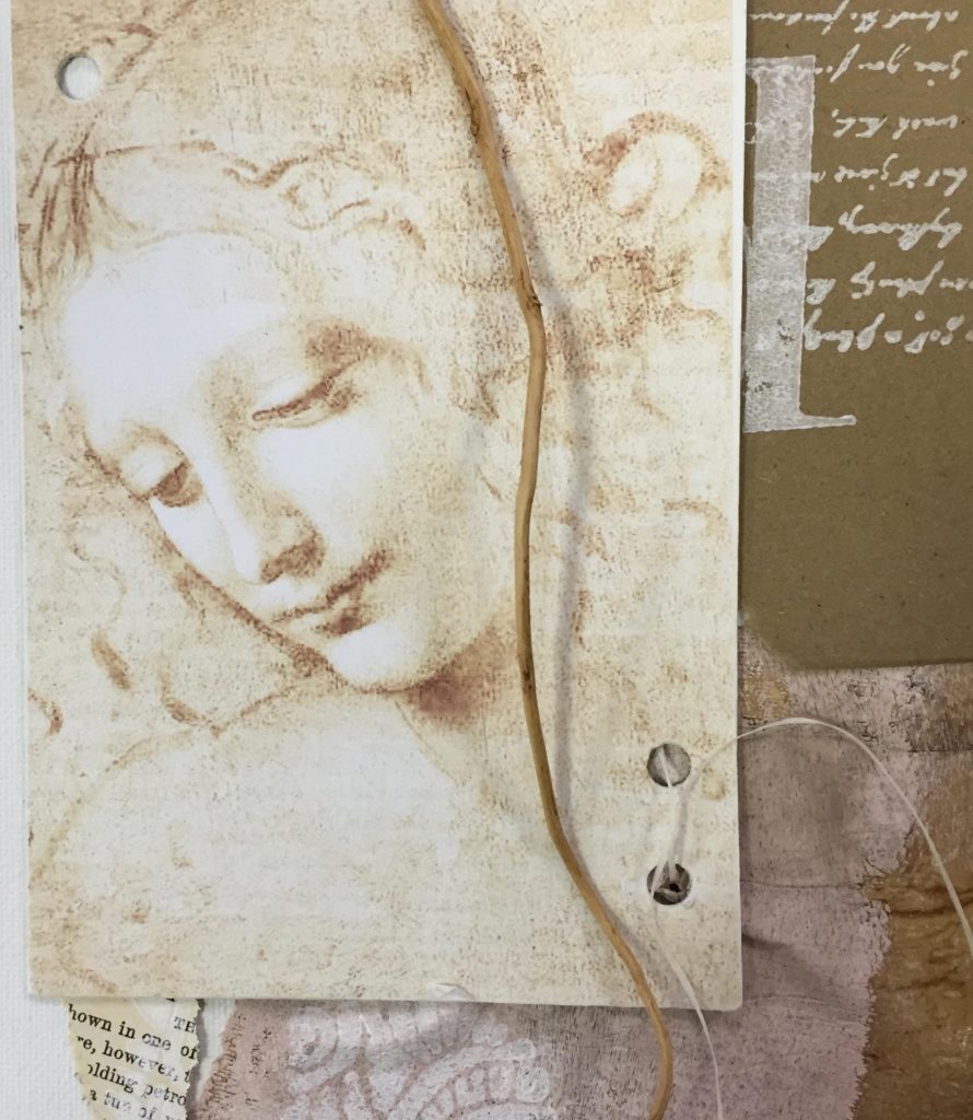
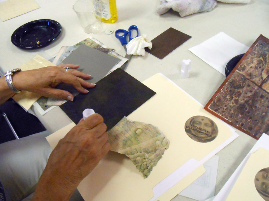
I’m so excited! Studio C Gallery at the Art Center of Corpus Christi invited me to show my work there. They requested some of my journals, which makes me happy because those are truly mixed-media work, plus I love hand-made books. It occurred to me that a 5×7′ journal is the perfect size for the 5×7″ collages that I routinely demonstrate in my workshops. So it was natural to create small collages for the journal covers.
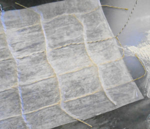
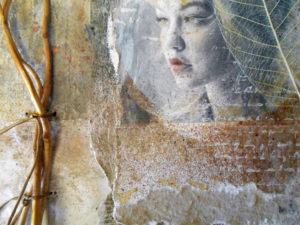
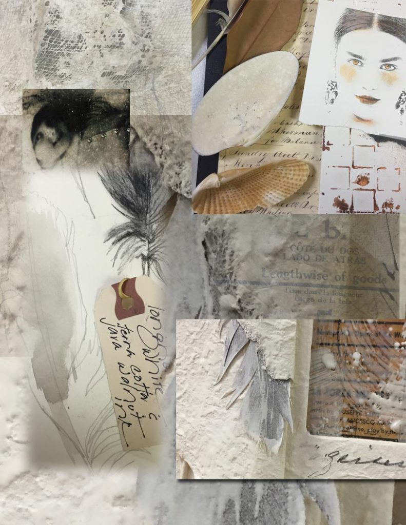
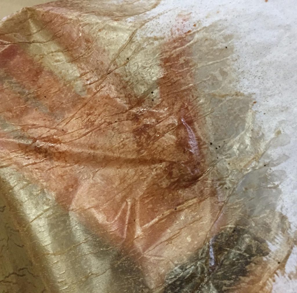
I used a combination of tissue, wax, ribbon, beads, wombats (actually no wombats) and I was pleased with the results. Here are some photos of six of these. I am creating the journals in a numbered series of ten, each with a title.
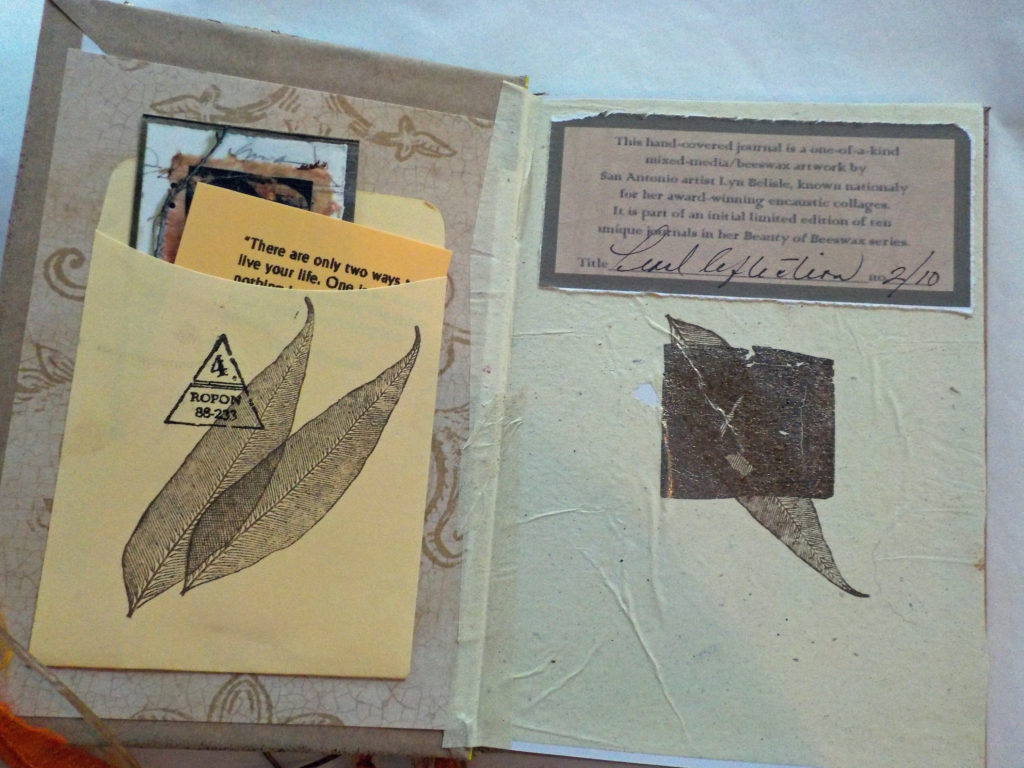
Journal inside front cover with title and number
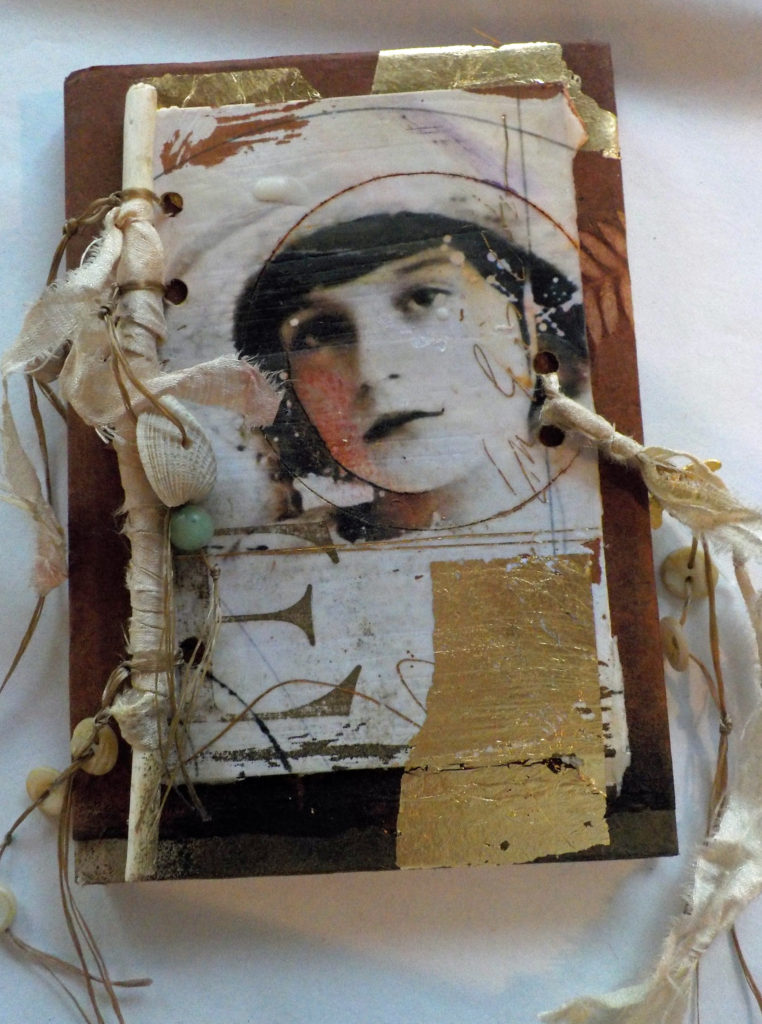
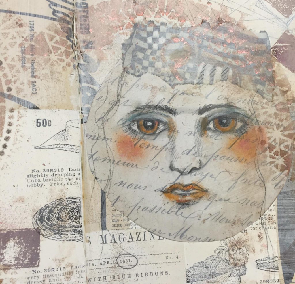
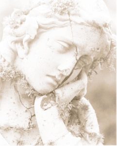
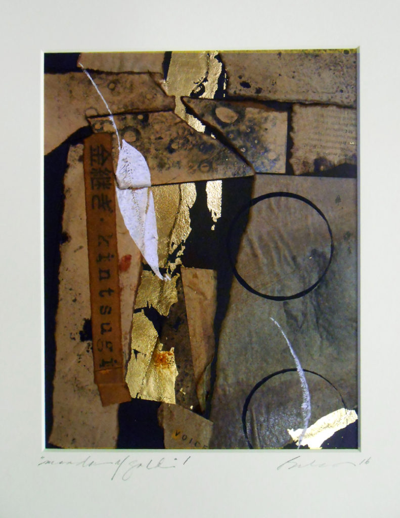
“Elizabeth”
“Pearl Reflection”
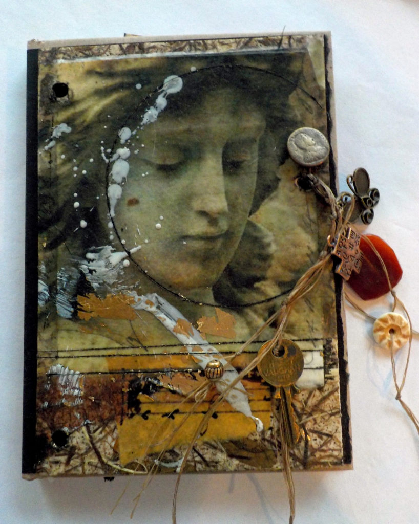
“Pensive Mercy”
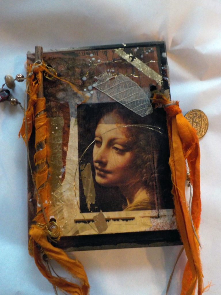
“Renaissance Dreams”
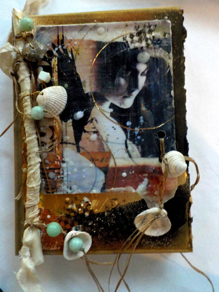
“Shell Spinner”
“Winter Bay”
It’s kinda cool that you get an original collage and a journal in the same little package! Functional art, for sure.
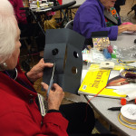
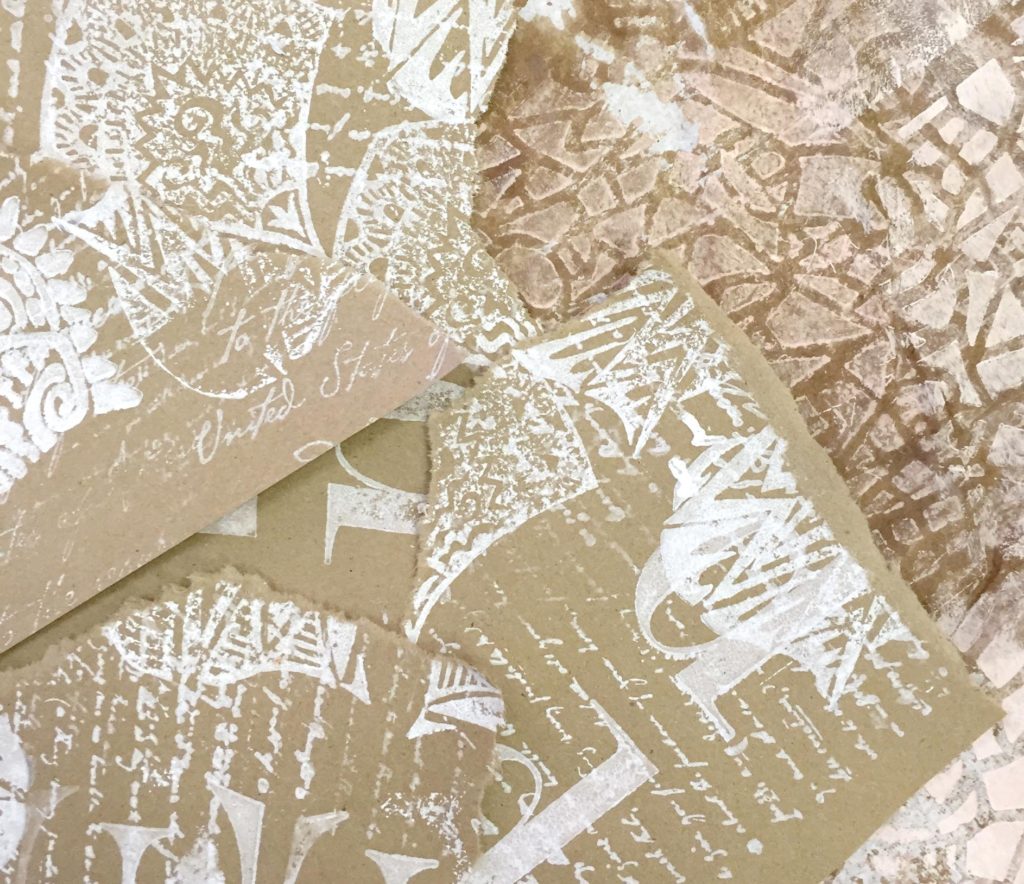
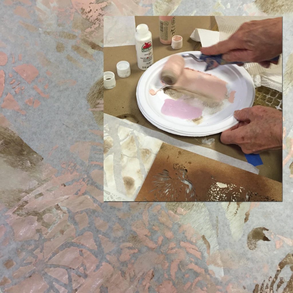
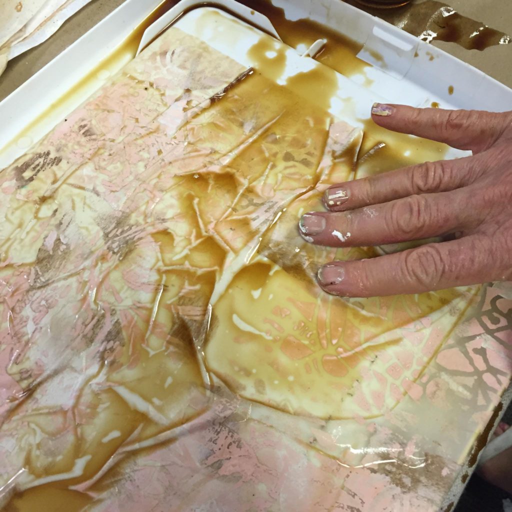
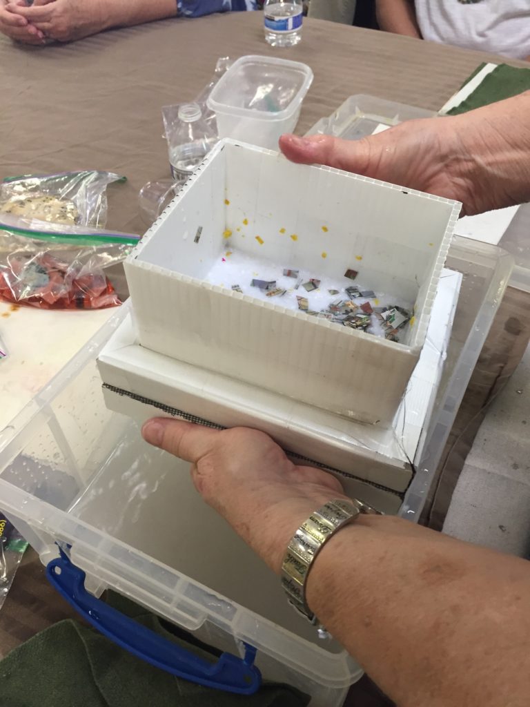
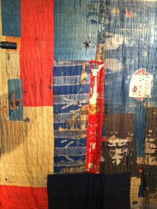
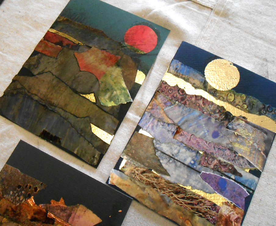
This past Sunday, I had a Wax and Tissue workshop at the little studio, and we created more of these 5×7″ mixed media/beeswax collages.
As always, the work was fantastic. Jo Etta Jupe, who teaches papermaking at the Southwest School of Art, commented that everyone’s pieces were authentic reflections of their personal style and vision. How true – take a look!
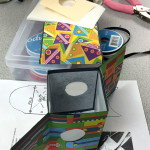
If you find yourself in need of an enjoyable small project, try some of these 5×7″ mixed-media collages. They lend themselves to all kinds of possibilities, including journal covers!
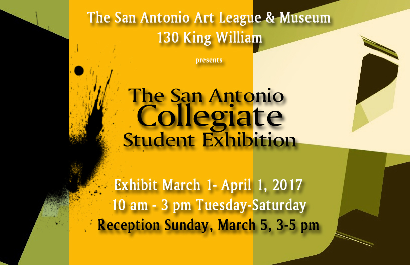
The weekend approaches – get out there and enjoy it. Oh, and if you’re in San Antonio, drop by the San Antonio Art League & Museum on Sunday afternoon for the opening of the Collegiate student exhibit. I got a sneak preview yesterday, and it is a strong show that will generate a lot of lively conversation!!


 Last night, I visited the